“It was all a dream, I used to read Word Up! magazine. Salt-n-Pepa and Heavy D up in the limousine. Hangin’ pictures on my wall...” are some of the most infamous lines in rap history. It describes a nostalgia that feels familiar, yet obsolete at the same time. It narrated a story a generation of us knew all too well—back when we collected posters, magazine pages, cassette tapes, CD liners, and album covers. With a roll of tape between our fingers, we collaged our favorite artists’ stories onto our bedroom walls. And these images stuck, only peeling when the tape gave out from the dust—a far cry from how quickly we consume images today.
From Napster, Facebook, Tumblr, Instagram, to Spotify, the radical shift in cultural consumption and the explosion of digital information alarmed industries across the board. For music, the rise of illegal downloading and digital streaming dribbled challenges from declining album sales to threatening one of the most appreciated canvases of the 20th century: the album cover. Pre-dating the vinyl revival, album art was collected and framed. Then, it became a reblog. Today, a repost. Album art over the past decade has sometimes been patched as an afterthought, quickly produced to match attention spans. Design has concentrated on shock value that rely on a quick release of hype or catered to individual singles, rather than on consistency of branding, an album, or a visual aesthetic that remains timeless.

But Chicago artist and art director Brandon Breaux, known as the visionary behind Chance The Rapper’s album covers, approached this as a challenge—to make album art matter, instead of accepting that it once mattered. Brandon’s aesthetic and treatment for Chance’s projects has been an unwavering vision, investing in 4 years building this campaign, now known as a trilogy. His digitally painted covers of 10 Day, Acid Rap, and Coloring Book maintained a specific aesthetic with a simple composition of Chance’s face in the foreground complemented with thematic hues in the background. What he created with the succession of these covers was a new marketing model for music that stems from iconic branding—focused on generating emotions and personal relationships to build a long time connection. Former CEO of Saatchi & Saatchi, Kevin Roberts, called this concept a Lovemark; the album art becomes an announcement, bait, connection, and representation of the music.
The result? Coloring Book has become one of Chance’s most shared and successful projects yet, landing him 3 Grammys last February. It isn’t surprising that this visual aesthetic grew in popularity, with artists such as Drake, Kehlani, Miguel, and Troye Sivan also inspired by the look. But what happens when your vision or model starts to become the trend? We had an immersive conversation with Brandon in his studio tucked in the Chicago Art Department about visual branding, how he conceptualized Chance’s album covers, the creative difference between how Kanye and Drake reappropriate underground culture, and investing in work that will stand the test of time.
CHARLIE KANE: The face of album covers were drastically different in 2012 when 10 Day was released. Mostly, the aesthetic was primarily focused on using photography. Why did you choose digital painting?
BRANDON BREAUX: I chose painting because I just knew the impact that it would have. I had been running a T-shirt company for a little bit and I was really involved, picked up on patterns on how culture operated. So it was really a matter of making something that was worth people’s attention. It was about elevating the perception of an artist immediately, so when seen up front, it would make people want to listen. There’s a lot of things that could be exploited in the recording industry because of how it’s set up for efficiency. You used to have painted album covers back in the day in the ‘70s, but we entered this stage [with photographers like] Jonathan Mannion. He became industry standard, and painting and illustration took a backseat. I understood I had to do something to make people care about the artist’s hand and not just photo or type.
“When artists challenge people… it takes people a while. It took years to build this for Chance.
CK: How did you come up with your concept? It was obvious [you wanted] Chance’s face to be in it, but how did you come up with the color scheme or composition?
BB: I kind of just drew from how I would want myself represented. And it was a very personal, personal thing. Album covers are a representation of people, and for me, I thought of it like a self portrait. So the original idea was to have Chance looking up because it was based on a photo. It was the only photo that I gravitated towards out of the folder they sent me [shot by] Nolis. And [Chance’s] head was supposed to be surrounded by vices like girls, weed, cool stuff that young kids are into. I went to my safe zone of what I really liked and that’s how the colors came together. But it took me so long to do the illustration, so I was like, “Cool,” and just stopped it right there. That was the best I could come up with with having to deliver.
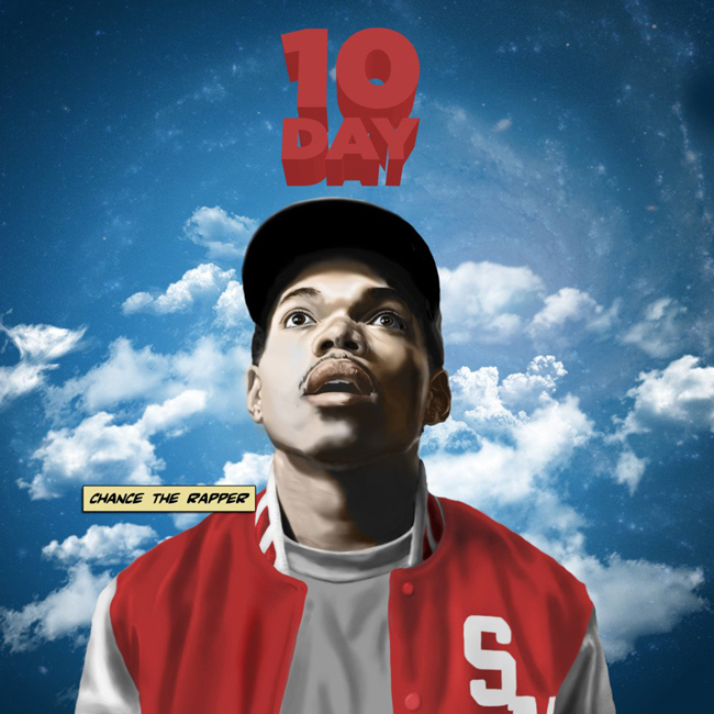
Brandon Breaux’s album art for Chance the Rapper’s 10 Day (2012). At the time, digitally painted cover art wasn’t the norm. This cover was the first of 3 that would tell a distinct narrative.
CK: I’m glad you didn’t include all his vices or thoughts. I feel like the work became so much stronger, especially since you’ve continued this for 3 projects. If you incorporated thoughts it may have been more trendier.
BB: And dated. It probably would have been more dated.
CK: Yeah, definitely.
BB: Yeah, I think that’s how design works. I think design is very much a practice of eliminating as much as you can until you’re left with what you need. I mean even the type on that thing [was] just Chance’s name [as] the title in the sky. But people needed to know his name because it was his first project. I tried to be as minimal as I could.
“I understood I had to do something to make people care about the artist’s hand.”
CK: [In the years between] 10 Day (2012) and Coloring Book (2016), the increase of images and sharing platforms amplified. How did you know you needed to stand out in the brink of image overstimulation? How was your method a way to stand out from overconsumption?
BB: I kind of designed it for use like that. I knew it would get some placement because I knew it was a different product. So my whole goal was to—let’s make this and make it dope. Let’s build it with the intention of standing in the test of time. It’s something different when an artist is representing or giving you who they are in the moment. When artwork comes [to represent] a person, a certain feeling or vibe comes behind it, too. And I think that Chance’s feel is a whole lot different—
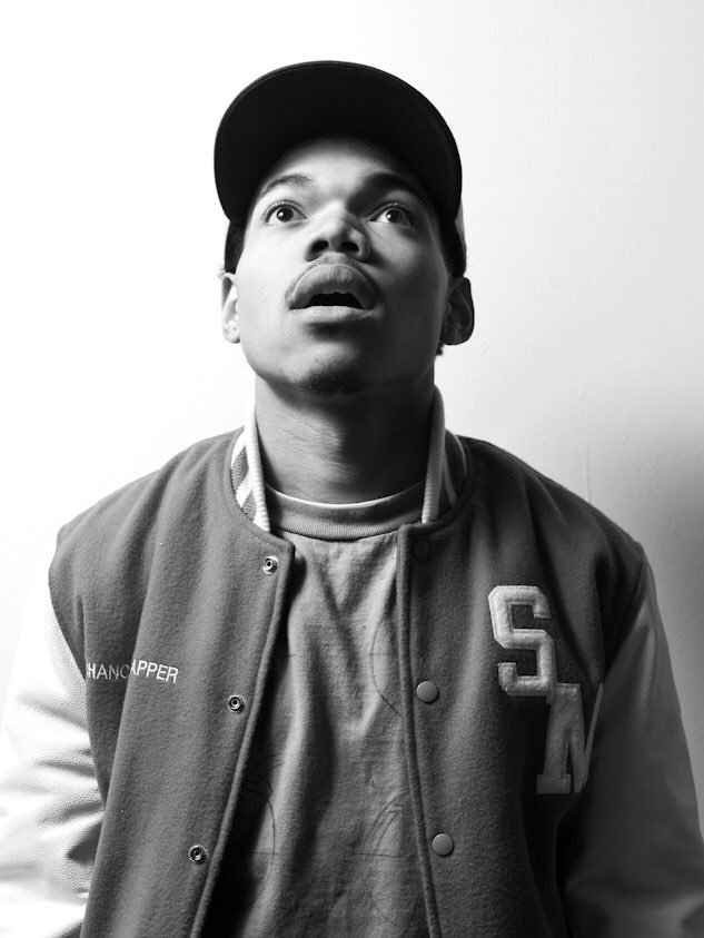 The reference image shot by Nolis that Brandon Breaux used for 10 Day’s album artwork.
CK: It’s more genuine.
BB: Yes! It’s placed a little bit more differently for people, too. And it’s a little unorthodox. It’s not so much in the stream of what’s going on or in this amplified sense of what is trending. We were on our vibe—people picked it up. And that’s exactly what Drake did the following year with [Nothing Was The Same]. I think Drake pulls from culture to create something that is most relevant at the time.
CK: What’s the difference between Drake and Kanye? I feel like both of them are able to curate different sounds, design, or trends and incorporate them in their own art. So why does Drake get more backlash then Kanye?
BB: When you look at them both, they hold a different tone or light about them. I think ‘Ye is more about the clashing of two opposed ideas—
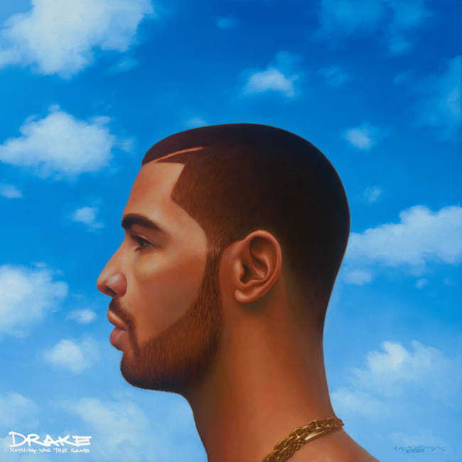
Drake employed strikingly similar artwork for Nothing Was the Same (2013) a year later. This is the artwork from the Deluxe edition.
CK: Like juxtaposition?
BB: Yeah, coming together and creating something new like the Big Bang. I think Kanye built his career off of understanding the divide and exploiting it in such a way that it gives birth to an original sense, sentiment, and fresh perspective. And Drake more so gravitates towards—cherry picking things and creates a formula. You know what I mean? Not so much colliding and opposing two ideas, it’s more so in the vein of things. I remember when he did the “Hotline Bling” video. When it came out, I was saying, “This is cool that he did this, but he created something that was intentionally made to create memes.” But I felt like the predecessor of that was this viral video of Kanye [dancing].
“I think design is very much a practice of eliminating as much as you can until you’re left with what you need.”
CK: Oh, I didn’t even think about the connection between those two. Wow.
BB: Drake is so easy to kind of like bread crumb, because his process is so surface. And nothing against him at all, but I think there’s a reason that people talk about projects like Chance’s for a long amount of time. Views was great. It was the background music of the time. But I feel like the impact of Views over time is going to be missing because it’s so much in the vein of what people already know that they like, and it’s not giving anyone a new taste of something.
But I really respect what he’s doing because I think it’s important. And you can see that it’s super effective, right? It’s like giving people what they want exactly when they want it. And when artists challenge people and give something different, it takes people a while. It took years to build this for Chance.
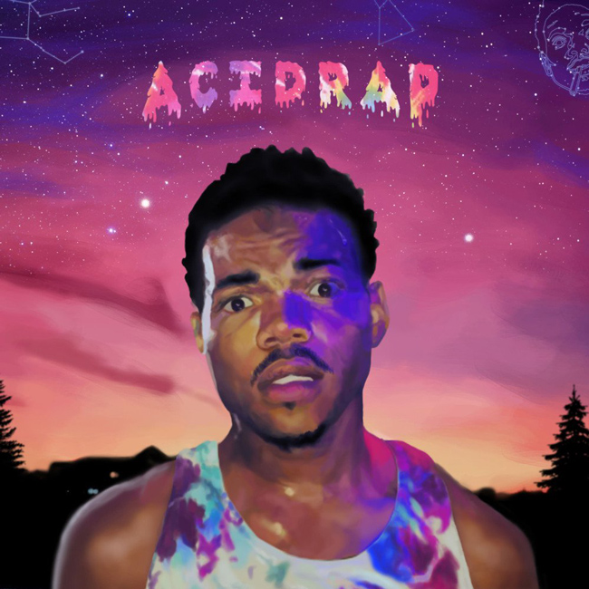
Brandon Breaux’s artwork for Chance’s second mixtape Acid Rap (2013).
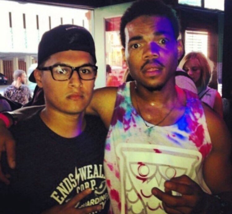
The reference image Brandon used for the cover art for Acid Rap.
CK: The landscape of visual branding in music also looked drastically different in 2012 and aligned with how we consumed music and the business. Biggest changes have been streaming services, and indie efforts that expose labels are not necessarily needed for success. The evolution of these factors also rely heavily on social media. How did you incorporate these factors with your visual branding for Chance?
BB: I thought of it in the overall sense of you encountering something on social media, [and how] attraction is going to win. We kept the same formula for the most part, and in that space. Business-wise, I think streaming [impacts an] artist’s significance. That’s something to consider. If anything, when [music] campaigns are centered around it, it starts to amplify like the importance of the artwork and the visuals. So I think artists are definitely in the mind state of doing that. And they’re starting to get better at it—assimilating in some ways, because I feel like a lot of it is copied, but that’s how a lot of culture works. You can’t expect otherwise because that’s how humans work. I’m not trying to reinvent the wheel every time I do something. If I go to build a rocket I’m definitely going to be talking to some people work in NASA. You know what I’m saying?
“When [Hotline Bling] came out… he created something that was intentionally made to create memes.'”
CK: Usually campaigns are short-lived though, existing during the promotion of an album or only identifiable to that project. What was the importance of keeping this visual aesthetic for 3 projects or for 4 years?
BB: We were really building the ship that we didn’t have blueprints for. It made sense story-wise, the succession. This may be another point in time but its relationship is still the same: it’s you and the artist. I was trying to brand something without necessarily having a logo. So it’s like, the art is the brand. And it may not be the same season that you interact with the last one, but there’s this consistent component that let’s you know what you’re listening to and who you’re looking at. When it came to the trilogy, Chance just hit me with, “Yo, I wanna talk to you about doing the third one.” It just seemed only right—when things peak in culture, we see through art history and our culture that it exists in threes. That’s why I was stuck that people could grab onto it, and use [anything for] the art to make sense for them.
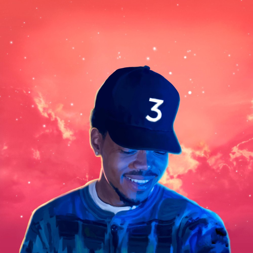
Artwork for Chance the Rapper’s 3rd mixtape Coloring Book (2016).
CK: Yeah, the 3 different covers have created a story sequence that people have theorized over and even made narratives themselves on the meaning. Did you intentionally mean to create this?
BB: I didn’t imagine the impact, so I was surprised to see it everywhere. It was crazy. People doing art work online, people doing custom shoes with it, it inspiring people’s makeup. Especially when Coloring Book came out, [the hype] increased even more. It was intentional for me—to tell a story in the way that I don’t know if the artist thought they could. Like if you told [an] artist before this all came out that, “I want to do a succession of 3 albums over 4 years and have it somewhat look the same but slightly different,” you know they might’ve told you, “No, I might not be feeling that.” So it’s definitely an example of a new formula to be taken on, a new way to develop some type of consistency with the work that’s beyond the sound.
Boston's never looked better, @chancetherapper. pic.twitter.com/K292aatekw
— SHAWN THOMAS (@xShawnThomas) May 4, 2016

