Who doesn’t love skate graphics? I too own too a good bunch of untouched and sealed skate decks, some of them bought back in the ’90s. Never put foot on them (better off since I am worse than Lil Wayne), kept them as a memory of a specific moment in time, but it was mainly all about the graphics on them. Sometimes, you just want the graphics to stay there, not to be scratched and disappear. I actually have a chair made of broken decks. Well, you can’t sit on the chair, but it’s funny. It’s actually a broken chair made of broken decks…
Skateboard graphics are an important factor of the skate culture, they gave skateboarding a visual presence and landscape, a new edge, something extra to talk about in your adolescence. Especially from the late ’80s/early ’90s and on – the beginning of World Industries, artists like Sean Cliver, Marc McKee, and so on. Don’t get me wrong, skateboarding = skaters. No skaters, no decks, no graphics. Yet, a cool graphic on a board is always welcome, always important.
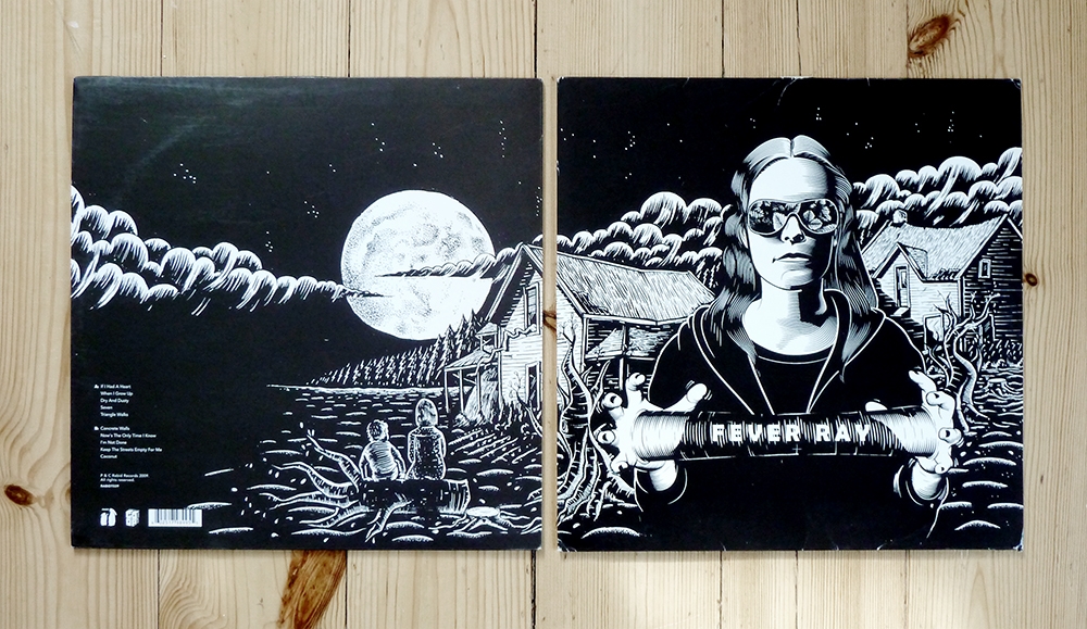
Artist Martin Ander aka MANDER comes from Stockholm, Sweden, and he is in the forefront of European skateboard art. With a background in the graffiti and skate world, MANDER picked up a pen in the early ’90s and never looked back. His work is unique and distinctive, thoughtful and detailed, seen around the world on the decks of skate companies like Flip, Bellows, and Sweet. As well as collaborations with WeSC, Reebok, and many more. And yes, he is also the man behind the album cover of Fever Ray’s self-titled debut, one of our favorite musical pieces of the last years.
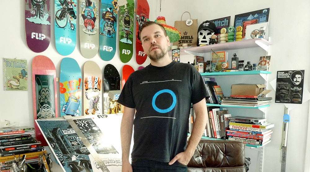
MANOS NOMIKOS: Did it all start from skateboarding?
MARTIN ANDER: Being a part of the skateboarding culture in the ’80s and ’90s definitely gave my creativity a direction and it has had a great influence on my style and my way of thinking, but I’m pretty sure I would have been doing something similar even if I had never gotten into skateboarding. I probably wouldn’t have been designing skate graphics, but still, graphics is just a very small part of my body of work.
How do you remember [yourself] as a kid drawing things? Did your parents help you get into the art world?
Well, I don’t really think I am in the ‘”art world.” I just work with illustration and do a little art when I have the time.
But yeah, my dad was an art director and illustrator, so I got a lot from watching him work.
He was also a big collector of art, art books, and all kinds of comics. So I’ve always had great sources of inspiration and material growing up. Dad was also the one who bought me the book Subway Art and a book about Rick Griffin, they both had a huge impact on me.
“THE STOCKHOLM SKATE SCENE IN THE EARLY ’90S WAS LIKE THE REST OF THE WORLD – VERY SMALL, WITH VERY BIG PANTS.”
Along with skateboarding, you also broke into the graffiti world as a writer and later as an art director of the UP graffiti magazine. How was graffiti and skateboarding back then in the Sweden of ’90s?
The graffiti scene in Stockholm was very creative during the early and mid ’90s, due to the city’s ‘”zero tolerance” policy. Τhe most active writers were forced to come up with new, quicker styles and techniques. Instead of the classic wild style color burner formula, some of Stockholm’s most active writers at the time – such as the VIM, MOB and TOX crews – began filling the streets and transit system with simple, experimental, humorous, almost ironic takes on classic graffiti styles. This, together with the style progression happening in Helsinki and Copenhagen during the same time, is what later became known as the now widely spread Scandinavian style. During the same time period, writers from all over Sweden moved to Stockholm, bringing never seen before styles and techniques that had been developed isolated from the rest of the graffiti world. So it was definitely an interesting scene to be in.
And even though the city and the transit company was coming down hard on writers and graffiti culture in general – even legal graffiti shows at art galleries would get shut down by the police – we still had some semi-legal hall of fames in industrial areas in the suburbs where writers had the time to meet new friends, work in peace, and party. That’s where you would find me if I wasn’t skating.
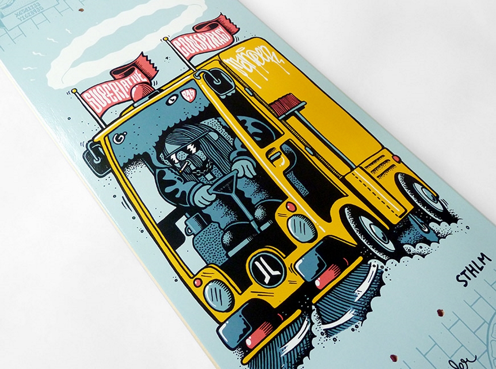
The Stockholm skate scene in the early ’90s was like in the rest of the world – very small, with very big pants.
After the collapse of the ’80s period, we were a tight-knit crew of 20 to 30 skaters left. The summertime was great – exploring the city, looking for spots – which also gave me an opportunity to see lots of graffiti. The winter time was not that great, the very few indoor spots were shut down or just fell to pieces. But we found shelter in a parking garage under the Sheraton hotel in Stockholm City where we had the perfect private spot to take part in the birth of street skating. Spending all winter in a parking garage with all your friends was on one part depressing, but also super creative and inspiring. We stayed there until ‘96 when skateboarding became popular again and we suddenly had a big indoor park, lots of new blood, skateboard magazines, and even a skate show on TV for a while.
How do you also remember your first board graphic and how did you evolve after that? Commissions started coming?
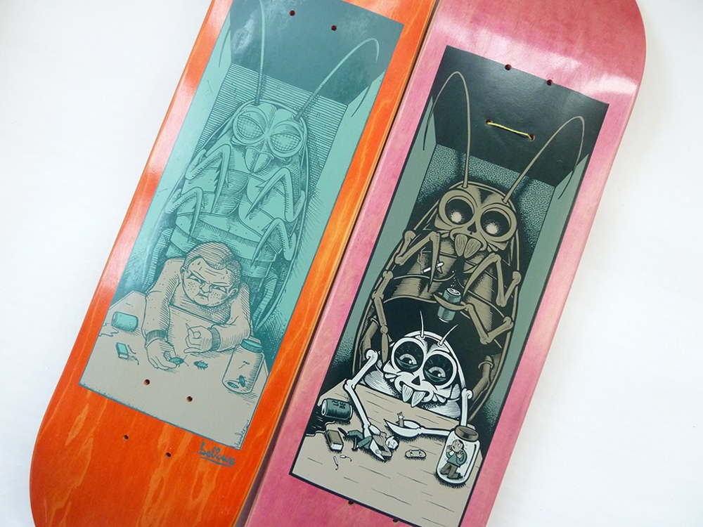
I’d been sketching and dreaming of doing skateboard graphics since 1987 when I first set foot in a real skate shop and saw the works of Jim Philips, Wes Humpston, and VCJ. 20 years later, my old friend from the Sheraton days, Martin Karlsson, started a company called Bellows. He knew that I worked with illustration, I was into graphics, so he asked me if I wanted to do a graphic for them. I was super stoked. I don’t really know why, but I drew a big bug standing behind a kid that was torturing insects. It turned out good, so they wanted more. Bellows had the same distribution as Sweet Skateboards, which was one of the biggest companies in Europe at the time, so I started working for them too. Then Seven Inch from Finland contacted me and since then, I’ve done graphics regularly.
About three or four years ago, I decided I wanted to get into the US market, but I didn’t know how. One day, I ran into Ali Boulala, another old Sheraton local. Since he was pro for Flip, I asked him if he thought it would be a good idea to contact them and if I could use him for a reference. They liked my work and since then I’ve been doing graphics for Flip.
What is the most satisfying aspect of your job?
I don’t know, I’m just happy I can make a living doing what I do.
But my favorite part of the creative process is inking the graphics. I usually do this at night time. When the basic idea is all worked out, the client has OK’d the sketch, all the preparations are done, the kids have gone to bed, telephone and e-mail disabled. That’s when I really get in to the work.
And of course, it’s always a great satisfaction to see the kids at the skateparks skating on my decks, or seeing my posters all over the city.
How would you characterize your style and what is your technique starting and finishing a piece?
I’d like to think that I work in some kind of classic cartoonist tradition, with a twist of graffiti and punk rock aesthetics. I think you can find traces of everything I like in my work. Skate graphics, punk rock, hip hop, underground comics, psychedelia, and rock art, graphic design, childrens’ books, infographics, lettering ,etc, etc.
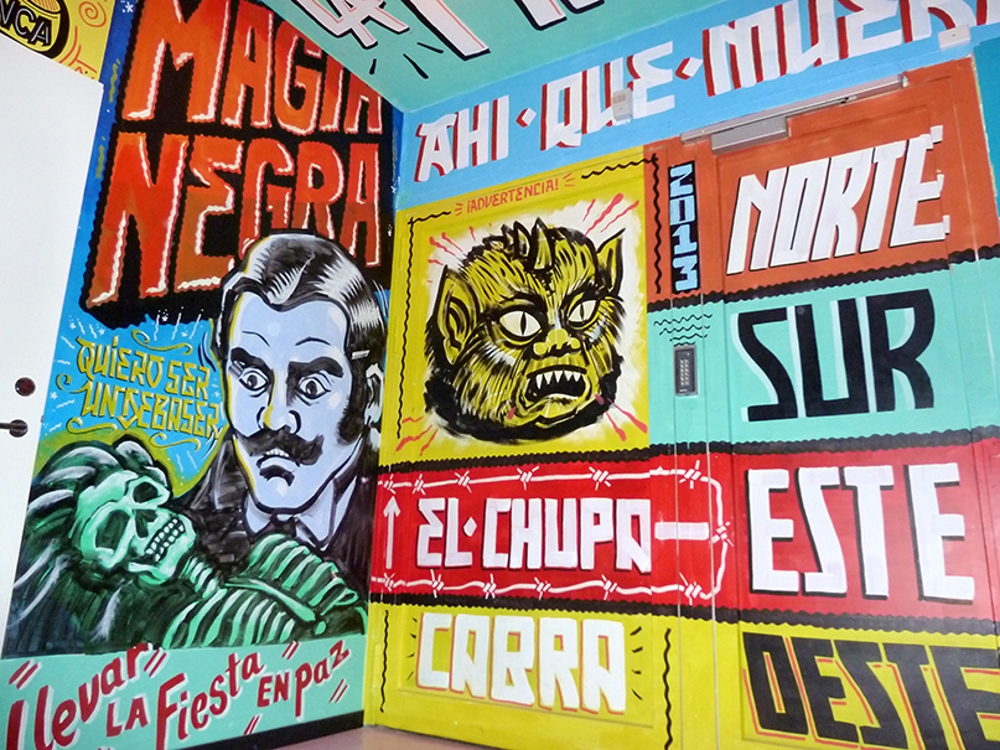
The way I work is very methodical. Before I start sketching, I’d like to have the idea all figured out. First, I do very simple sketches of the lay out to get the composition right, then I go into detail. Then, I usually leave the sketch until I know I have the time to ink it all in one sitting. If I do something wrong in the inking process, I usually start all over again, I like my originals to look good. I usually don’t like to use the computer more than for coloring and separations. It’s a great tool in many ways, but I think using it too much takes away the nerve in the lines, that’s what makes a drawing come alive.
I usually ink with India ink and brush for the thickest lines, and a bunch of different markers and fine-liners for the rest. No fancy papers, regular 240g A3 printer papers will do. Then I scan it with a regular A4 scanner and paste it together and color it in Photoshop. Or in Illustrator if it should be separated for screen print, but I never vectorize the line drawing, vectors kills the nerve,. I just draw the other colors in Illustrator and leave the scan as a bitmap.
“[SKATE ART HAS] VERY LITTLE TO DO WITH SKATEBOARDING.”
This is the way I work with the projects I put my heart into, but of course, sometimes I just draw what a client wants me to draw, or draw something in Illustrator from start to finish if that’s what is needed. Even though this is my passion, it’s also my job. So whatever works works.
You have also done artwork for album covers like the infamous Fever Ray one. Different approach doing an album cover than a board graphic?
Well, the biggest difference is that when you do skate graphics, you usually do a series of graphics. Which means that you have to come up with three to eight different graphic ideas that have some kind on common thread. An album cover is usually just one image, but an album design usually includes the whole packaging with labels and booklets and stuff like that. So it’s more like graphic design. And when you do album covers, you usually have to deal with much more people and opinions.
But every job is different, and every client if different, I think I go in with the same approach in whatever kind of job I’m doing.
How do you see the current state of skate art? I have seen many experimental artists or photographers working on board graphics lately...
I think there’s a difference between “skate art” and “skateboard graphics.”
“Skateboard graphics” are commercial illustrations on skateboards to make the skateboarding look cool. It’s a 40 year old design tradition with many sub genres and styles.
“Skate art” is using skateboarding as a medium to make the art look cool. For example, a photographer printing his images on skate decks and hangs it on a wall. Or when a “street artist” uses old skate decks as a canvas. It might be good as art, but I’m not really interested in that, and it has got very little to do with skateboarding.
“Skate art” can also be a label put on art made by famous skaters. Some of it is awesome, some of it is not.
As for the skateboard graphics scene, I think it’s great, better than in a long time. There are so many talented artists doing graphics and so much diversity. The art departments at the big companies are dropping extremely high quality graphics nowadays, and the new smaller companies are bringing new styles and edge to the scene. I don’t see as much logo decks and blanks anymore, which is a good thing. And with Instagram, it’s easy to find the other graphic artists and see what they do.
Looking back, what are your favorite skate graphics that you have drawn, as well as graphics from other artists?
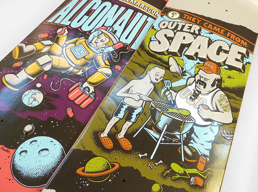
I’m usually most stoked of the on the graphic I’m currently working on, but there are some series that I think turned out exceptionally well. Like the Space series for Sweet and the Unmatched series for Flip. I really like some of the stuff I did for Bellows, Seven Inch, and Polygon. And the Stockholm tribute deck I did for WeSC, that was truly a labor of love. And last but not least, the upcoming series I’ve done for Flip called Iconoclastics, that’s probably my best series yet.
I could talk for days about favorite graphics from other artists. There are so many amazing graphics and graphic artists from all the different eras of skateboard design. So I’ll just give you one from the top of my head that I really like: Schmitt Stix Joe Lopez BBQ by Neil Blender. It’s simple but not sloppy, it’s limited to two colors on a stained wood background. And the motif is just so far from all the other graphics I liked at the time I saw it, so I just stuck in my head.
What’s next for Mander? Future projects and collaborations?
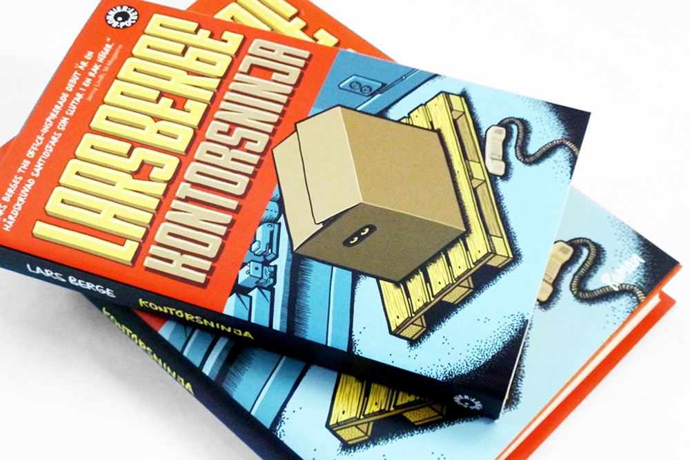
I just sent a new series for Flip to print and am working on the next one. I just did a T-shirt graphic for Cheapo, I’ve got book covers, album covers, and some B2B corporate jobs on the drawing table right now. And hopefully, I will start working on a sequel to Slajs this summer. Slajs is a rap-along childrens’ book I did with my friend Kristoffer Malmsten last year. And I will paint a big mural with my man News at the Spring Remake Graffiiti Festival in Rågsved in Stockholm April 18th.
::
Visit Mander’s website at www.mander.nu and follow him on Instagram @manderoid.

