Here at The Hundreds, we live for a good story. That’s why there’s a meaning, purpose, and greater narrative behind every piece of clothing we design to every essay we publish—from co-founder Bobby Hundreds’ brand motifs to the meaning behind our new Wildfire logo. As Bobby wrote: “The Hundreds isn’t merely a clothing brand or a media network; it’s a storytelling company. And in most all we create, there is a reason.”
We usually like to let our audience find the references and easter eggs yourselves, but today we’re gonna explain a few inspirations behind our Spring 2017 graphics. And if you missed it, check out the story behind our “Monkey Business” shirt (the Gary Hart affair and political scandal that changed journalism forever).
The “Flying High” T-shirt
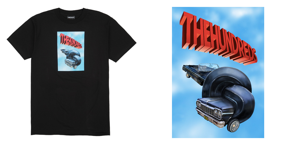
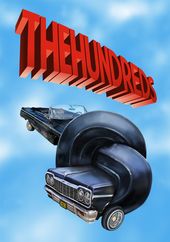
This one is based off a movie poster for 1980’s game-changing comedy film Airplane!, which continuously lands itself on best of all time lists year after year. It’s one of our favorite movies of all time—a first of its kind at the time—and it’s no coincidence for us that it was released in the same year of The Hundreds’ inception, 1980 (the year Bobby and Ben Hundreds were born). Here’s the original poster below.

And here’s our version below, replacing the plane with a classic in our culture, the constantly name-dropped ’64 Chevy Impala—West Coast legend Eazy E’s ride of choice (“Cruisin’ down the street in my 6-4“):
The “Connected” T-shirt

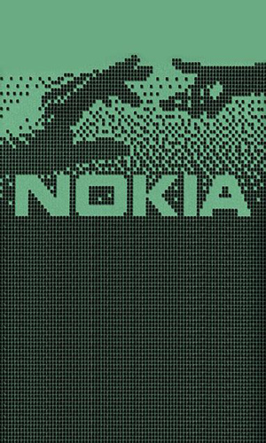
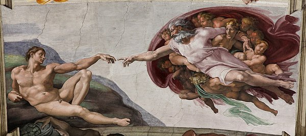
This one’s all nostalgia for us. Back in simpler times, pre-smart phone, when we thought our Nokia plastic brick was the shit, this was the iconic start up screen. It’s based on Michelangelo’s Sistine Chapel fresco, “The Creation of Adam.” From a design standpoint, we appreciate that the artwork was created under pixellated restrictions—oftentimes, the most inspired work is made that way. The Nokia 3310 was originally released in 2000, and was just re-released in February with some updates.
Michelangelo’s original:
And a detail of the hands:

The “Book It” T-shirt
If you grew up in the ’90s, you remember that annoyingly catchy Skip-It commercial:
Back in the day, everyone on the schoolyard wanted one. Our parents personally refused to buy them for us for fear of us cracking our heads open on the blacktop.

Photo: buzzfeed.com
The Skip-It was originally released in the ’80s, but the re-release in the ’90s was what doubled sales, with the addition of a counter that let the wearer know how many freakin’ skips they were doing. Our “Book It” graphic takes that original Skip-It logo above and flips it, adding a ball and chain instead:
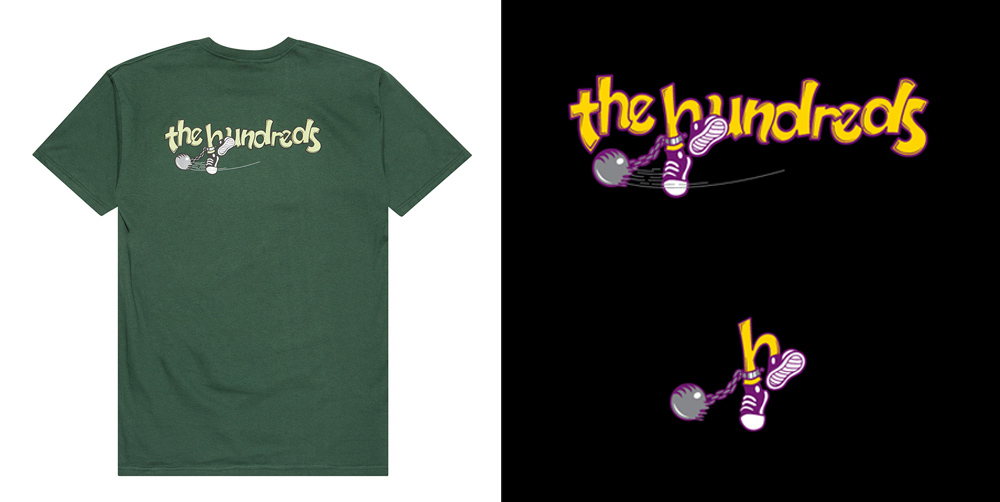
Fun fact: the bruise-worthy kid’s toy was co-invented by Avi Arad, the later chairman, CEO, and chairman of Marvel Studios. He recently produced the Ghost in the Shell remake. Wtf.
The “Charlotte” T-shirt
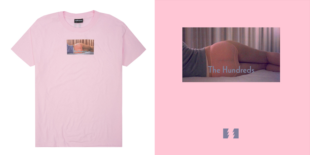
We made this shirt in homage to one of cinema’s best standalone opening shots. Lost in Translation is one of Bobby and The Hundreds staff’s favorite films for its understated meditation on loneliness in the modern world.
That feeling of alienation amid all the noise. It’s only natural that the film begins quietly with that static shot of Scarlett Johansson’s backside with its soft blues and pinks, crescendoing into a hazy shoegaze soundtrack. In the next scene, Bill Murray’s character stares out of a car at crowds of people and neon lights, looking like a fish in a bowl gazing through the glass.
Bobby’s a huge fan of the film’s director Sofia Coppola (tracing way back to her X-Girl connections to Sonic Youth’s Kim Gordon, Spike Jonze, etc.) and this isn’t the first time we’ve done a shirt that references the 2003 movie. The first was our “Inside Out” shirt, which we spent a lot of time making the perfect video spoof for HERE.
The “Charlotte” T-shirt is a nod to that first shot. Fun fact: For those who have seen Lost in Translation, did you ever notice that in this opening sequence, Bill Murray’s character looks up at his own advertisement? Meaning, the car ride actually takes place after everything that happens in the rest of the movie.
The “Ugly” T-shirt
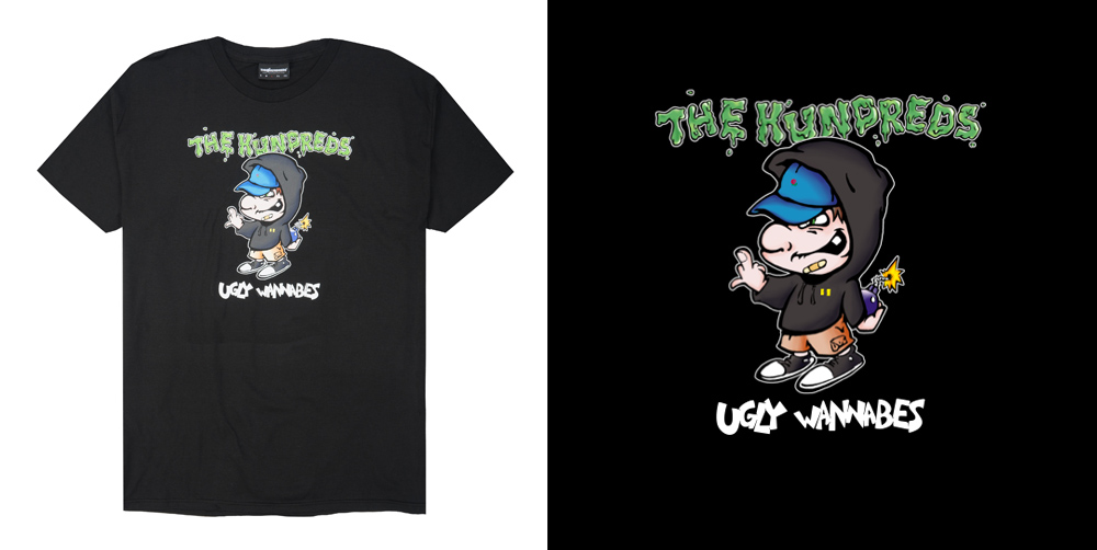
Early ’90s band Ugly Kid Joe represents a few things we love. The Isla Vista, California-based group’s lyrics and attitude were often strewn with humor and sarcasm (their name was a spoof of Hollywood ’80s glam metal band Pretty Boy Floyd). Ugly Kid Joe’s 1991 release As Ugly As We Wanna Be was the first EP ever to be certified multi-platinum.
We flipped the unforgettable cover of their first EP…

And created a Streetwear version. We even did a play on words, replacing the original title with “UGLY WANNABES.”
***

