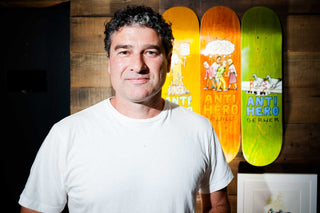
Having recently completed a touring exhibition titled “Worst of the Worst” sponsored by Vans and featuring 50 original works, Todd Francis has shown that contribution to skateboarding is greater than logos, graphics, or any illustration. Francis’s work is a voice vital to skateboarding’s history. In some ways, his output—specifically two decades worth with Antihero—casts him as a visual historian of one of skating’s most influential, eclectic, and imposing characters.
Since 1995, Antihero has been a symbol of skateboarding’s scabby and sometimes absurd reality. The mix of always on and slightly off has created a powerful brand and visual aesthetic, powered by personalities. Along with Julien Stranger, John Cardiel, and Chris Johannson, artist Todd Francis’s contributions to Antihero have helped the brand maintain its relevancy and message, without relying on reissues or nostalgia. “Julian has a really strong aversion to reissues because it’s lazy,” he explains. “I think in his words, and I’m going to paraphrase them, but nothing pulls the curtain back further on someone’s lack of creativity than just taking something they did that people remember them for and doing it again and again and again.”
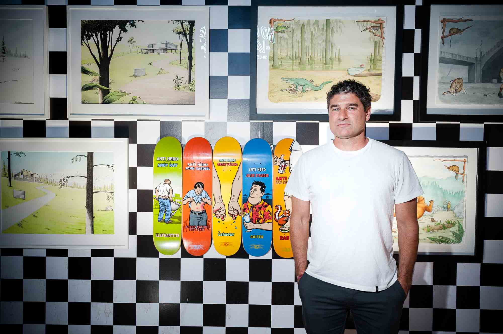
Whether it’s Cardiel still pushing himself to grind post-accident or looking back at his milestone drop-in at Burnside, there’s a vitality to Antihero that feels driven by desire and necessity, not sales goals and KPIs. In 1995, skating was on the precipice of an unlikely boom partly due to the attention of the X Games that ultimately led to a lot of stale skate graphics.
“We really cared and really wanted to say something at a time when no one was.”
We can argue or reframe the motivations, but it’s suspect that almost every brand started to steer their art direction into logo-based product or characters aimed at a younger demographic out of “coincidence,” and not to tap a new market. Conversely, brands such as Santa Cruz and Powell Peralta, who can be considered “heritage,” had lost direction and market shares, while a former giant, Vision Skateboards, barely existed. Since no one would realize what the X Games or the 900 would do for skating, in 1995, was starting a brand with graphics that could be considered “depressing” a risk?
“Not a lot of people cared so there wasn’t as much at stake,” Francis says about Antihero’s formation. “We really cared and really wanted to say something at a time when no one was saying anywhere near the type of stuff we were interested in—being political and being cruel and funny at the same time.”
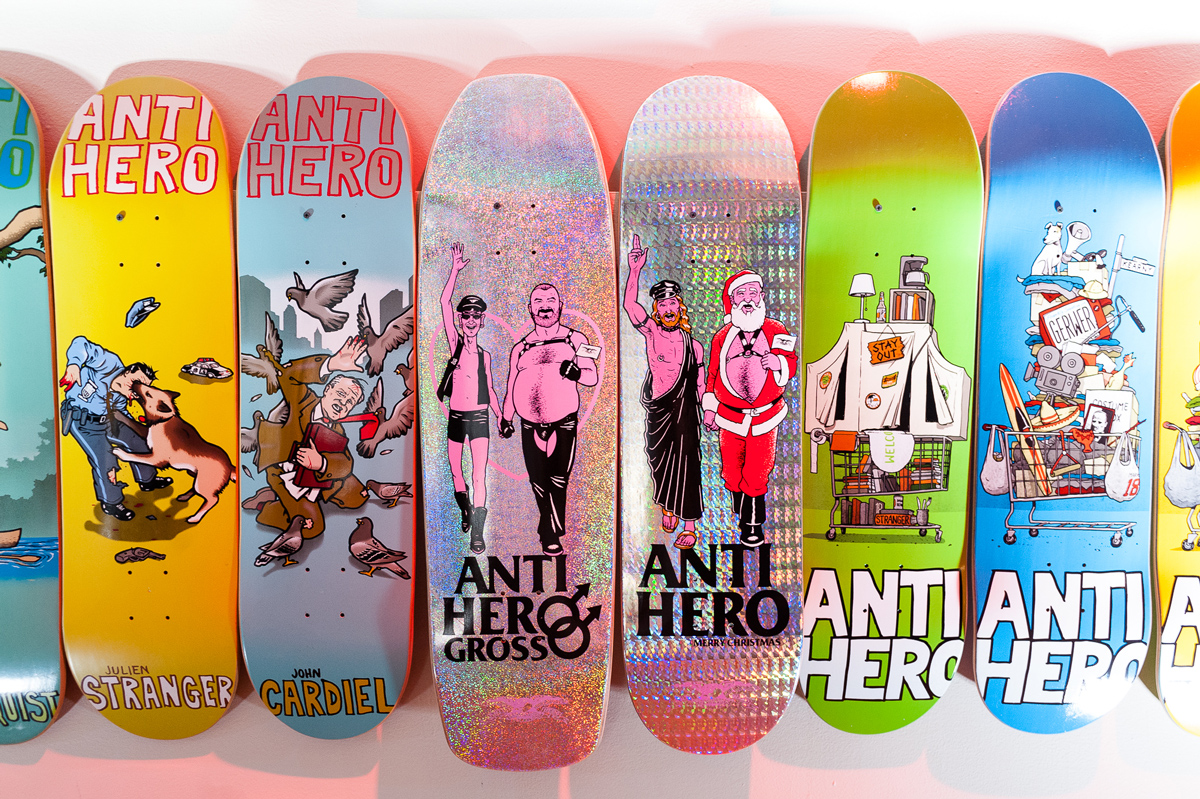
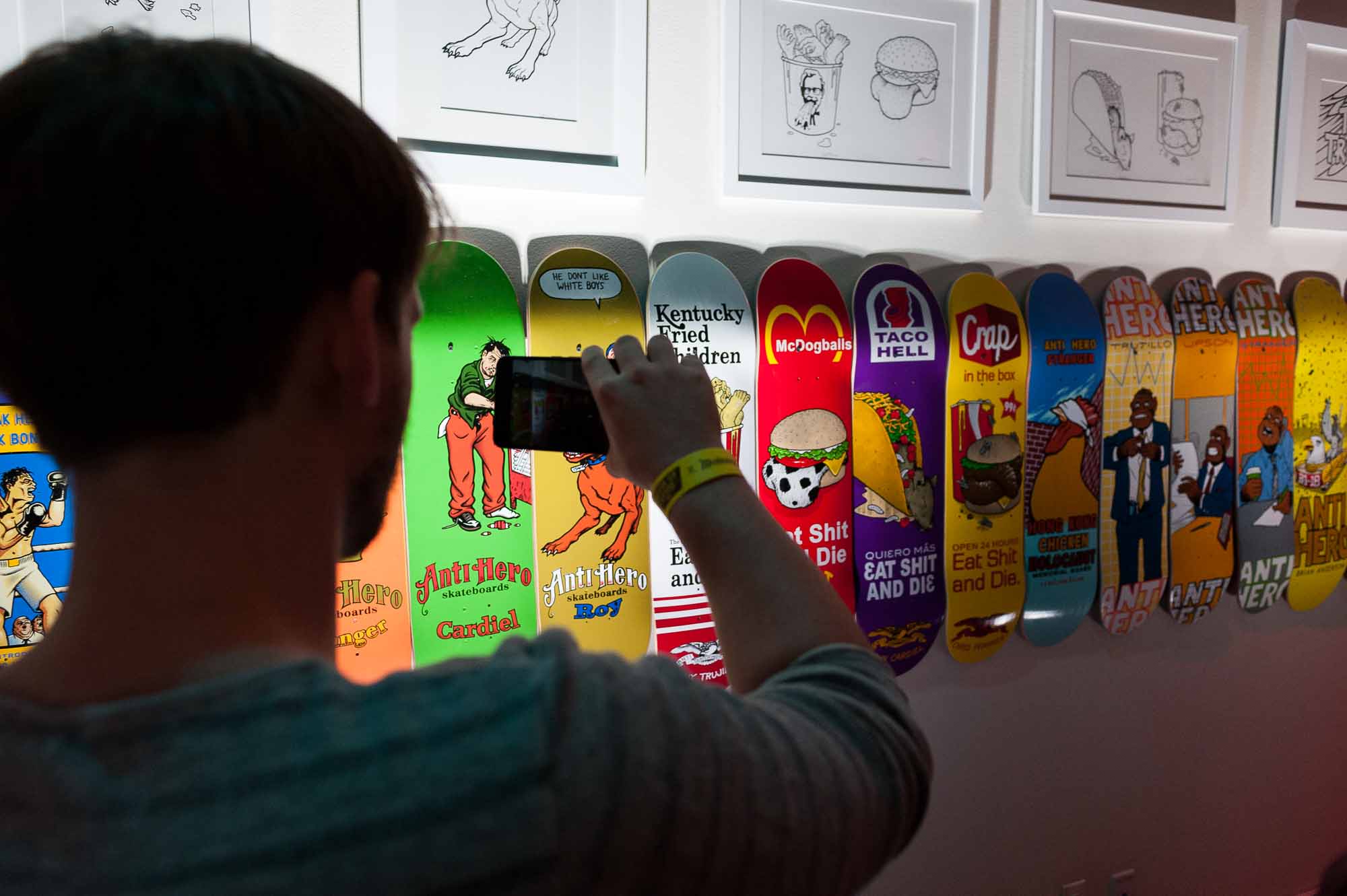
Working with Spitfire, Real, Stereo, Element, Stance, HUF, and Oakley, as well as illustrating for ESPN, Penthouse, and a bevy of other publications, Francis’s sardonic take on politics, culture, and everyday life casts him as one of the greatest visual instigators of our generation. As the creator of Antihero’s original “Eagle” graphic, as well as the city-centric “Pigeon” character, he’s a part of their DNA and evolving story, whether or not he’s drawing graphics for them. His darkly comedic take completely aligned with Stranger’s vision, channeling a city that in many ways no longer exists, yet, despite the tech industry makeover, still has its warts and pockmarks.
“Antihero is based in the city, and that winds up being the source for all this inspiration,” he says. “A lot of it starts in San Francisco, with the guys that live right in the Tenderloin, right in the heart of things who spend a lot of time there. You’re witness to a lot of visual brutality, even in a time like this where money has swept in and totally changed the landscape.”
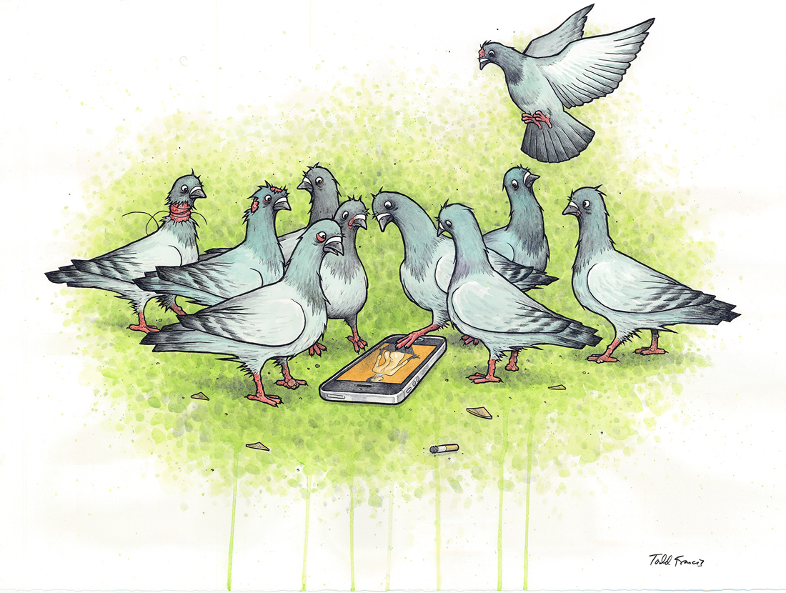
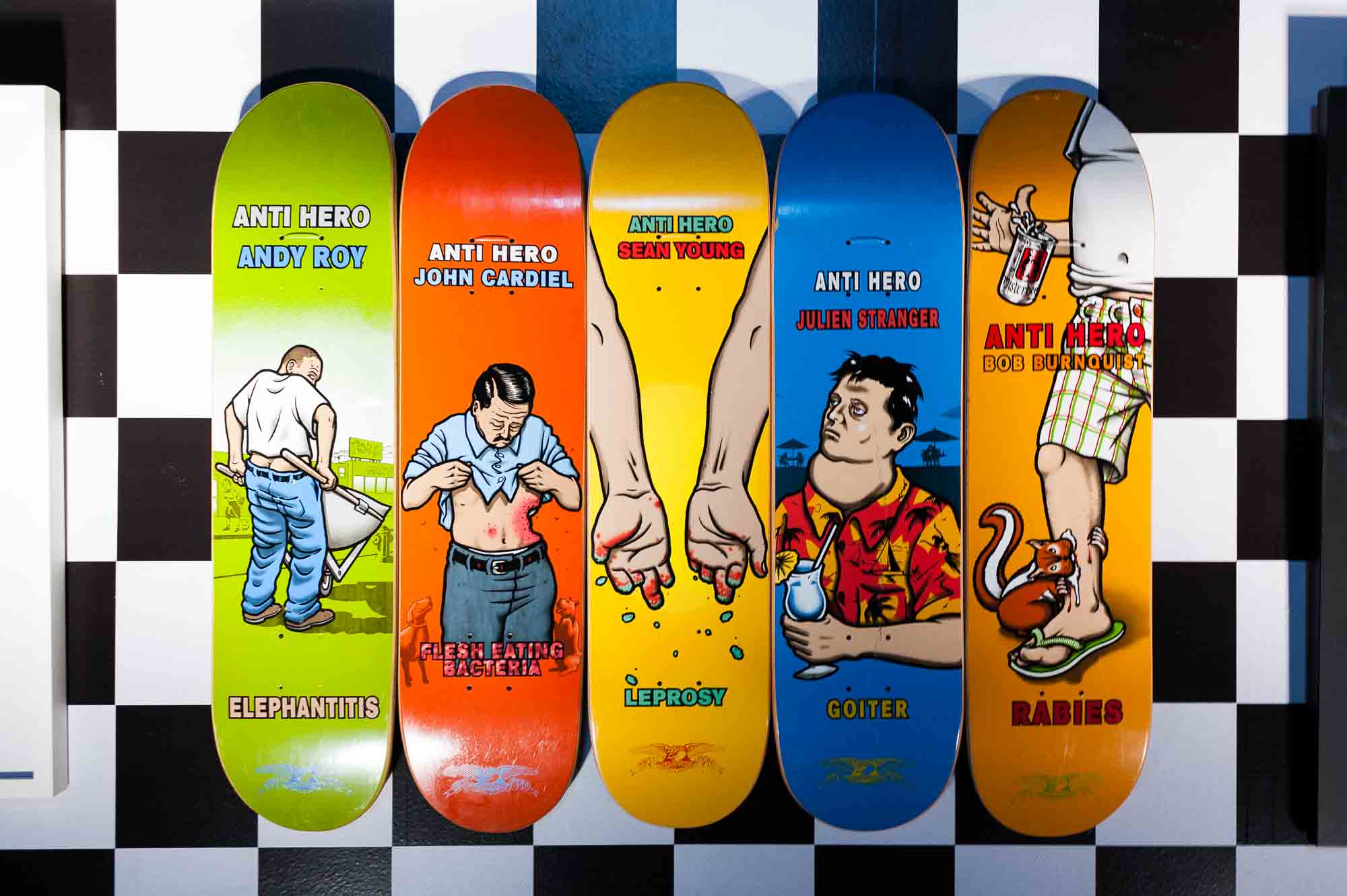
Francis captures that reality with a specific comedic edge that’s both playful and poignant. Characters stricken with deformities, violent animal attacks, some aloof city bird, or fast food workers all drill into this inane commonality of American culture, that needs levity more than ever. Part of what’s made Francis’s work so communicative, is that he eschews pretension and simply puts forth ideas that entertain him or push buttons. A lot of that provocative nature can be peeled back to growing up in Southern California as the American hardcore punk scene was burgeoning. In fact, in many ways you can see a connection between his style and evolution and that of Raymond Pettibon, both coming from CA and using as much comedy, tragedy, and wit in their work. During the ‘80s in Southern California, it was also impossible to not feel the band’s visual presence, with their anti-cop, anti-anything and everything, flyers plastered everywhere, as well as the “bars,” scrawled and spray painted by fans who identified with their ethos.
“[Pettibon’s art for Black Flag] was a constant inspiration, and just the crude anger of it in the best ones—the strongest ones,” he explains. “Those have always been inspirational. For me, also getting his work now, the stuff he does with waves and that sort of stuff speaks to me almost as much, because it shows there’s a thoughtfulness to it and a different type of inspiration. More sort of a slow burn instead of an explosion, you know.”
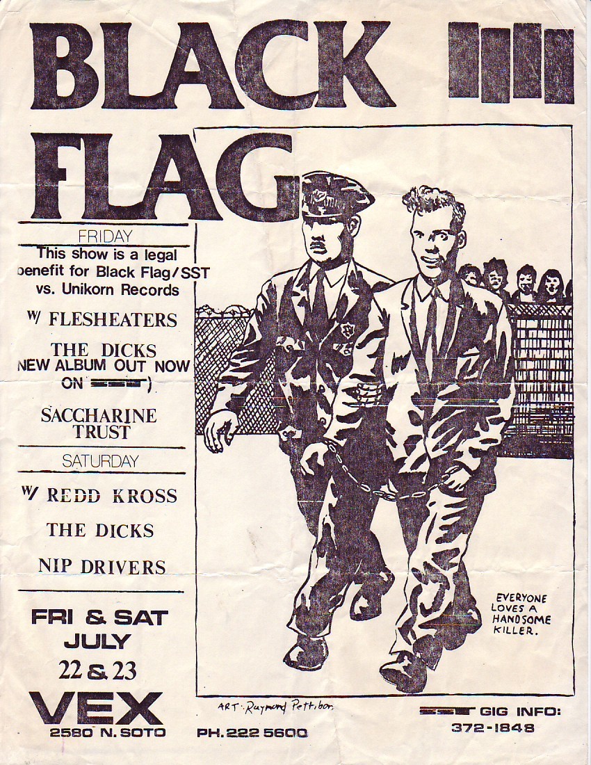
Raymond Pettibon flyer art for Black Flag circa 1980s.
It’s no secret that Donald J. Trump becoming the 45th President of the United States has provided unlimited material to both detractors and supporters, but behind satire is something much more than just drawing The Donald’s hands much smaller or throwing his face on a stick of soft butter. Like Pettibon, who has lampooned Trump in several recent exhibitions and zines, Francis hasn’t shied from taking on Trump, realizing it’s divisive, especially when creating things that are ultimately products.
“I get a lot of shit for the stuff anti-Trump stuff that I do,” he says. “I catch a lot of hell for that, but that’s what I want. I don’t care. When you’ve been doing it this long, you’re always afraid you’re going to run out of ideas, or maybe not ruffle feathers or affect people the way that you hope to. You get those responses, it feels really good, I’m not going to lie.”

