2016 was a lot of things. Sure, plenty of those things were not-so-great, but luckily for our sanity, it wasn’t all bad. In fact, the bright minds who work within the world of graphic design brought us a number of trends that made the clothes we buy and the websites we visit look just a little bit nicer. Here is a look back at the brighter side of creativity and design this year.
T-Shirt Graphics Got Simpler—and Much Cooler
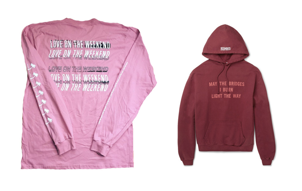
L to R: Official John Mayer T-Shirt via @ThunderYells, Vetements Oversized Jersey Hoodie via MrPorter
We’ve seen a number of trends when it comes to graphic T-shirts and sweatshirts over the years: big and bold multi-colored prints of the early 2000s, the post-2010 “logo printed everywhere” look (think Hood By Air) and, presently, the minimal trend that is sweeping our collective closet. Simplistic typography, creative restraint and negative space have all reigned supreme this year. The “less is more” approach seemed to spread like wildfire as designers for streetwear brands, high-fashion labels and music merchandise companies alike all seemed to jump on the trend.
While it’s true understated T-shirt designs have always had their place in the apparel world, the sheer volume of brands who tapped into the style this past year is hard to deny. No complaints though, because the more subdued your T-shirt is, the easier it is to find an outfit to match it.
The Death of the Parallax Scroll
Screenshot via The Matrix / Warner Bros.
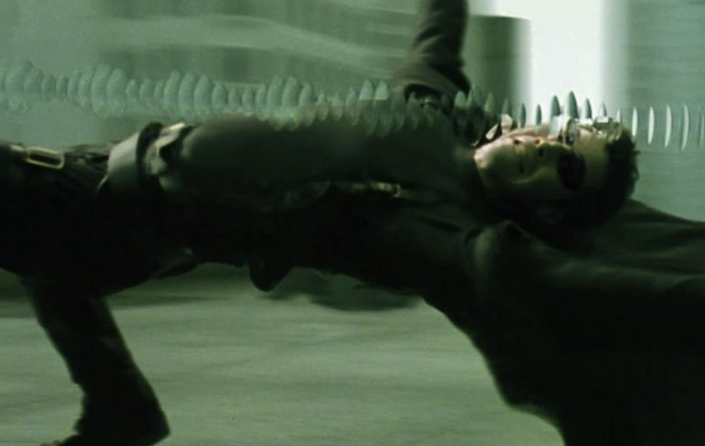
Have you ever been scrolling through a website only to suddenly feel like you’re flying through space and time as huge headlines and images float by at different speeds? That’s parallax scrolling and it was seemingly used on every website over the past two years. The effect started as a nice way to elevate a user’s browsing experience but it quickly morphed into an overused trick beloved by art directors everywhere.
Even though the science behind it is quite cool—multiple backgrounds and design elements are calculated to move at different speeds to create a sensation of depth—it quickly can become a headache when not executed properly. The parallax scroll essentially became the Barbara Kruger tribute of web design: slightly interesting at first but quickly loses its charm when you see everyone else doing it too. Luckily, the trend reached a saturation point late last year and there has been a shift to move away from the parallax. Long live the lazy-load, though.
Less Instagram Filter, More Film-ish
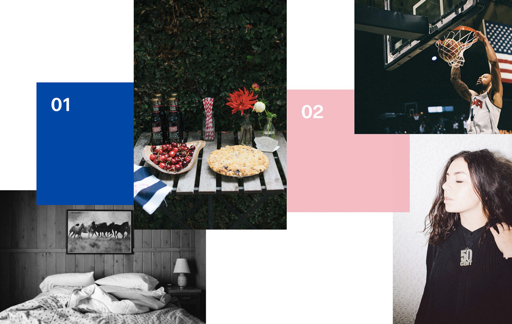
Image via VSCO
Instagram, six years in, has proven to be a great vehicle for sharing photos amongst friends and an essential tool in helping photographers gain exposure and build loyal followings. That said, its image filters have always sucked—the faux polaroid edges, fake lens flares and clumsy color hues have never been a good look. What’s worse is the platform’s popularity had a big (and unfortunate) influence on photography as a new generation of photographers began to experiment with this filtered effect. Luckily, we’ve seen a rise in other options when it comes to adding some character to your digital photos.
VSCO, the company behind VSCO Cam and a line of Adobe Lightroom plugins, is perhaps the frontrunner of these alternative options. The start-up-turned-global-app announced earlier this year they hit 30M active users, which means that more people than ever are posting better looking photos—which is a very good thing.
Web Design Became Weirder
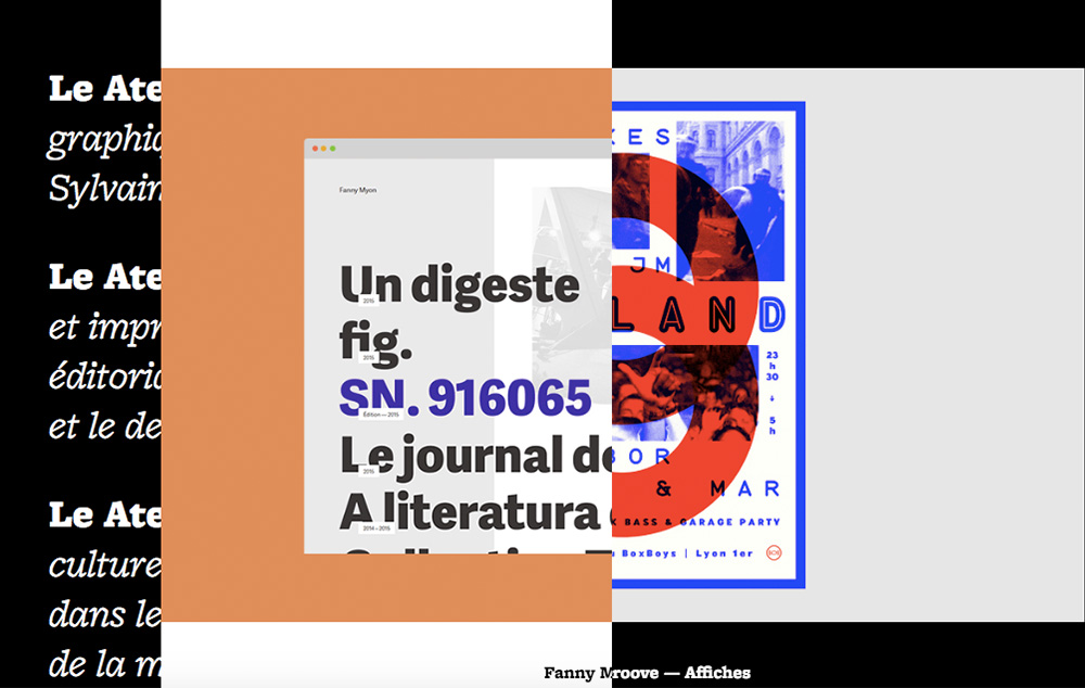
Screenshot via Le Atelier
Trends in web design tend to come and go faster than most other industries. Since there isn’t a physical deliverable, experimentation comes easier, and with less overhead. There is no need to worry about unused samples or expensive 3D printed prototypes, so designers and developers have the ability to try new styles and techniques as they please. We saw a variety of micr0-trends that came to life this year—flat design, brighter colors, whimsical animations, irregular grids—but the overarching theme was easy to spots: web design got way weird.
It’s difficult to pinpoint the specifics but 2016 saw digital creatives really looking to push the envelope. Websites have become more playful, less pixel-perfect and much more interesting to look at. Rules were broken and old notions of best practices have been thrown out the window and the result has been fun for everyone.
Fashion and Pop Culture Went Heavy Metal
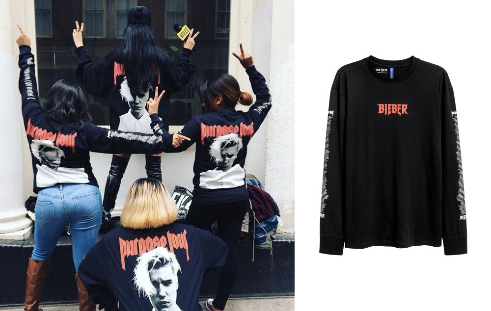
Image via @vfiles
The influence of metal on fashion and pop culture this year was inescapable. The entire pop music industry seemed to adopt the menacing logos and dark imagery of heavy metal when it came to their own merchandise collections. Everyone from Justin Bieber to Kyle Jenner to former One-Directioner Zayn Malik got in on the action—even heavyweights Kanye West and Rihanna both used a gothic lettering style as a focal point of their tour merch. Buzzy French label Vetements practically cultivated their entire image from the subculture.
While a number of metalheads were understandably frustrated with pop megastars stealing styles from their scene, it slowly became more and more commonplace. It was edgy and exciting when Bieber unveiled his line of metal-themed merch (designed by Jerry Lorenzo of Fear of God with the help of the artist Mark Riddick), but quickly became tiresome when we saw the same schtick from the likes of Malik and Jenner. Either way, the style is a much better look than the boy band merch of yesteryear, so fans should be grateful they can profess their love for sugar-coated music while still looking stylish.
Simple Doodles Are Back in Business
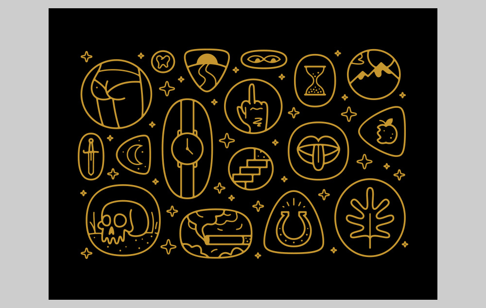
Image via Justin Pervorse / Dribbble
The use of clever illustrations in graphic design has never gone out of style but it’s a really good time to be someone who spent their childhood doodling on the back of binders. We’re currently in the midst of resurgence in simplistic line drawings (aka doodles) and it’s resulted in some amazing work. There will always be a time and place for detailed character design but the infectious charm of rudimentary sketches is finally getting its time to shine.
Over the years, big companies and corporations have relied on clever cartoons to make boring remedial tasks such as signing up for car insurance more fun and feel less sterile. The tactic has taken off this year and big brands from all types of industries are looking to talented in-house artists and freelancers to add layers of whimsy and charisma to their digital properties.
***

