
Born in Louisiana, Chris Wilson’s fascination with visual narrative was born out of curiosity. The worlds of illustration and paintings he was exposed to on Southern metal compact discs, comic books—and later the sleeves and handbills of New York City hardcore—inform as much as they are cosmically built into his artwork.
The art of ‘80s NYHC particularly represented an intersection of urban culture, mashing punk against hip-hop, with satire, power, and an unspoken sketchiness that drove his curiosity. Along with his quest to consume every flyer, album sleeve, sketch, and artifact of New York Hardcore, he’s immersed in anything from Pen & Pixel hip-hop CD design to Robert Crumb, somehow all tying back into his desire to tell a unique story.
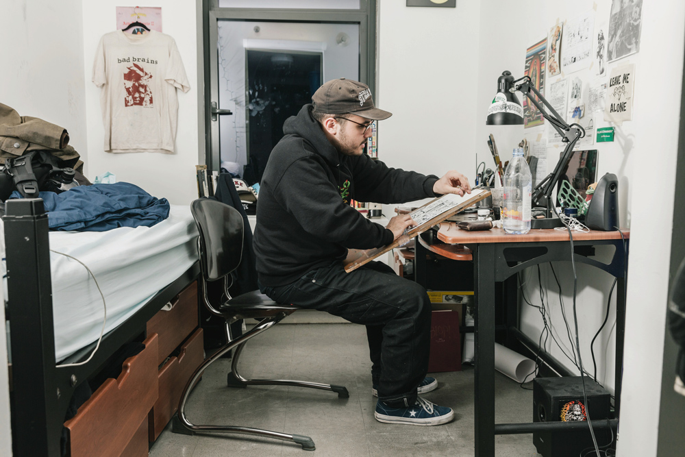
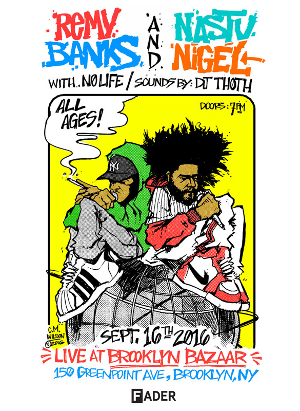
After attending high school in Colorado, he immediately headed to New York City’s School of Visual Arts to tighten up his skills and explore all the hallowed locations of the city, though most have gone through the facelift of gentrification and urban development. Still, he’s amassed an impressive body of work in both hip-hop and hardcore, that’s expanding into comics, apparel, and beyond (he currently plays guitar in New York hardcore outfit Liberty).
We met in Tompkins Square park to discuss our shared love of hardcore minutia, Southern rap, and telling New York City’s story in our respective mediums.
ANTHONY PAPPALARDO: You’ve worked for so many different types of bands and artists. How are they finding you and what do you think attracts people to your work?
CHRIS WILSON: People reach out to me—starting with hardcore bands. At this at this point, I’ve done so much that people know what my aesthetic is, and also, they recognize it from what they see online. When it comes to rappers who reach out to me, they don’t realize the visual aspect of the hardcore art, so they just want that “big boot, skinhead vibe.” It’s something that hardcore people are accustomed to, by seeing [Sean] Taggart or someone. They’ll ask me for something like that.
That’s interesting, because visually, hardcore’s aesthetic—specifically in New York or LA—was linked to gang culture, not necessarily punk rock. It was graffiti-inspired, not necessarily looking like the Circle Jerks mascot (Shawn Kerri). Do you think that link attracts rappers who might be more familiar with that look though?
I think it’s the entire aesthetic and that it’s back in fashion.
Right, just look at how big bomber jackets are with everyone.
I notice now, because I do hang around with a lot of people in rap culture and I do study their aesthetics and interests—they do like certain things that I like. They want graffiti characters. It resonates with them too. Rap is in hardcore—it’s just as much a product of rap as it is punk. Look at the Beastie Boys.
Sure, the narrative that they are like separate things is just selective storytelling. When I talk to a lot of older dudes, meaning people my age, they don’t understand that an 18 or 21-year-old person’s entryway to subculture and music is so much broader now. They’re getting into Infest and Wiki, all coming in at once.
It’s interconnected now. When I look at Antwon, for example, he’s coming from both hardcore and rap, and he knows both like the back of his hand—he’s cultured in both. I was talking to Travis Miller (Lil Ugly Mane); he came up asked if I liked the new Ice demo. I love that. They’re looking at what hardcore kids are doing, they’re looking at what Lil Ugly Mane is doing, and they’re wondering what it is and where it’s coming from—it’s another outlet to absorb. Then when they come to a show and see the moshing, the T-shirt graphics, it’s even more to be influenced by.
I’d like to see the influence swing the other way too, in the way that you hear really early Triple Six Mafia demos and DJ recordings, and they have that same primitive sketchiness that the Negative Approach 7” has. I’m not saying I wanna hear more raps over hardcore beats, but more about the production and what you can do with sound—layered and a little off.
Sure, a new aspect culturally and musically and like, you know. I love like when rappers come to me with mocks—their demos and sketches for what the album is they want me to illustrate. And I’d always think, “That is perfect.” They’re rapping really hard, it’s unmixed. That resonates with people. Those imperfections are what people like.
Going back, what was your entry point into hardcore?
Probably be watching my dad play in bands in Louisiana. There was one specific place everybody came to jam. Going to that jam room, my dad would play with certain people that I would look up to. These guys were wearing Down shirts—very Southern metal stuff. My dad would draw like girls on the wall and stuff during the jams. That was cool. Four walls closed in, looking at music and stuff. That really stuck with me. Then later, watching him play live in bands and him listening to Korn and Limp Bizkit in his truck. Eventually, that led to me being obsessed with the album artwork.
In middle school, I was bored with the music I was listening to, which was more “internet metal,” but then from that, I heard Terror and Gorilla Biscuits—that was my entry level. I totally related to what they were saying in their aesthetic. I never heard people talk about zines in a song, but these were things I was making on my own already. I didn’t know what they were yet. Looking at the booklets and album art—that whole vibe [is] one thing that appealed to me. It made me want to be involved with it. My dad didn’t know what hardcore was. Being from the South, I loved what my dad was into—Crowbar, for example. I found hardcore elements in that and started putting it together. It resonated with me and made me appreciate it more.
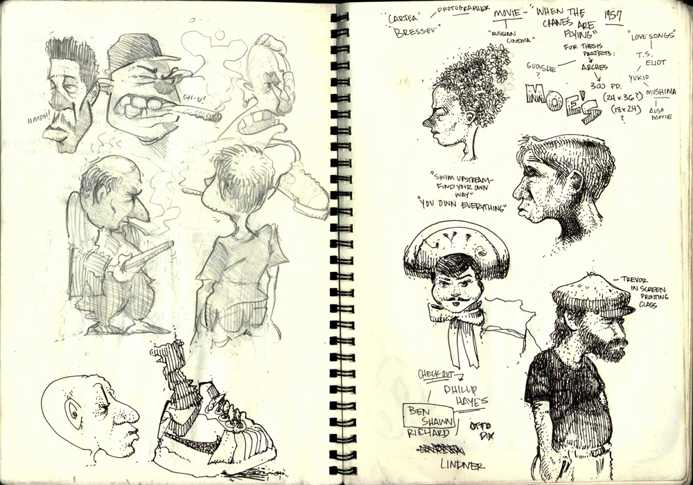
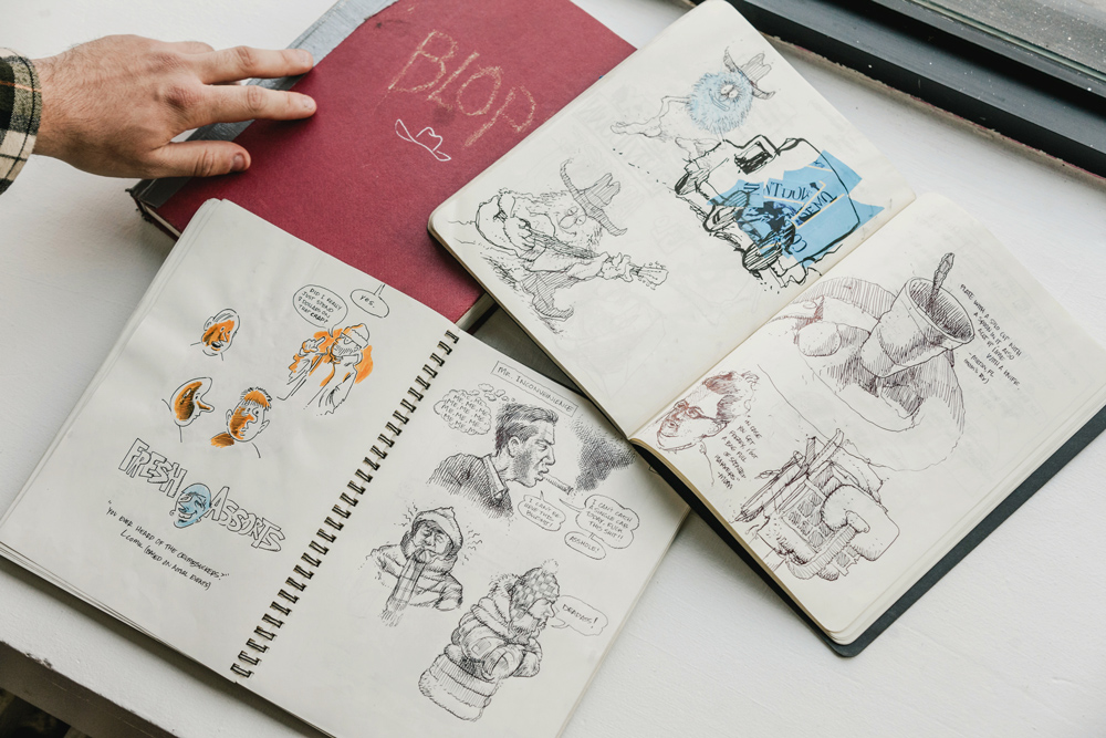
There weren’t any local shows in Louisiana at the time, but I’d find live shows on the internet and see them happening at the same time. I remember just emailing bands, because I had so many sketch books. I didn’t know what I was drawing—it’s good to draw without thinking. I had this epiphany when I saw Sean Taggart’s art. I realized I could draw this wacky shit for bands!
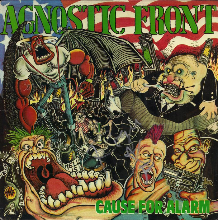
Sean Taggart’s cover art for Agnostic Front’s second full-length album Cause for Alarm.
Now that you’ve been in New York City for four years, how has actually being immersed here changed your work?
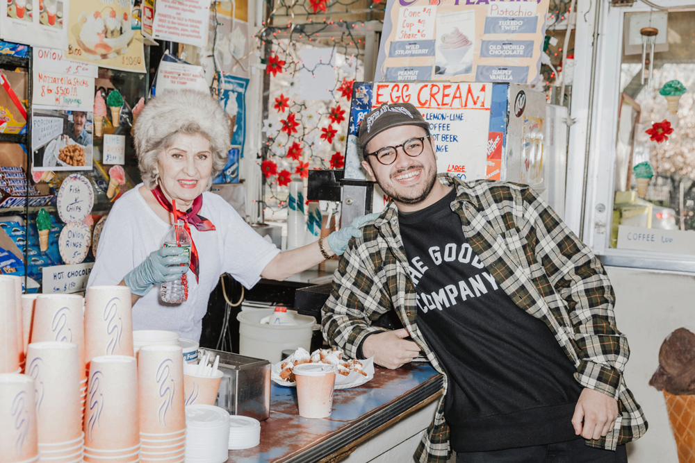
Before I got here, I was going to high school in Colorado—just being in high altitude all the time is a change. Coming from there and being dropped off in New York City, with no parents around or anything, I just thought, “Where am I?” As soon as you land here, there’s stress. You start thinking and it’s a bunch of noise. I moved to a dorm on 23rd street in Gramercy—it’s not the Lower East Side and there wasn’t anything going on, so I gravitated to the LES. Even after school. I’d go to different places, like The Good Company that I thought were culturally interesting and show people my sketch books. I’d come to the Tompkins Square Park TF and see William Strobeck just chilling. Those were things I’d see in Colorado, and now I’m here, walking on the same soil. Going to SVA (School of Visual Arts) where Harvey Kurtzman was a professor (Mad Magazine) or Brian Donnelly (Kaws) went, it was important for me to go there and come here, to carry on that tradition in my own way.
“In a way, hardcore is like an underground comic.”
How have comic books influenced your style and process?
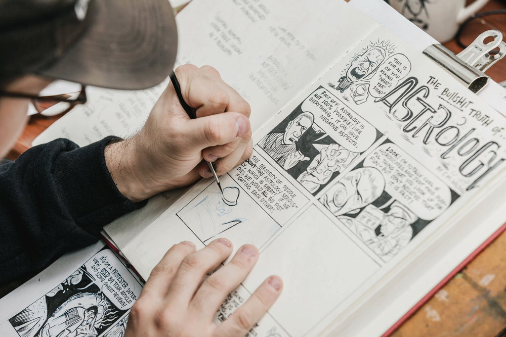
Along with being so intrigued by the hardcore art, I found guys like Robert Crumb and Gilbert Shelton in high school. I was blown away by the amount of time and effort [put] into that work. That made me realize that you need to be able to draw and really tell a story—you need a punchline. It made me want to turn it inside out and figure out how to structure a comic. I’ve been taking short story comic classes with Thomas Motley. In a way, hardcore is like an underground comic. You look at a Zap comic, you see the same characters that you’ll find on a hardcore album cover. For a while, I felt like I wasn’t telling a good story in my work, especially because I’m known for doing commissions. Comics have been my own way to have full control over the story and characters. They come from my friends or interactions on the subway. Comics are the perfect way to document those moments.
What you are carrying on is an actual lineage of hardcore illustration, but it’s very specific to the genre. It’s its own thing that illustrates what’s going on with the music. What did you like about [Sean] Taggart’s style?
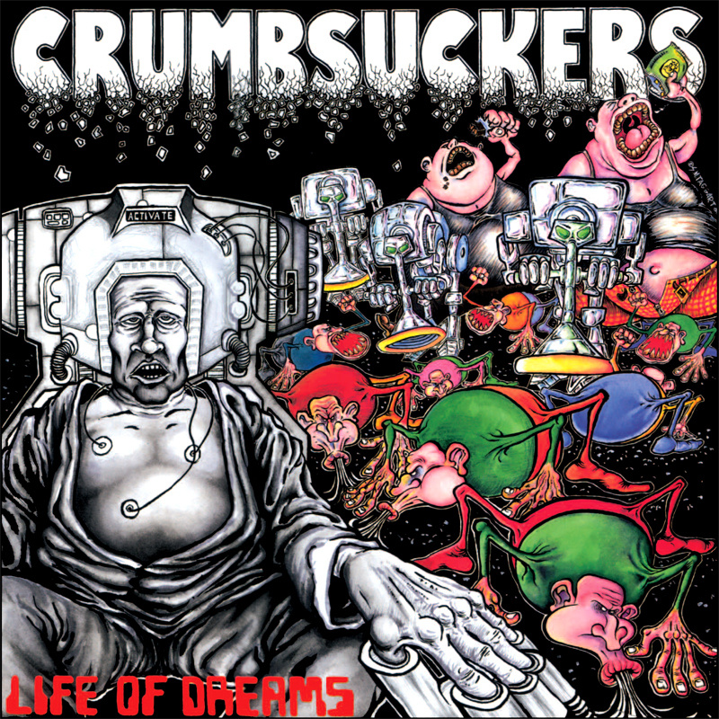
I like that I didn’t understand the elements of New York Hardcore, but looking at those drawings, I could understand the types of characters [he was drawing] in the actual scene. Looking at the Crumbsuckers’ first album... those guys with the big mouths and cheeks—the weird bony arthritis hands. I thought it was insane. He spent so much time drawing that stuff for the band. It goes back to my dad’s CD collection, I’d look at The End Complete by Obituary and it would resonate with the music. And his flyers too. There’s an iconic Carnivore flyer—a five panel illustration of a guy falling into a demon’s mouth... and the way he would write. That unique handwritten lettering is something I tried to replicate.
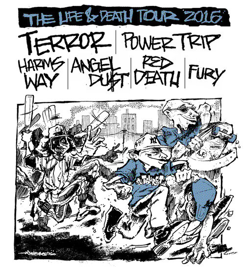
The album and flyer art builds an actual curiosity that makes you want to go to the show or hear the band and, even though I was familiar with them prior, that’s the feeling I got from the Fury illustration you did for their LP. How did that come together?
At the time when I drew that, I was in the Louisiana—I wasn’t in my studio and had no supplies. Jeremy Stith [their singer] reached out to me and said he wanted something fresh and new and that he wanted me to challenge myself. He sent me little doodles of two faces combined. From that point, I was digging up things from a lot of ‘90s hardcore bands, like End To End. I wanted that same vibe, because the music is just as powerful. It was a ‘90s period where bands were using stretched out text, their clothes were baggy...
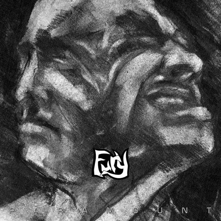
Chris Wilson’s album art for Fury. Chris Wilson’s album art for Fury.
It was almost a visually classical period in hardcore (the early-‘90s). Bands were using drawings of statues or whatever. It didn’t look of the time at all.
Everything was more renaissance. That’s a pun, because hardcore was in an actual renaissance at the time too, overall. But back to the cover, I was at my grandmother’s log cabin in Louisiana and I didn’t have any paper or supplies and was debating doing it when I got back to New York, but I asked my grandma if she had anything. She had some charcoal and office paper, so I sat down in this crazy room, surrounded by all these old paintings—there was a total vibe in that room—listening to [Fury’s] Paramount rough demos without vocals. I was trying to get a vibe of what I wanted the cover to truly be. I drew the cover by looking at my face for the left side, trying to nail it. That’s one thing that I’ve never done, is a charcoal figure study. I never thought it would amount to anything, because no one likes charcoal—it’s dirty. I finished the cover on 8.5 x 11” office paper, sent him a picture and he loved it, but I didn’t at first. It wasn’t until later when it had the type laid over it and the logo—it made it that much better. It didn’t look like a hardcore record.
That’s why you want to listen to it. Hardcore’s funny, because when you get into it, you want everything about it to be a certain way. Then when you are accustomed to it, there’s more power in being surprised.
Fury has a history of being different with their aesthetic. I knew that the silhouette of the face and the figure, it had that renaissance vibe. I like to have fun with it. It’s the same feeling I get when a rapper asks me to make a mixtape cover. Now I get to dive into the music and put my hands all over it.
Do you try to drill into who they are and what they’re about before you start drawing?
I like to build references that they can look over. There’s a bunch of blogs that post old Pen & Pixel covers and I love the things that look really cheap and stretched out [in Photoshop], not really shaped right—the imperfections. If someone wants that style, I’ll put my twist on it. If they want something hand drawn, I’ll try to put their personality into it. For example, if they want a guy smoking a blunt, kicking back, I want it to be that when you look at it, you know I did it and that it’s their music, just as much. You can’t draw a bunch of skinheads or straight edge guys on a rap cover—it just doesn’t look right. It makes me happy that rappers can reach out to me, even if we have different backgrounds, and they see something in my work that they want artistically. I think it’s important to be into everything and build references. I try not to turn down anything, because new is good. I just hate when someone comes to me, asking for a drawing of the grim reaper holding the world or something.
![]() Houston design firm Pen & PIxel’s album art for S.B. & Joey’s A Clear Dark Nite. Photo: Noisey
Houston design firm Pen & PIxel’s album art for S.B. & Joey’s A Clear Dark Nite. Photo: Noisey
I want to get into this specifically. If you do a metal cover and draw a bad demon, it makes the music sound shittier. Think of Fear No Evil by Grim Reaper; that’s the least determined and scary skeleton crashing through some stained glass, it’s comical. But in hardcore, sometimes really raw and borderline bad works. Like Pen & Pixel, it’s just so off that it’s cool. I see a lot of bands trying to do have a shitty drawings on purpose, but it doesn’t have any charm.
I think they’re looking at older illustrations, they’re looking at Breakdown or Absolution flyers, looking at it in a different perspective than I would. They want “shitty” drawings for their demo, because I think back then, that was the best they could actually do.
Sure, because it’s being done by an actual teenager in 1988 or whatever. Not a grown man in 2017.
It’s limiting your potential to do something cool. I love that you can do things like that in hardcore and you can get away with it, though. It doesn’t need to be the coolest demon or whatever, but if it did, it would be interesting and that’s fun to play with. When you stretch out a character or make a character with big hands or feet, it makes you interested. A lot of bands don’t have a character or symbol that represents their band. That’s missing and could be brought back.
Well, that segues perfectly right into my rapid fire questions, so let’s go, starting with best hardcore mascot?
Probably Token Entry’s “Jaybird” (Drawn by Ernie Parada). It’s a fucking bird!
Worst hardcore illustration?
It’s shitty but I love it, but the Blind Approach New Age cover. The guy is so cruddy, but it’s fucking cool. But it is shitty.
:format(jpeg):mode_rgb():quality(40)/discogs-images/R-1152590-1196376240.jpeg.jpg)
Best hardcore intro song?
Probably Big Contest.
Best unity song?
Probably the one with the piano.
Nah, shit, I meant a song about unity, not Unity the Pat Dubar band. I meant unity in concept.
“As One” by WarZone. That’s a good one.
Hardest mosh part by a California band—there’s not a lot to pick from, sorry.
Against the Wall has some parts, but I’m going to go with “Undertone,” by Inside Out.
Best band with the worst name?
Butthole Surfers.
Most you paid for a record and least you paid for a good record?
I paid $45 dollars for a copy of Warzone Open Your Eyes.
Damn, that could be both actually.
But best for cheap? I love the Shelter No Compromise 7”... I got it for two bucks.
Maximum number of bands that should play a show before it is considered a fest?
Five is good, if it’s more than that you can’t pay attention. I can’t stick around that long. And start at six or seven.
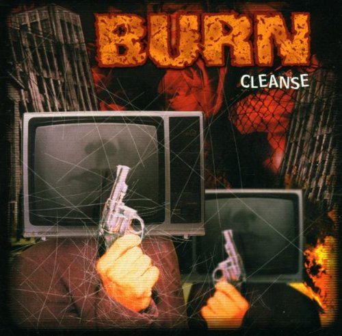
Album cover you wish you got to illustrate?
I’d love to do something for Burn. It would be sick to redo the cover for Cleanse. I love that record and would love to see what it would be like with a drawing or painting.
***
cmwcreations.com. Follow Chris on Instagram at @cmwcreations.
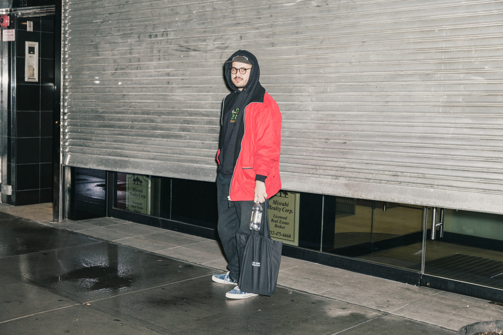
Photos by the talented Julian Berman.
For related reading, check out our interview with Lisa Czech, who makes punk, feminism, and anger-inspired comics and tour posters.