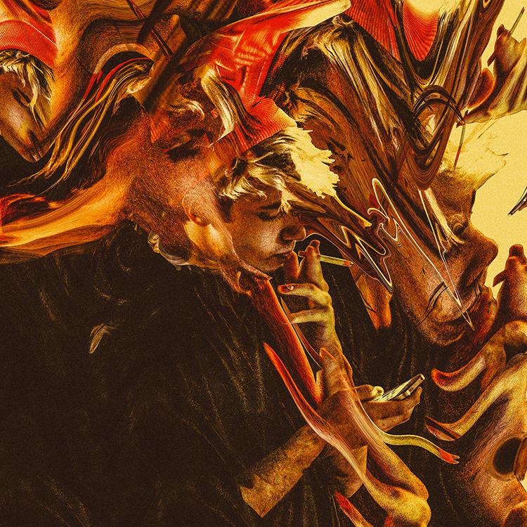
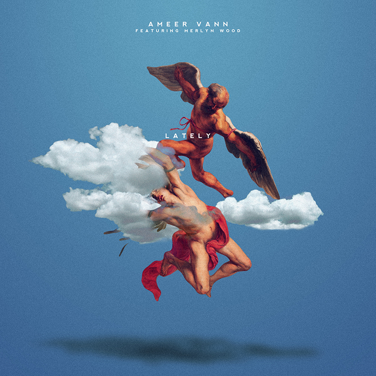
Recently, I stumbled across the website of a very young, mysterious graphic artist named HKCOVERS, at the suggestion of the The Hundreds’ graphic designer Julian, who’s a big fan. The Florida-based designer’s work includes warped, alternate iterations of well-known album covers, coupled with a sense of grit and longing that makes them particularly recognizable and unique. Some of his cover work is so clean that I initially thought a majority of them were official; myself ignorantly not knowing that creating alt-covers is a sort of new wave Tumblr/IG graphic design-obsessed hobby for – almost rebelliously – self-motivated designers like HK.
I reached out to him to talk a bit about his craft, curious to learn more about a young figure who seems to encapsulate the sentiments of a millennial ‘Net-grown design generation attempting to graduate from nostalgia. As HKCOVERS himself says, a generation that restlessly creates “purely off the spirit of having fun and for the sake of creating something out of nothing because we have that power.”
ALINA NGUYEN: In our digital age, more and more people are studying graphic design. What direction do you see your work moving? How do you feel about the state of contemporary graphic design?
HKCOVERS: It’s cool seeing people take an interest in design, hopefully for the right reasons. In regards to my future work, It’ll get crazier. I want it to represent and express the era and culture i’m living in, but still withstand the tests of time for future generations to appreciate.
I don’t really stay in tune with current contemporary design, I check on some artists every now and then, but I don’t want to try to keep up with it. It’s “normal” and safe. That’s boring. Like I would read this design blog talking about yearly trends in design and it’d be basic shit they highlight and project, maybe even backwards at times. It reminds me of this design class I was in while at my university. I failed twice because I wouldn’t adhere to the guidelines on assignments due to the fact that I would challenge myself and the course itself. I didn’t wanna stay safe, I don’t want to be normal. It does no one good staying secure all the time.
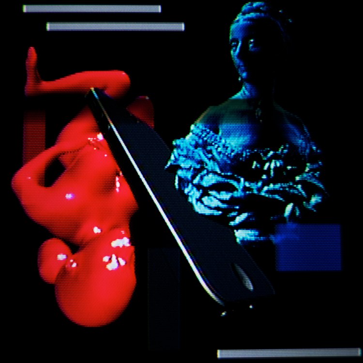
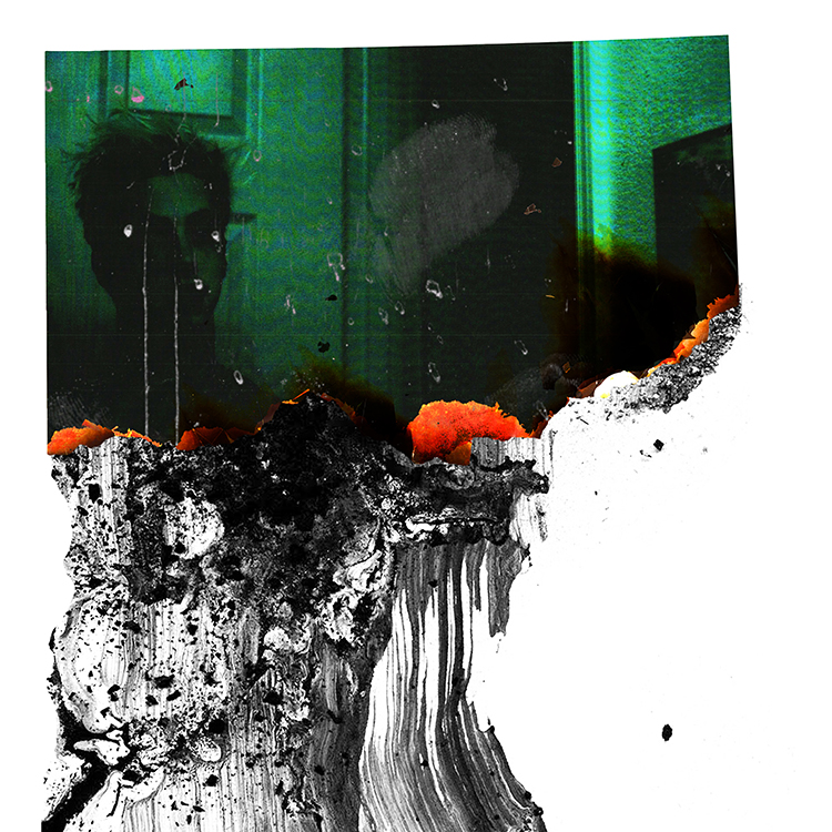
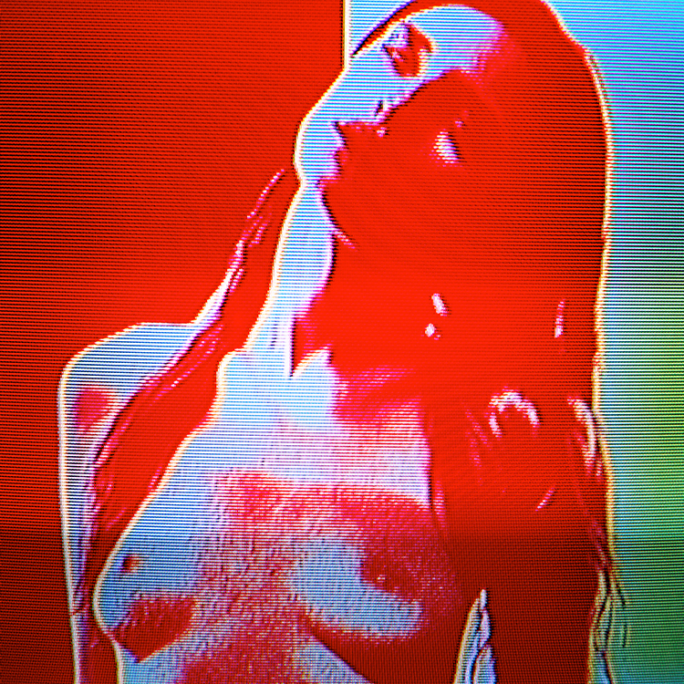
From HKCOVERS’s series for Digital Madrid.
Before designing, were you ever into art or sketching?
I really didn’t know what was going on or really start to appreciate art until I was 18. This 2D Design course I was in really changed my whole perspective, and honestly changed my life. Just going through different artists and their work, color theory, form and function, aesthetics, working with different mediums – basically fueling and training my creative eye. To date, he’s one of my favorite teachers.
“I DIDN’T WANNA STAY SAFE. I DON’T WANT TO BE NORMAL. IT DOES NO ONE GOOD STAYING SECURE ALL THE TIME.”
What is your earliest memory of realizing that you were a creative?
I would doodle everywhere on school assignments as a kid, but really didn’t express myself much as a kid. I would keep to myself, always observe and study – and still do. I really tapped into my creativity and started executing when I was 16.
Who are some of your favorite artists?
Salvador Dali, Nabil, Travis Brothers, Bryan Rivera, DeadDilly, and Rudcef. There’s more, but I really like the direction these individuals take their craft and ideas.
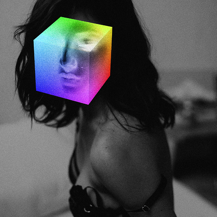
I noticed you seem to incorporate elements of net art in your work. Do you consider yourself an Internet artist?
I don’t want to, but I pull a lot of inspiration from Internet art. It’s really cool and I love certain artists who create in that realm. I don’t consider what I do strictly net art, however. On the other side, I feel like some net art has the idea present, but the execution is sometimes off. Nothing wrong with that, but I want to have everything well-rounded on both sides.
The Internet is for sure a huge platform to display my work at the moment, but I also love holding something I made, something tangible, outside of a viewing it from a screen. It’s honestly a whole other experience holding your work or seeing it blown up at huge sizes rather than being compressed on an Instagram page or website. I live for that.
Who are some Internet artists whose work you enjoy?
Yung Jake is really tight. Fresh ideas.
Another is a friend of mine, Clayborne Bujorian, he isn’t an artist, he’s a discombobulator.
Still fresh. Mr. Doob is so raw to me, his medium is the web browser, and you just get lost into his creations. Amazing.
You have some really interesting design choices, like cutting off Travi$ Scott’s head for your alternate Days Before Rodeo cover. Can you tell us a bit more about what dictates your design choices?
I don’t think I have a set aesthetic that I build on yet – I want to come into one. But I approach anything with the idea of making something look aesthetically pleasing overall, but also adhering to things like composition, colors, typography, and overall vibes and whatnot.
The Travis artwork was fun ’cause I was anticipating Days Before Rodeo, and thought I’d have a take on the artwork. The idea of leaving his head out and leaving him only in that pose was fresh to me, he was captured really well there, the scene looks tight, like the youth looking up to their leader – or like when The Beatles used to have their fans trembling or whatever. I thought it’d be only right to have handwritten text, kind of projecting the idea that Travis himself ripped apart of the artwork to write out the title on the album. Honestly I don’t know my process half the time, it’s always different with everything I do. I just want it to look good and have the idea projected properly at the end of the day. All I make sure is that I get my idea across well.
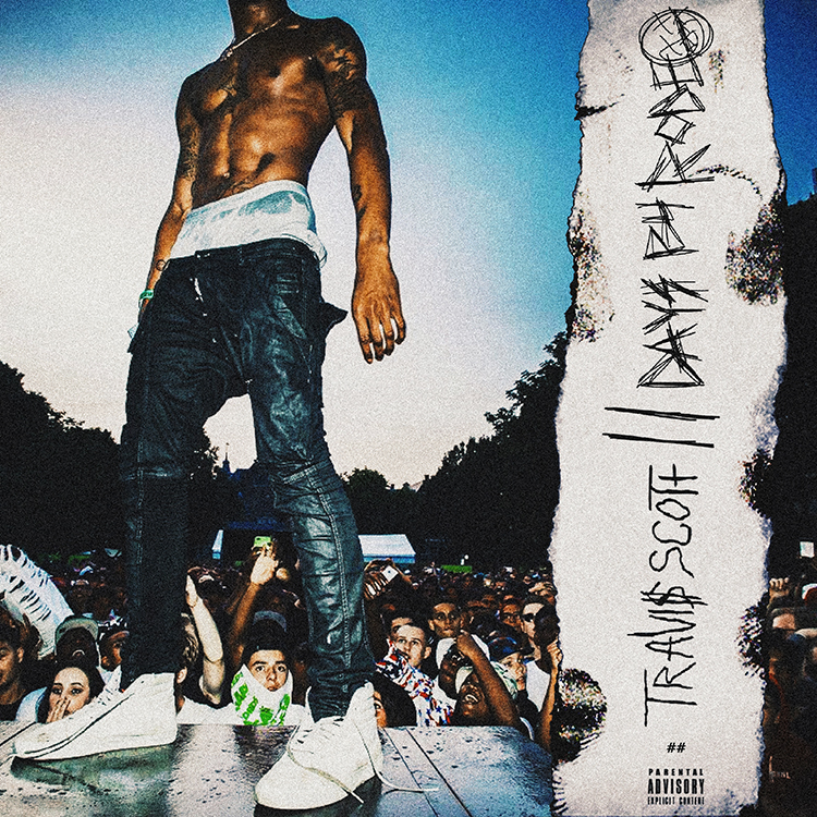
This photo was actually taken at the Appelsap festival – you can spot someone wearing a The Hundreds x Appelsap towel in the front.
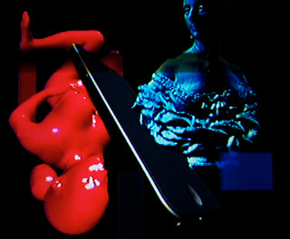
Can you tell me more about the work you did for Digital Madrid, and what inspired the lo-fi style you incorporated into it?
Digital Madrid is an online gallery hosted by TheILSMag, in which graphic designers have a chance to be spotlighted and showcase new work to the world.
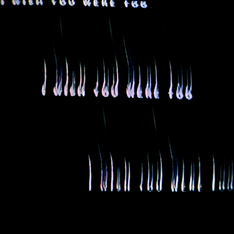
My last set was based on this world where I created pieces inspired by this analog, low fidelity design-scape. Just very weird, chilling stuff that wasn’t based on anything nostalgic or anything – but more left end of the spectrum. I feel like people love to exploit that analog/lo-fi feel for nostalgic purposes. I wanted explore that side and bring something new out of it.
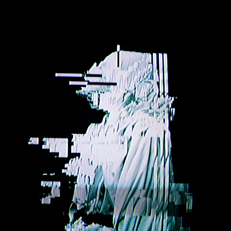
Besides the Kevin Abstract video, what other video work have you done? What were your 5 favorite music videos that came out in the past 5 years?
I do videos for friends just purely off the spirit of having fun and for the sake of creating something out of nothing because we have that power.
5 music videos in the past 5 years I really enjoyed were:
Ben Khan – “Youth”
Tyler The Creator / Frank Ocean – “She”
Beyonce / Drake – “Mine”
David Bowie – “Love is Lost”
Chief Keef / Lil Reese – “I Don’t Like”
What’s the most exciting instance of recognition or shout out that you got for your artwork?
I did some work for Bad Boy and got Diddy to shout me out, that was crazy.
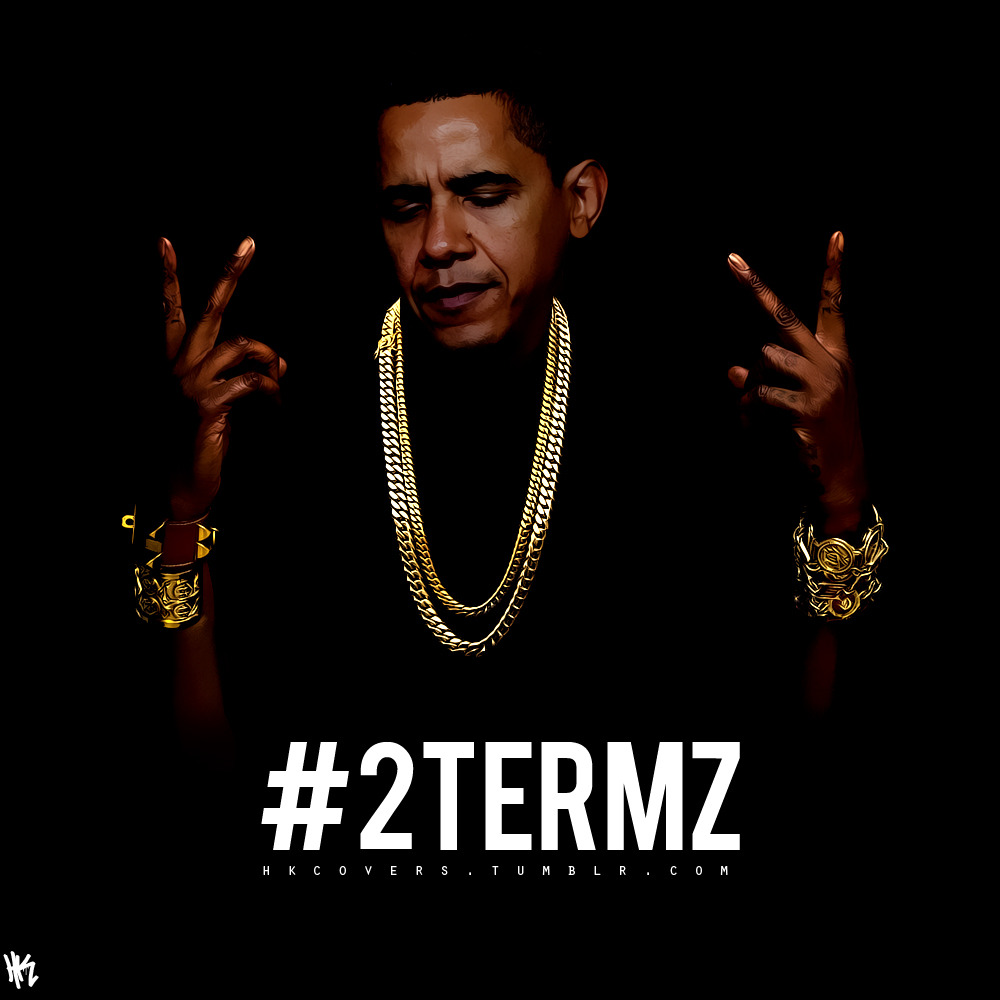
Another time I made this “2Termz” meme in my math class around election time. It got really viral for a bit, it ended up on MTV and on countless bootleg shirts.
Do you have a favorite album cover of all time? Why?
My favorite album cover of all time has to be Cudi’s Man on the Moon 1 art. That or Get Rich or Die Tryin’. The gunshot through the glass is tight.
::
WORDS BY ALINA NGUYEN

