EDIT : ALL “TOP TEN” TEES ARE NOW IN THE ONLINE SHOP!
So, this is officially the final day of The Hundreds’ first decade. Over the past ten years, we’ve built our house on a foundation of graphic t-shirts: Hundreds – no pun intended – of tees. Front-crest and back hits, pocket t-shirts, baseball raglans… Photo-print tees, all-over-prints, discharge… Ironic graphics, offensive graphics, philosophically dense and cerebral graphics… We did it all.
What they all had in common, however, was that they were limited. And as any diehard The Hundreds follower knows, once a t-shirt sells out, it’s traditinally done forever.
Until now. For the first time in the history of The Hundreds, we are re-printing and re-issuing ten of our favorite graphic t-shirts from the brand’s first decade. We dug up all the original art and silkscreened them onto our favorite colorways of that style as well. The Hundreds’ TOP TEN were handselected by both Ben and I. Ben’s five favorite The Hundreds t-shirts of all time are:
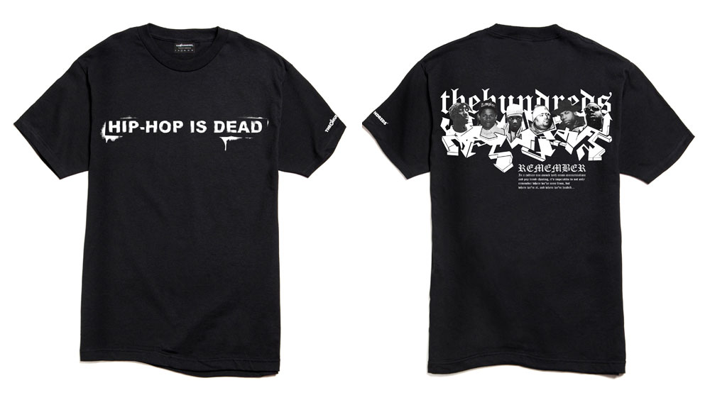
1. Hip-Hop is Dead(Fall 2004):
This was the first tee that really garnered us recognition, and broke us in the media and opened a wave of retail doors. It was our “Jesus is a Homeboy” or “Che” tee that exploded the brand to that next level. I designed it between the library and the classroom while Ben and I were still in school. The original intent was to riff off of “Punk is Dead,” but flip it for the early 2000s’ era, when Hip-Hop – as we had known and loved it – was unraveling. The shirt was controversial on many levels and reached the most prominent rappers of the time, some who publicly made a stink about it. Nas was also aware of the shirt, as his record by the same name didn’t publish until years later. To date, it’s still one of our most successful tees and was also offered in brown and navy, although black is the one most people remember.
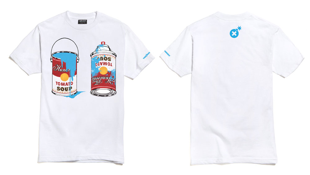
2. Cans (Summer 2005):
Pretty straightforward, “Cans” was an homage to the pop art of Warhol’s era, while bridging it with our art of choice today: graffiti / “street art.” I remember sitting down with the original Warhol cans prints and wondering why no one had ever thought of the cans in a different sense.. as cans of paint. The only dilemma I was stuck with was whether to illustrate a paint can or a spray can. In the end, we decided on both to really seal the deal. Again, years later, we saw it resurface as a Mr. Brainwash concoction, but real The Hundreds heads know who did it first.
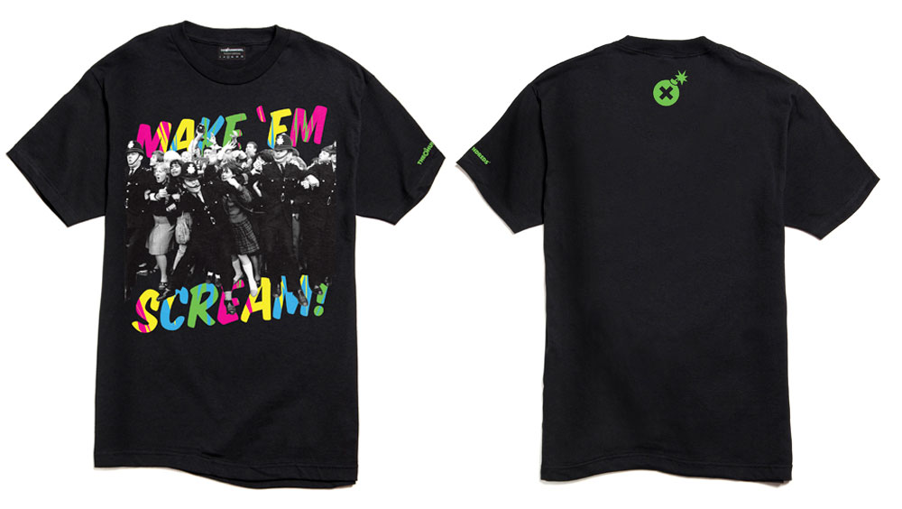
3. Make ’em Scream (Fall 2005):
The reference photograph was borrowed from a Beatles compendium. This piece was entirely design-driven as I was seeking to collide a black-and-white photograph with all fluorescent colors in a comic book font. I never expected the t-shirt to perform the way it did, but serendipitously, “Scream” happened to release at the same time as an anticipated Nike shoe that locked up succinctly with the color scheme.
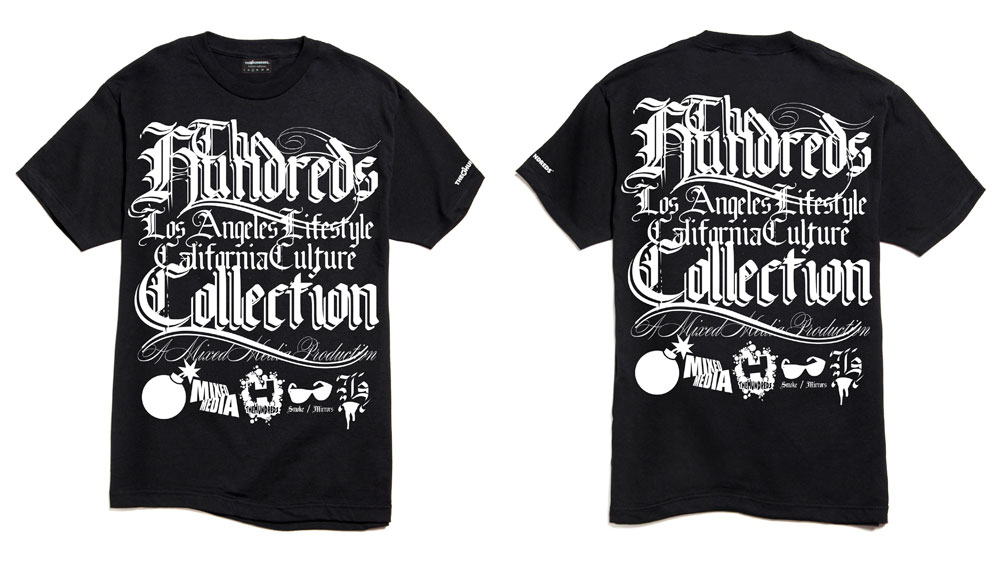
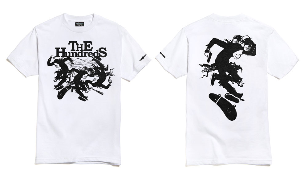
4. Nine(Spring 2005):
Okay, so this shirt was actually planted from a suggestion by our close friend Lindsay (now, of Kenny). We were visiting her out in New York and she threw out an awesome idea – tonal printing white on a white t-shirt. To execute the vision, I needed to come up with a large and complicated-enough design to make the print visible, subtle enough, and beautiful all at the same time. Inspired by the Old English lettering that is indicative of Cali culture, I laid this script out and we offered it in 4 styles: Black on white, white on black, white on white, and black on black.
Due to the popularity of this tee – especially within our circle and community – we produced a second rendition named “Eighteen” a year or so later, doubling up on the classic fonts and typography. And since then, whenever we print a similar-themed t-shirt involving our mottos written out in our favorite fonts, we name it another multiple of 9. For example: “27,” “36,” “45,” and even a “54.”
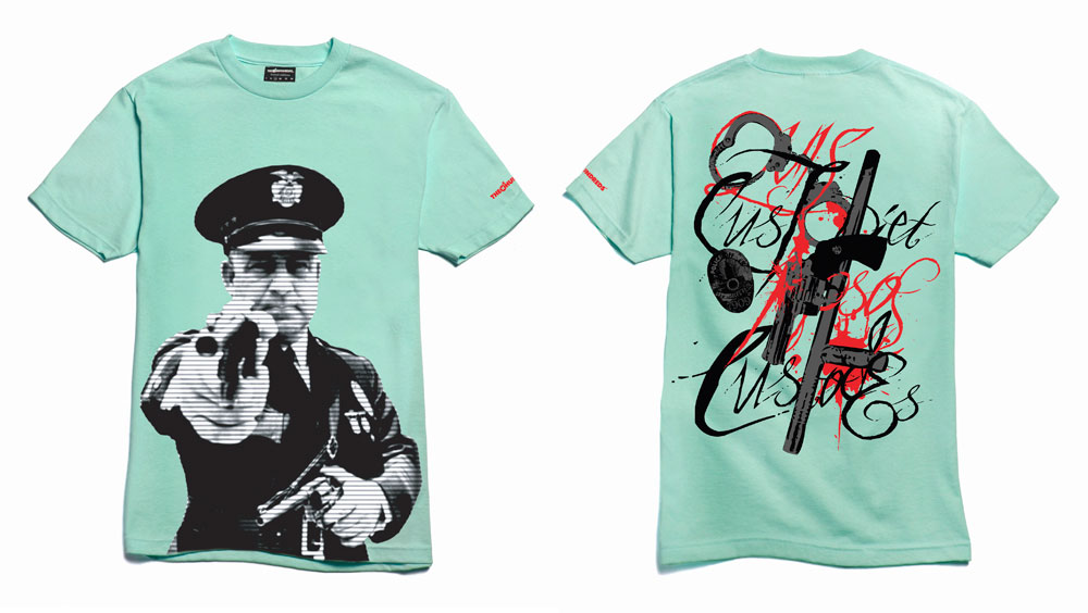
5. Cop(Spring 2007):
The Hundreds has had a pretty colorful history and tense relationship with law enforcement, that’s resulted in a number of t-shirts that call out the police or at the least, question their integrity. Maybe the first and best known of these was “Cop,” featuring an early 20th-century photograph of corrupt LAPD police chief James E. Davis. The back reads “Who will police the police?” This was also one of the few times we offered a mint-colored t-shirt in the line, and so of course, it was the colorway we had to bring back.
And my five are:
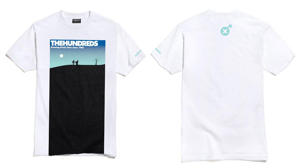
6. Waiting(Fall 2007):
I love this shirt for a number of reasons. First and foremost, the layout worked out even better in reality than it did on paper. It was a different approach to graphic placement than we were used to, with the front image running off the bottom of the tee, and helped me to think anew about t-shirt design . But secondly, it was a parody of Samuel Beckett’s “Waiting for Godot,” one of my favorite classic reads, and also a working metaphor for our position in our career and industry. Accordingly, I tweaked the original characters into silhouettes of Ben and myself.
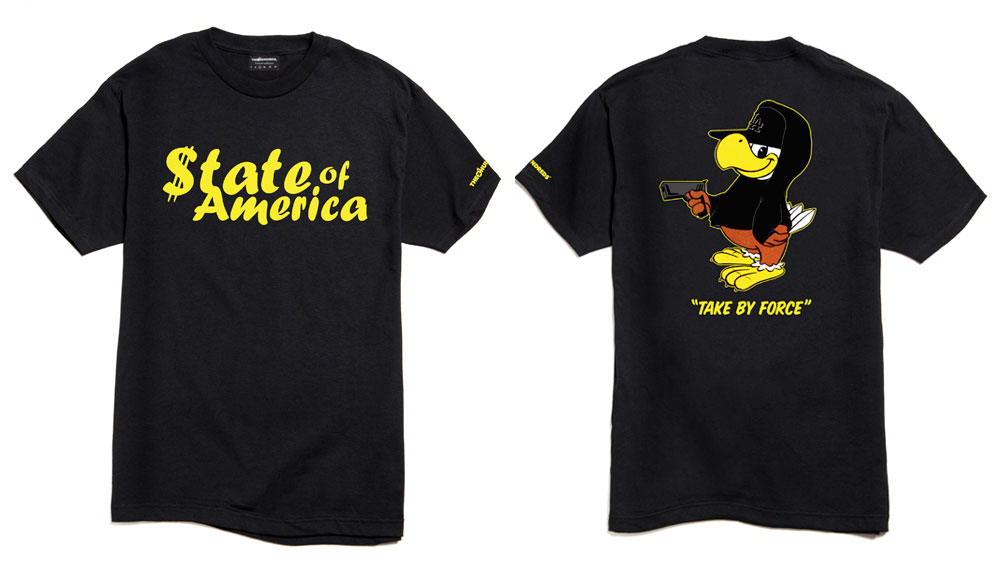
7. State of America(Fall 2005):
When I diagram the perfect The Hundreds t-shirt to our design team, this is one of my prime examples. “State of America” involves all the elements I’m looking for in telling our story: It broadcasts an opinion, re-appropriates a familiar reference, and ties into our brand theme of California Culture. “State of America” spoke on our image as a nation during the Bush presidency. With our international relations in disarray, we (the States) were considered more a bully or thief than a friend to the rest of the world. To illustrate the point, I flipped Sam the Eagle, the 1984 Los Angeles Olympics’ mascot, into an NWA-style gangbanger. And best of all, it made for a cool-looking Streetwear t-shirt.
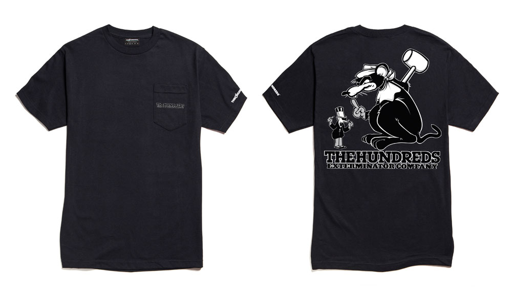
8. Pest (Winter 2007):
This one is pretty special to me because it was the first t-shirt Benjie worked on when he came onboard as our Graphic Designer. Like “State of America,” it shared a political stance while tweaking a popular L.A. icon. Western Exterminators is a local pest control company that features a man in a top-hat waving his finger at a helpless mouse as its logo. A couple other notable Streetwear brands have worked the parody in the past, but none did it like we did, with the roles reversed and the rat getting its way. Not only did the underdog allegory work for The Hundreds, but with the Western Extermination slant, the t-shirt opined on the U.S.A. acting as the world’s exterminators. Plus, it was a crest-hit, pocket-print, enlarged back print. Does it get any better?
9. Jerky:
I think this is my favorite The Hundreds t-shirt of all time, again, because of the double and triple-entendres that are all woven together in 1 classic Streetwear graphic. My concept for this was to highlight our brand’s synopsis of L.A.’s subcultural melting pot. So this graphic mashes the Tommy Boy record label logo with the Circle Jerks iconography. Hip-hop and punk rock meet in “Jerky,” encapsulating everything The Hundreds stands for in a simple, 1-color t-shirt.
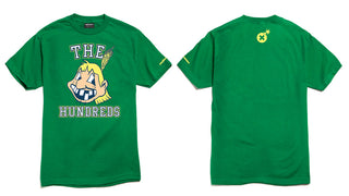
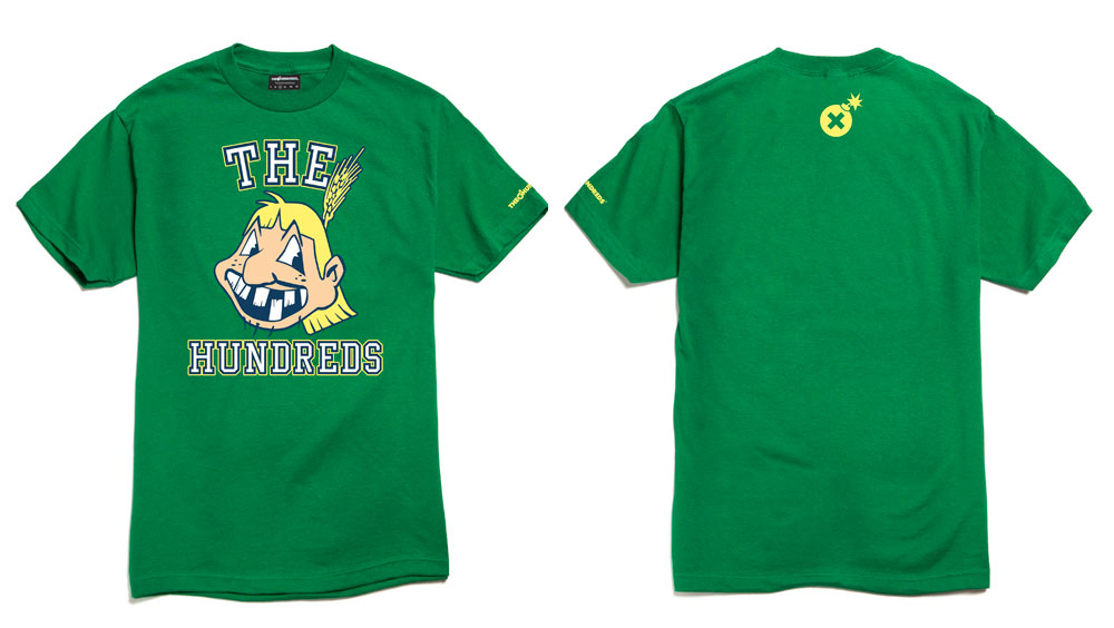
10. Honkys (Summer 2005):
Totally offensive. Totally fun. “Honkys” was a reverse-racist flip on the Cleveland Indians’ offensive mascot. But more importantly, this shirt is a nice reminder to keep our sense of humor and not take ourselves so seriously. It’s just Streetwear, it’s just t-shirts. 10 years of having fun, proving our point, and making some cool art and fashion while we’re at it.
The collection will be produced in very limited quantities and made available exclusively through the The Hundreds Online Shop starting tomorrow morning, Saturday, July 27th, 2013, and throughout The Hundreds flagship locations (THLA, THSF, THNY and THSM) the following Thursday, August 1st, 2013. All graphics remain unchanged from their original forms, with the exception of a specially redesigned 10-year anniversary version of our classic Bar logo emblazoned across the left sleeve of each shirt.
Jump on it. You don’t wanna wait another ten years for this to happen again.
by bobbyhundreds

