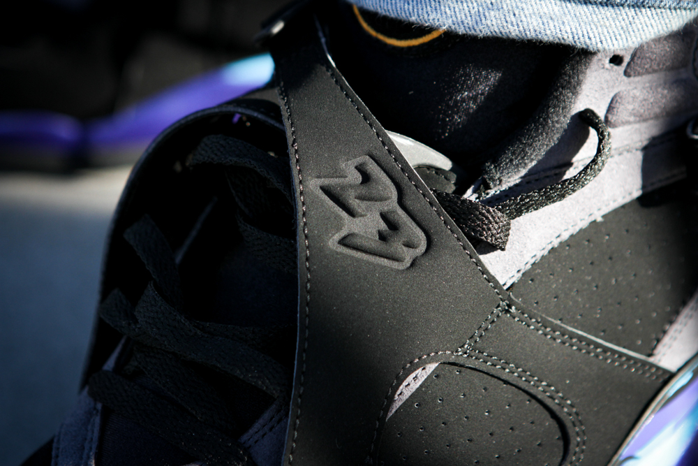
When I was just a little vato loco back in ’93, I wasn’t the biggest fan of the Jordan 8’s debut. Honestly, I stopped liking Jordans after the VII, and to be exact, it was the Bordeaux’s. The Jordan 8 was the first Jordan that had absolutely no Nike branding anywhere on it. So that pushed me further away from connecting with the sneaker. Tinker thought Jordan Brand was strong enough to continue on with its own branding, without any Nike iconography still adorning the Jumpman side by side. The whole strap thing—aka bunny ears and craze pattern—they had along the side wasn’t something I was looking for, especially since the colorways were abstract and bright. It was far from the original black/white/red hue that you would usually see on Jordans. It took me years to appreciate Tinker’s vision. He was truly light years ahead of anyone else when it came to shoe design.
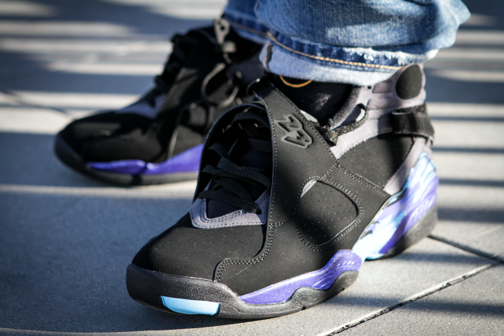
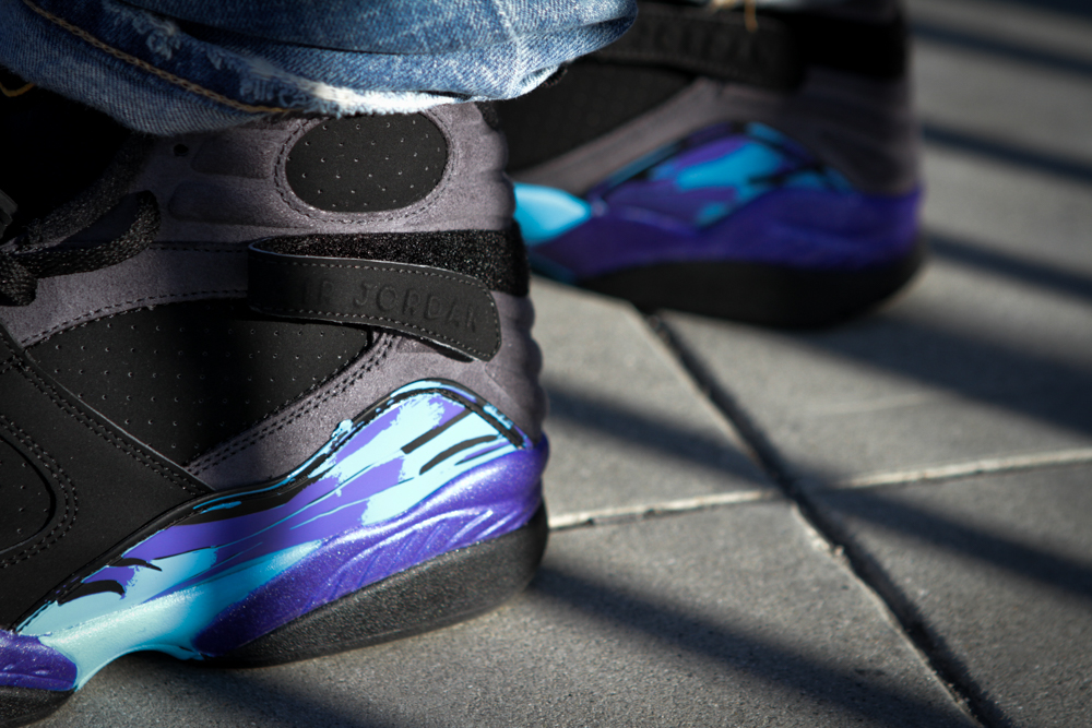
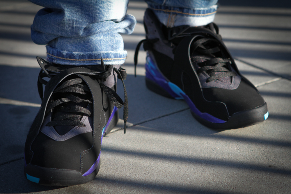
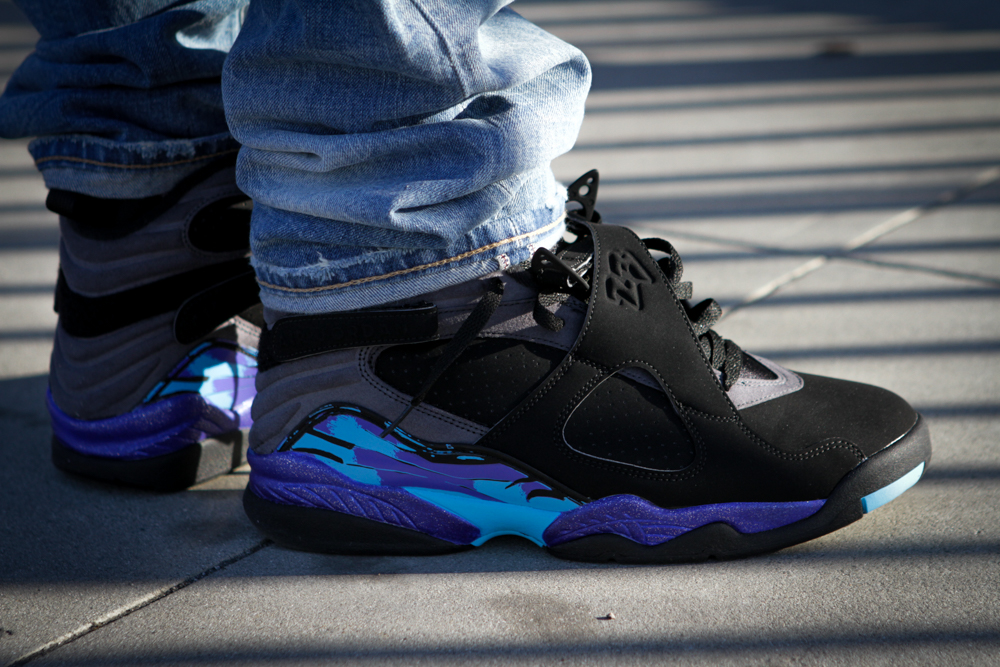
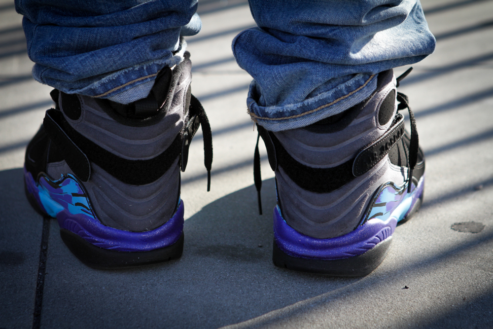
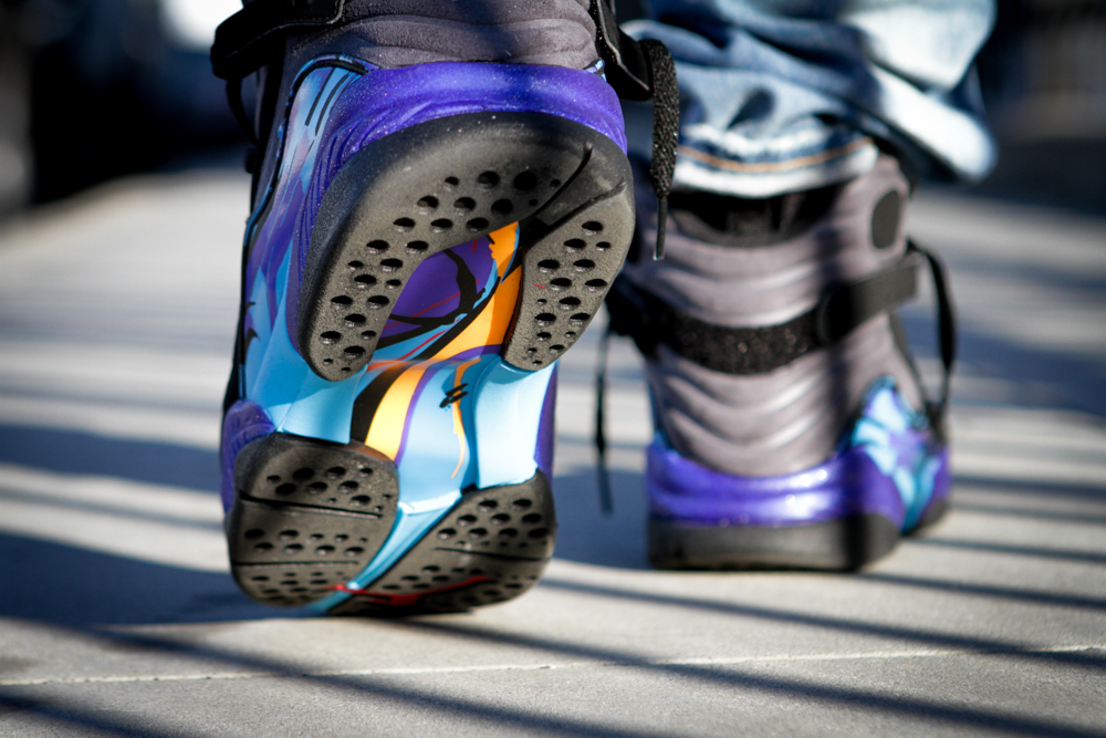
It’s been 8 years since we last saw the Jordan 8 “AQUA” in 2007, which is a long enough hiatus for such a coveted colorway of a Jordan. The concord/aqua splashed across the side paneling, sitting beside the nubuck/durabuck black uppers and the light grayish suede ankle supports, scream the ’90s—with a little hint of gold here and there that really ties everything together nicely on this colorway. The felt/chenille tongue patch really makes this shoe. I’ve never actually seen anything like this done before. Of course, only a Jordan can pull off like this. The Jordan 8 “Aqua” makes its return this Black Friday, November 27th at your local Jordan Brand retailer.
