As a visual art form, skateboarding is about visceral reaction to movement and environment. Same guy, same spot, same trick, different result. This extends to how we dress, how a photograph is framed, grip tape technique, and skateboard graphics. In the 1980s, wider decks provided more area for skateboards to tell a story—character-driven, steeped in Hot Rod culture, skulls, swords, serpents, psychedelic, and even painterly. The look of the skateboard split from the stark logo and stripe-driven look that Sims and Santa Cruz had streamlined, taking the personality and localism of Wes Humpston’s Dogtown aesthetic into new realms.
One of the pioneers of this renaissance was Ron Cameron, responsible for sculpting the look of Blockhead and Acme, yet often omitted from the narrative. His list of contributions would take an entire page, but we can just drop Vans, Nike SB, RVCA, H-Street, Vision, Formula One, Strike, Channel One, World Industries, Blind, Grape Netwerk, Toy Machine, Foundation, 510 Wood, G&S, True Love, Krooked, and Real here for now. Having left behind a body of work that’s still expanding, that not only drove skate graphics forward in both complexity and simplicity, it’s even more puzzling that anyone would ask, “Who the hell is Ron Cameron?”
I thought I knew a little, but in our two-hour plus conversation, I realized that it was a fraction of a fraction of the unbridled creativity and outside-the-box thinking that sets Ron Cameron apart from the fray.
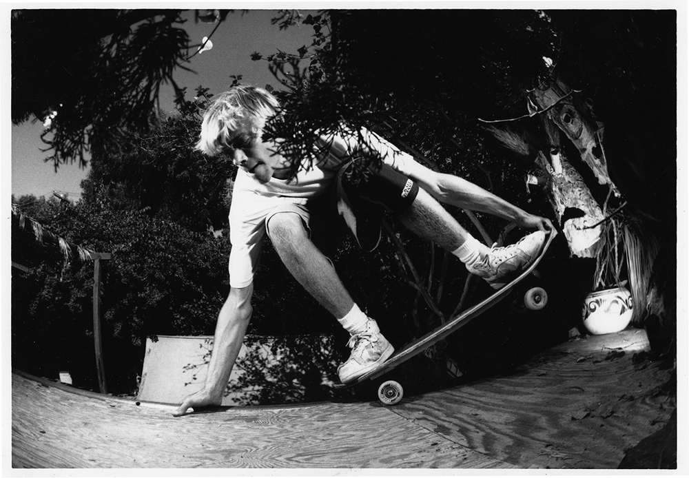
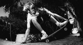
1989: Ron Cameron frontside nosepick to good buddy tail grab in at Tod Swank’s ramp. Del Mar, CA. Photo: Steve Sherman
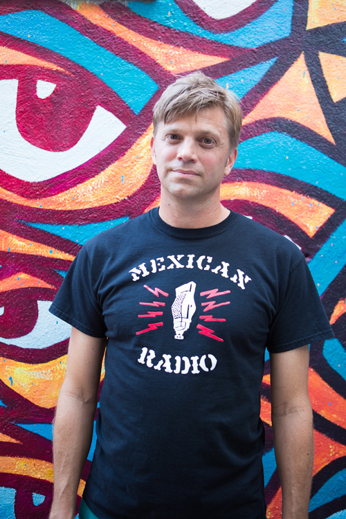
2016: Ron Cameron wall mural art “Bar.” Palm Springs, CA. Photo: Dre Naylor
ANTHONY PAPPALARDO: When did you figure out that you could actually have a career doing graphics for skateboards?
RON CAMERON: It was kind of a natural progression [slash] accident. I got into skateboarding in the late-’70s and started buying magazines right before all of the skateparks and shops closed around 1979. I grew up extremely poor, so when I got a magazine, it was gold. I studied those cover to cover, and at that point, I was just drawing a lot. I was the kid in elementary school who won art awards and stuff like that. I was always the “best drawer” and I didn’t know what else to do with that, except I knew my dad had done drafting. My parents divorced before I was even born, but I always heard my dad was artistic, that he was a painter—abstract painter and commercial painter—so I knew I had that in me.
“I grew up extremely poor, so when I got a magazine, it was gold.”
When Thrasher came around in 1981, it was fully punk rock, black and white—and skateboarding quickly changed with it. I was still looking at those old color ’70s magazines, just to see color photos and stuff, and I already had started molding this idea that I wanted something to do with the exciting stuff in those color mags. Around 1978, there was this one ad for Sims skateboards that featured Tom Sims in a backyard in Santa Barbara—I’m sure it probably wasn’t even his house, but he had blueprints out on a table, and I was like, “That’s who I want to be. I want to engineer and design skateboard stuff.”
At that point, around 1978, Sims was one of the largest skateboard brands. They had a cool logo that everybody wanted to draw. It kind of of looked like Van Halen’s logo. Then by 1980, Sims broke out and became one of the only skateboard brands at the time to do full-blown, colorful, whole-board graphics.
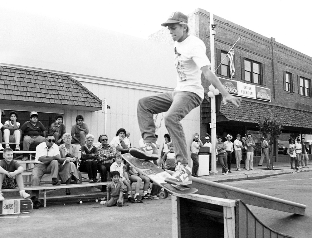
1986: Ron Cameron ollie boardslide. Reedley, CA. Photo: Kevin Bergthold
And simultaneously, you were trying to pursue being a pro skater, which led you to the Blockhead camp, right?
Yeah, I also wanted to be a professional skateboarder when I grew up. In the early ’80s, I thought, I can’t be like these new guys; I can’t be Christian [Hosoi]. I can’t be Allen Losi. Brad Bowman was my favorite, but I’m never going to be as stylish as him, and I don’t have access to competition bowls. So, I’m going to have to copy Steve Rocco and do street skating,” because around 1982, he was the only full-time street skater, as I saw it.
Around 1984, Brad Bowman coincidentally left Sims and started his own company called Hollywood Sk8s, and he had the Streetwise model that had this blunt, blockish nose. It sort of looked like a freestyle board, but with a shorter nose, and I was like, “Dude, that’s a modern board built for what real, new street skating is, and that’s what I want to be a part of!”
So, I cut down a Sims Jeff Phillips model like the Streetwise shape. I was already hand-painting graphics and airbrushing things—stenciling and stuff to make it look like screen-printed graphics. I didn’t quite understand how that worked until I got to high school and they had screen-printing equipment. So, I bootlegged graphics from Sims, Hollywood Sk8s, Thrasher, TWS, and some other companies, and put them on t-shirts. And I cut all the art with an X-Acto knife on rubylith film, they didn’t have photo-stat camera stuff! I had a shop sponsor at the time—Blockhead just released the “Street Style” deck, and that shop had it up on their wall. It was an enlarged freestyle board with this big, blunt blockish nose, like the Streetwise, but better. And it wasn’t a fish shape like all of the other decks just coming out. So, that was my first sponsor deal... I didn’t get free stuff from the shop, but I got stuff at wholesale cost.
1989: Blockhead releases “Splendid Eye Torture” featuring Ron Cameron, Sam Cunningham, Jim Gray, and more
How much later did you get introduced to Dave Bergthold and the Blockhead crew?
Right at that same time in early 1985, at the Sacramento Streetsyle Invitational Tower Records contest. Somebody introduced them to me and I found out Blockhead was these two Daves: Dave Berthold and Dave Hayes. Dave Hayes happened to be Dave Bergthold’s best friend and helped him run the company out of Bergthold’s parents’ garage. I guess he caught wind that I was a good skateboarder or something, so suddenly I met him and he was kind of intrigued by me.
Mark Gonzales also came up that summer to a demo at this shop called California Skate in Stockton. The Blockhead guys were going, so somehow I hooked up a ride with them, and it was kind of like my audition to ride for Blockhead. It was all jump ramps and curbs and stuff, and I got sponsored. And so I was like, “Okay, I have sponsor, I’m on my way to becoming a professional.”
Within a few months, there was a party up in Roseville at Dave’s parents’ house and we were all hanging out at the kitchen table and I started doodling on some paper—just goofing off, drinking beers and stuff. They saw that I drew some pretty interesting stuff. Dave later asked for some logos, so I just whipped some out, and one of them ended up being a new Blockhead logo—tall skinny letters that were all kind of squarish with an abstract square behind it—and he just ran it, as-is. He didn’t clean it up or anything.
As I started doing more graphics, I realized that my drawing style was actually representing this company Blockhead, and that it could help take the company to the next level. This was, like, 1986. I had just discovered graffiti art, I was super into that at the time, which makes your lettering style explode.
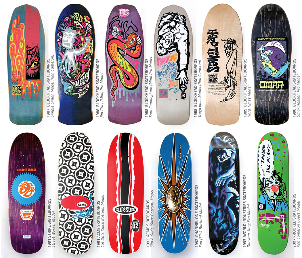
1987-2007: Various production skateboard art by Ron Cameron
Back in the ’80s, skateboard companies had to have their own distinct identity. You could not try anything that another company had ever done. Santa Cruz had Jim Phillips had that “Santa Cruz” look, so if you even got close to copying it, you know people would call you out on it. That even happened to me with a Mark Partain graphic—the one that’s kind of symmetrical with a big Native American guy with a globe, and he’s kind of underlit by campfire light with smoky lettering. That one was so close to another company’s style, which made me a bit uncomfortable. I did it because Dave Hayes was super into Salba and Santa Cruz at the time, and kept saying, “We need more graphics like that.”
How did your aesthetic start to become more distinct?
I just felt the responsibility to develop my own style that looked like nothing else out there, but also reflected what was going on in the streets at the time. By taking things that interested me, I just put things together accidentally or naturally. I was already a big record collector, so I got a lot of ideas off of record covers. I thought about how to leave the past behind—the new wave angular and blocky look which kind of defined Blockhead when it first started.
“I just felt the responsibility of developing my own style that looked like nothing else out there…”
I’d ask myself: “What is so not in, that it would be rebellious and funny?” I decided that would be ’60s psychedelic dirty hippie stuff, so I started buying records and trying to figure out what psychedelic was. And you know, I never even thought about the word much before that. I was only into hard rock, new wave, punk, reggae and ska before that moment. But, I knew graffiti lettering looked kind of colorful and psychedelic. To me, psychedelic was almost smoky, liquid lettering—it didn’t even have to do with drugs or anything, just really bright vibrating colors and everything bent and swirling all over the place. I started figuring out what psychedelic was. At least to me, my mis-interpretation of it. I got to that, [funnily] enough, through dub reggae, specifically the King Tubby Meets Rockers Uptown song by Augustus Pablo that was on this compilation album I bought at Tower the year before. That song just sounded totally bizarre to me, because it’s full of echo and reverb and the vocals come and go. It’s weird and woozy and exciting all at the same time!
Also, again, New York subway graffiti was a huge influence on me. I’d already done “pieces” and stuff, mostly out in the boondocks under overpass bridges, and even on my high school handball courts—I was kind of like the secret white, blonde surfer skate kid on the West Coast doing graffiti art. Later on, I was talking to one of the team guys from Blockhead, Keith Cochran. He knew some of the San Francisco graff guys like the CBS Crew. Back in ’87, they took me to some little alley parking lots that sort-of allowed—but not really officially—graffiti guys to do pieces on some walls just off the main streets. Keith saw that I was into graffiti, so he was hyped, and got one of those guys to make a full-blown graffiti art board. But, Dave Bergthold was having none of it, because he didn’t like hip-hop. So, I knew I was going to have to sneak in graffiti or mix it with punk rock and then take this new, very uncool hippie ’60s psychedelic thing and kind of mash it up together. Around 1987 or 1988, that became the new Blockhead style.
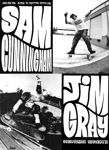
1988: Blockhead Skateboards Jim Gray & Sam Cunningham ad, with art & design by Ron Cameron
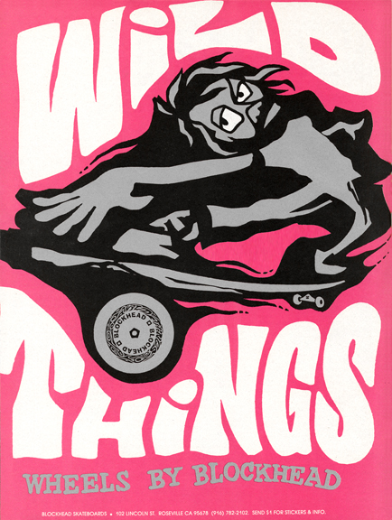
1988: Blockhead “Wild Things” ad, art & design by Ron Cameron
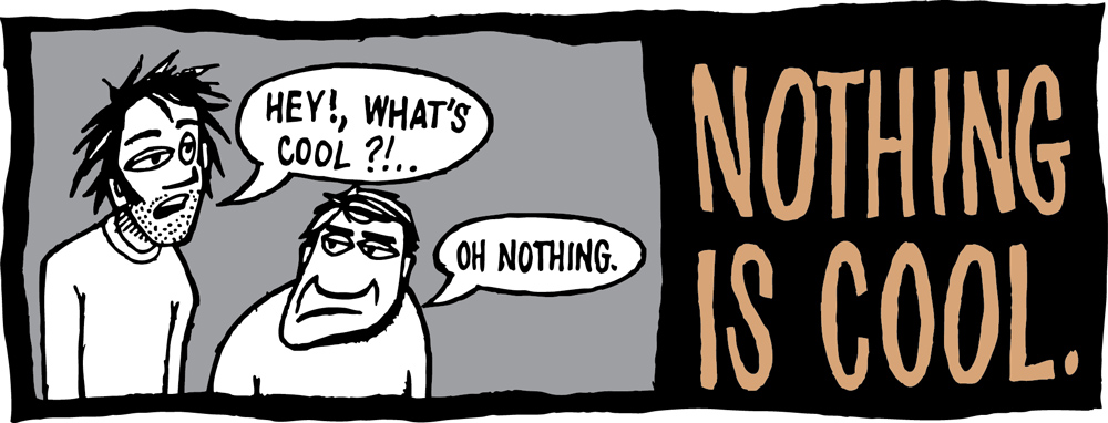
1988: Blockhead Skateboards top graphic “Nothing Is Cool” by Ron Cameron
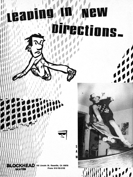
1988: Blockhead “New Directions” ad, art & design by Ron Cameron
In looking back at some of your designs, specifically the “Simple Simon” Blockhead deck from 1987, it looks like a real outlier for the time, with many elements that are being used in graphics today.
Yeah, it’s all about what you grew up with. In the late-’70s, I was really into custom car culture. I was totally into going to drag races and car shows and that heavily influenced me. I also collected KISS magazines, so in ’78 and ’79, hot rod, drag racing, and skateboard magazines were my whole deal.
With the “Simple Simon,” the upside-down face in that racing stripe bar was a full-on Neil Blender and Swank Zine reference, or nod. Neil’s influence came to me in what I see as a trilogy, “The TransWorld trilogy” as I called it: Neil Blender, Lance Mountain, and Garry Scott Davis. When TransWorld started, the publishers hired those three pro skater guys as their writers and designers. Neil and Garry wrote and drew these bizarre illustrated cartoons with Twilight Zone-type of stories in their own monthly columns The Aggro Zone and Street Sheet, and Lance had his own column called Ramp Locals. That right there changed my world completely.
Suddenly, I realized that through drawing, you can make something out of just your imagination. That was kind of like Neil bringing the Picasso vibe into his work. Nobody had an attitude like Neil, and he communicated it so well through his cartoons, through his writing, and even with lettering. The words he used were just so Neil. They were so unique, rebellious, stinging, and hilarious.
I thought the phrase or name “Simple Simon” was good, because it just knocked everything down to simplistics. There’s a musician named Jason Lytle who formed the band Grandaddy in the ’90s and actually rode for Blockhead. For his first incarnation of the band, he liked the “Simple Simon” graphic and board so much that the first name he used for Grandaddy was Simple Simon, back when they were making demo tapes.
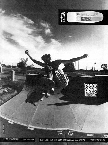
1988: Blockhead Skateboards Ron Cameron ad, featuring the “Simple Simon” deck
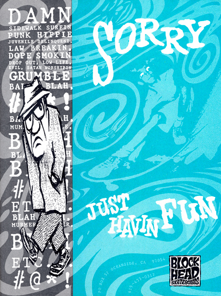
1989: Blockhead ad, art & design by Ron Cameron
That theme of stripping things down and refining them really came through in the Hard Times graphics, which was one of the first real price-point lines that skaters seemed to embrace. What inspired that series?
Again, that just came from rebelling against the market. Blockhead started rebelling against the market with the “Neon Circus” board in 1988, that one had a really pointy nose. Nobody had pointy nose boards back then, except for Keith Meek and Rick Windsor, because it was a San Jose/Sacto kind of thing, but I think some of the team guys were requesting that, because it was new and different. Dave laid out a plain grid of square Blockhead logos in the background and then added this big, thick border square thing in bland muddy colors. It was called “Neon Circus” and that was a complete stab at the bright, gaudy and explosive Vision “Psycho Stick”, and Santa Cruz graphics that were starting to go all day-glo with transparent layers upon layers of neon ink—although we had been dabbling with that style a bit, too.
Fast forward a couple of years, the market was changing and kids wanted something more affordable and basic. Nobody put plastic rails on their decks anymore, so street boards were just getting obliterated; it almost didn’t matter what the graphic was. That whole Hard Times concept got kind of lifted, again accidentally, from a crew of three guys who did everything together: J.J. Rogers, Jay West, and then Joe Lopes. They were San Leandro East Bay guys and they had their own thing going. They would come down to our place in Oceanside and everything was “hard times.”
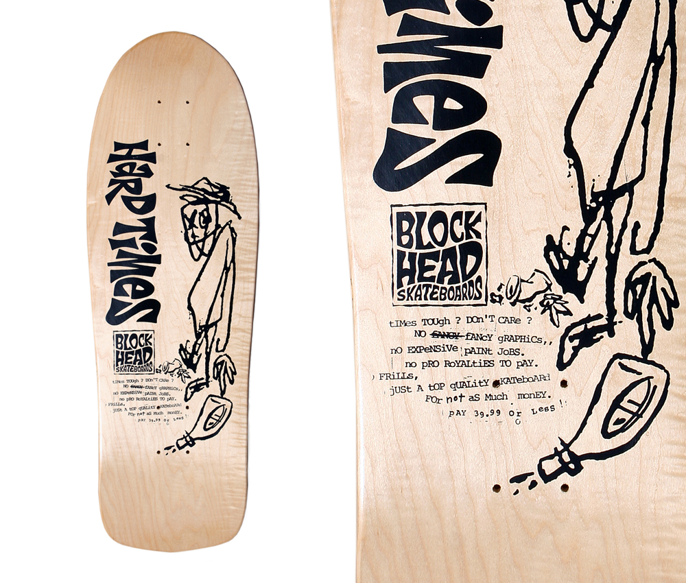
1989: Blockhead Hard Times deck, art & design by Ron Cameron. “Ron Cameron scribbled a rough drawing on a tiny scrap of paper and then enlarged it on the copy machine and then added the iconic HARD TIMES lettering and banged on a typewriter to get [the] slogan ‘tiMes TOUgh? DOn’T CARe? nO EXPeNSiVe pAINt JoBS, no pRO RoYALtiES TO pAY. nO FRiLLs, jUSt A tOP qUALitY sKATeboARd FOr not aS Much monEY.'” – blockheadskateboards.com
They had no money and they would stay at our apartment, but they were totally into being broke. They had their own slang terms, one of which was “Hard Times,” and they would name everything hard times. Hard Times sandwich: that’s white bread with lettuce. Hard Times spaghetti: that’s top ramen with ketchup. And so on… it just became hilarious. Dave kind of put those things together and decided at the same moment that we needed to make a simple, one-color graphic that we could sell cheaper, to help us compete with The Big Five companies, while setting us apart.
I thought, OK, I’ll just make the graphics look really bad on purpose.
We had moved Blockhead down to San Diego at this point and I had access to TransWorld magazine’s Xerox machines, so what I would do is draw a really crappy drawing really small with ballpoint pen, and then just completely blow it up and enlarge it on the Xerox machine so it would just come out as chunky and crappy as possible.
“I thought, OK, I’ll just make the graphics look really bad on purpose.”
When you left Blockhead for Acme, your style really did an about-face, becoming more focused on icons. Was that Jim Gray’s influence or a conscious decision to change?
Yeah, I realized that if I was going to do something new and different, it couldn’t look anything like what Blockhead did. I had to completely come up with a new look. Around that time, even when companies like H-Street and Vision approached me and wanted me to do freelance graphics for them, I was so at odds with letting them have graphics that looked like Blockhead. It felt like I was slutting out Blockhead. But, I did it a few times. That’s one of the factors that helped me realize that I would have to create a new look if I were to ever do graphics outside of Blockhead.
First, for a few months in 1990, I did Sector 3. But, the financial backing was bad, and it still looked too much like the Blockhead style, so maybe it was good that my first attempt at doing my own company didn’t work out. Jim Gray had recently left Blockhead, too. He seemed like the knowledgeable business guy, and I needed a partner in crime, especially since I had zero small business training. Nothing! I hadn’t heard much about Jim after he left Blockhead. He had been working with Brad Dorfman at Vision for about six months, trying to test his marketing skills. But, that didn’t work out like he wanted it to. Jim was determined to start his own company. He already had an oval logo for Acme that was actually designed on a Mac in the early computer days by Jim’s buddy, Spencer Bartsch, who was the singer of Shattered Faith from Orange County. Spencer was working in the art department at Gotcha! clothing at the time. The first Acme ad just consisted of Jim’s manifesto that name-dropped all of the other companies at the time. There was no artwork or anything–just black and white text with a computer-looking oval spikey logo at the bottom.
It was hard for me to let go of doing my own brand, Sector 3, but when Jim told me that he wanted to call his brand Acme, which coincidentally was the same name I wanted to use for Sector 3’s wheel brand at the time: Acme Wheel Co. Plus, one-word names were coming in, and since we both had the same name idea, he suggested that we join forces and do it together.
Jim’s idea was to reference old 1950s Americana-looking images like ice cream and hardware store logos and stuff. I was down with that, because I was into old thrift store gas station jackets at the time, the ones with racing stripes and old retro automotive logos. Jim also loved MAD Magazine’s style and humor. As far as the “Blockhead look,” I was still playing with the psychedelic thing, but trying to alter it, keeping it to wording, patterns and colors that reflected the psychedelic vibe and philosophy, but without the blatant ’60s lettering style. There’s all these records from the early 1970s—these educational records for school kids that were intensely psychological and bizarre. Those influenced some of the logos, like the one that said “Acme Experimental Company.” I was going further with that Blockhead psychology, but then visually matching it up with really simple, clean, bold colors and trying to get away from crazy graphics, with simple color blocks and circles and logos.
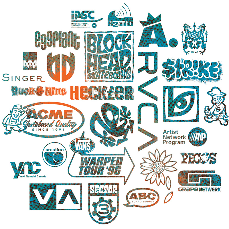
1986-2006: Various company logos by Ron Cameron, including the minimalist Acme “A Crown” logo near the top
That was really predictive of where every company would head in the late-’90s and into the 2000s, with logo and typography-based boards being so predominant.
In a lot of ways, skateboarding is immature, because by nature, it’s about teenagers and kids. Back then, the new skater-owned company guys of the early ’90s were excited by this new gold nugget, which was that skateboarding was now becoming a money-making thing. Suddenly, and ironically, they were behaving just like the “Big Five” back in the ’80s, who they had been trying so hard to get away from! It was a reflection of them being excited by this new late ’90s environment; X Games, big corporate sponsors, and “the internet.” Skateboard shoe companies were becoming huge, and I think the skateboard company guys wanted in on that, too. There was now no ceiling on how much money you [could] make, and the big corporations still hadn’t quite infiltrated skateboarding yet, except for the X Games / ESPN, but it was on the verge. I think that reflected in just the mood, which then was reflected in the graphics that became simple and almost corporate logo-based. Acme was a product of the times, and maybe you’ll see the message Jim was making in 1991/1992 was starting to come through around then, away from the rock star riders and back to the company being the big name.
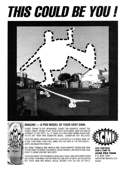
1991: Acme “Pro Model” ad
Acme seemed to take the counter-approach to what Rocco and World Industries were doing and succeeding with throughout the ‘90s, by making the riders actual rock stars.
Yeah, exactly. You can say Rocco was one of the reasons Jim started Acme, as a counter-balance to Rocco’s growing standard of making the pros most important and the company itself second in importance. Jim thought that would just become chaos, and it eventually did. Like when half of World Industries’ riders jumped ship a couple of years later and started Girl and Chocolate. In another ironic twist, at the end of 1992, Rocco pulled me from Acme to re-start another company under his umbrella. All of a sudden in a different era, a different decade, I was employed by the guy I used to look up to when I was a little kid street skating. I actually wasn’t quite happy with how things were going with Jim, so Rocco brought me in to start a company with Ed Templeton and Mike Vallely called Television, which they had initially done through Brad Dorfman (Vision) for a split second. I was going to be one of the trio involved with that.
At the last second, after they quit New Deal, Mike decided he didn’t want to go back to working with Rocco—just like that. Mike V is rad that way! Me and Ed were stunned, confused and stuck. Rocco was nice enough to just employ me there, so I helped with Big Brother magazine under Jeff Tremaine, and did graphics for some of the skateboard brands at World. I was there for about five or six months, but it wasn’t what I originally went there for, which was to create my own specific brand with partners. I went back to trying to start my own brand, which was always my dream, back to Brad Dorfman, where Ed had just took Television, changing the name to Toy Machine.
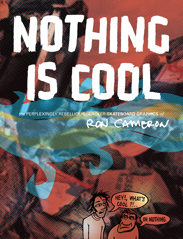
2016: Ron Cameron skateboard graphics and design book, slated for 2017
Okay, I always wanted to know this, but why the hell did people always go back to Vision and Dorfman—even in the ‘90s, when his star had fallen?
Simple, he had resources. I also think our fantasy made us think he had money that we could utilize—we could use him for his money. But, he did have physical resources. That’s one thing that Brad was smart about. He had silk screening equipment and skateboard presses. You know, he had everything to knock out any product in-house. Plus he still had distribution connections all over the world. That made it very tempting.
Back then, it was all about trying to do your own thing, but without resources and money, you had to try to do it through someone who did have cash, like Brad. My drive in the ’80s and ’90s was just through the roof. Back then, I lived in warehouses, I lived on people’s couches, just trying to start a clothing brand and a skateboard brand. That was the only thing that mattered to me. Well, that and creating new stuff that had never been done before. But I was one hundred percent committed to those things.
“Back then, I lived in warehouses, I lived on people’s couches, just trying to start a clothing company and trying to start a skateboard company.”
By 1991, I was over the turning pro thing, so I just had this drive to start a brand and put forth my own vision. But back to the Vision thing, in the past, me being basically a kid without any understanding of real business led to some bad decisions, and now Rocco was coaching me through all of that. That’s what was hilarious. I was like, “Hey, Rocco, I’m talking to Dorfman. I’m going to do a company called Grape Netwerk.”
I think Rocco was happy, because we knew I couldn’t do my own brand there with him at World without having a top name team lined up first. He just asked which riders I had. “It’s all about the team guys now. If you show me who you got, we’ll talk.” I was trying to do it the old school way, you know–start the company and then get the riders. Rocco’s business model was the opposite of that: riders first, then make some graphics that would sell.
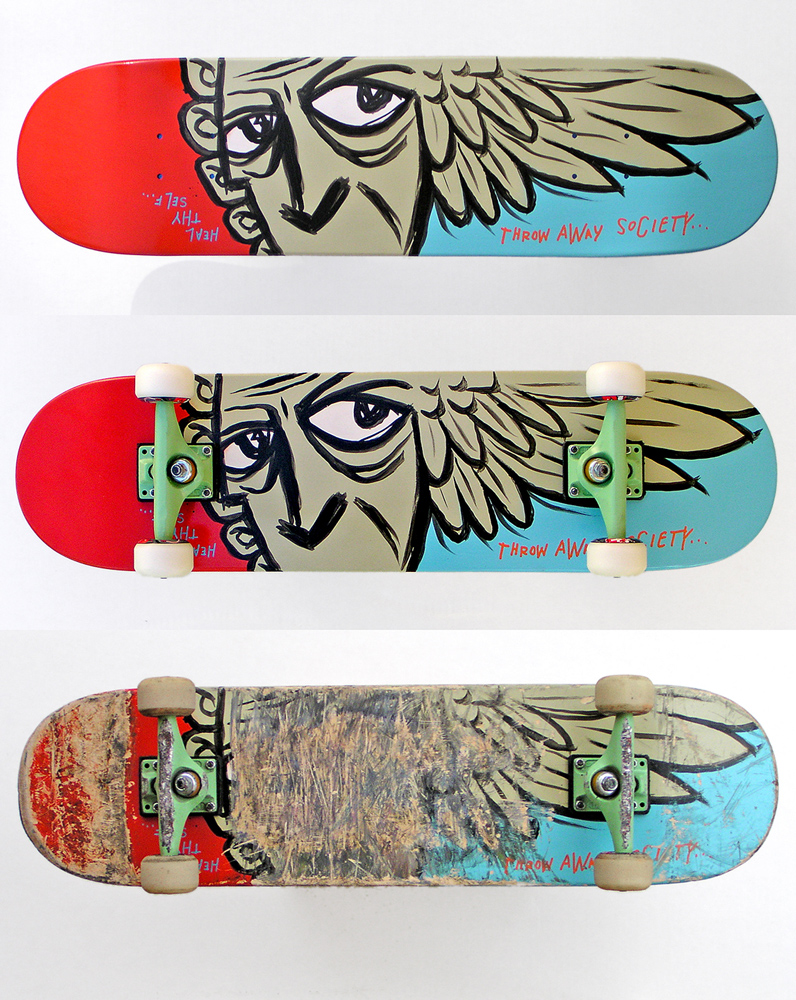
2004: Destroy Art!!! Hand painted deck “Throw Away Society,” set up, then skated.
Oddly enough, when I was starting Grape Netwerk and helping Ed Templeton start Toy Machine, thanks to my art friend Thomas Campbell I was in talks with Drake Jones and Chad Muska to ride for Grape Netwerk, but they wanted to know what the hell it was first, so I guess that was kind of hilarious, too. I was so convinced that I could start the best skateboard brand ever if I could just get a partner to do it with, with solid financial backing and riders that I was stoked on.
When I tried to make the move from World to Vision, Rocco would coach me through meetings with Dorfman. It was scary as crap, because here was this legendary industry mogul guy, and I called him out on his failings, because I knew I really didn’t want to start my brand with him, which allowed it to almost be like a joke. But, man, it was scary to stand up to someone like that. Around the third meeting, it turned into the opposite, when I challenged Dorfman and stood up to him and his claims… he got off on that, and then he wanted me to be part of the Select Distribution team. The lion secretly wanted to be bullied! Then Rocco was like, “Make sure you get this amount and ask for control of this.” He was negotiating me leaving World. He kept saying, “It’s never going to work. Talk to me in six months. You’ll want out—you can’t get through to Brad Dorfman.” Well, it didn’t work, so then we moved Toy Machine down to Foundation—and then it worked.
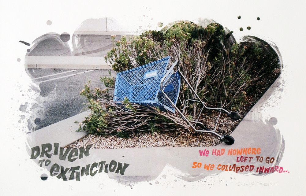
2010: Photo and stencil collage art print “Driven To Extinction.” Photo, design, & lettering by Ron Cameron
I don’t think people realize that Toy Machine could have involved Mike V under World Industries once again.
It was probably a good decision, because Mike could be a little high strung and passionate. But, I think he really needed to make that choice for himself. I questioned that, too, when I left Acme for World, because I was doing a thing with Jim that was starting to compete and butt heads with Rocco and World, then suddenly I was going over to the enemy camp! But, I will say Steve Rocco paid me properly, for the first time since I had ever worked inside the skateboard industry. He did take care of me financially. I’d never made anywhere near two thousand dollars per month before. I learned how job descriptions and agreements worked. “You’re going to do this and this, and I’m going to pay you this.” But still, it didn’t pan out, and I ended up feeling like I wasn’t doing anything but jumping on the trampoline and eating vegetarian food that Orb made in the World kitchen, goofing off with all of the [soon to be] Jackass guys.
But, I was getting paid correctly for the first time in my life, which gave me a little confidence.
***
Currently, Ron is in the midst of a massive creative reboot, including a robust radio program titled The Way Out, an apparel brand launch under his infamous “Nothing Is Cool” flag, and detailed website, chronicling his decades of design.
www.roncameron.net. Follow Ron on Facebook and Instagram @the_ron_cameron.
Follow Ron’s audio/visual project THE WAY OUT at www.thethewaywayoutout.com and mixcloud.com/roncameron/.
Keep up with Nothing Is Cool at nothingiscool.net and on Facebook.
In September of 2016, The Hundreds collaborated with both Blockhead Skateboards and Acme Skateboards. Read about the collaboration and where to get it HERE.

