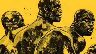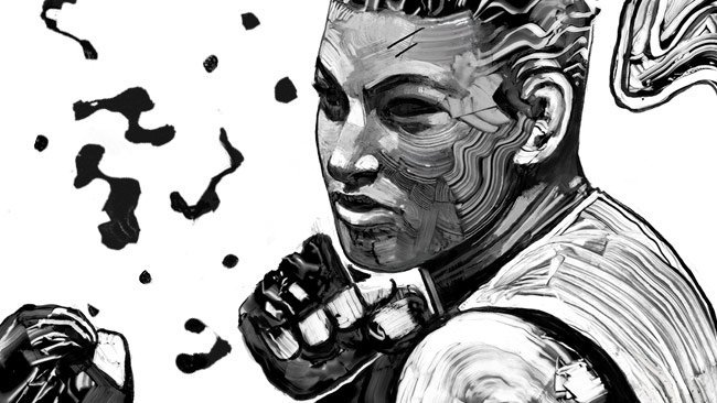
Detail of “200 TRIPTYCH,” 2016. Acrylic, Digital 18×24″.
With aggressive brushstrokes, hardened textures like weathered rock, and stark monotone colors, Gian Galang has developed the perfect style to portray a world of violence and physicality. From ultimate fighting and boxing, to comic book characters and basketball, Galang’s focus is the human form and what the body can do. His stripped-down colors and bare line work allow for a raw expression, honing in on anatomy and movement with dynamic surfaces. The style is a balance between illustration and fine art, one that’s as much about personal expression as it is about instant appeal.
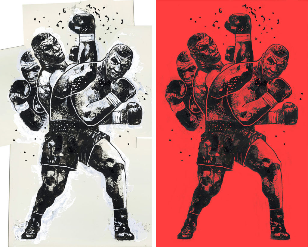
Work in progress detail and final of “IRON MIKE,” 2016. Acrylic, Digital 16×26″.
Galang came from the world of advertising, where getting a message across clearly without any messy pretense is the goal, and that direct sensibility shows. Through boutique advertising agencies, he found space to be creative and paint occasionally, but he didn’t find it fulfilling enough. So in his spare time, he continued working on personal projects that allowed him to find himself artistically.
As a lifelong practitioner of martial arts, he decided a few years ago to do a series focusing on the UFC championships. This first series was in full color with a Street Fighter motif, with the style hewing closely along the lines of his passion for video game and comic book art. And it proved popular with viewers, plugging him into an active audience, where his work grew popular on Reddit.
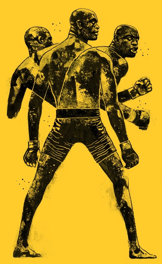
“SPIDER,” 2016.”Acrylic, Digital, 18×30″. Read the feature article on Vice Fightland.
Soon VICE’s Fightland wrote a piece about the series and asked him to do illustrations for the site, an ongoing gig that would prove essential to his development. “I really discovered this style with Fightland, where I was doing a lot more experimental stuff,” he says over Skype from his home in Brooklyn. “It was a locked in subject matter that I already knew about. I would experiment with different styles and my deadlines kept me working quickly and not thinking too much. Who’s fighting next? I’ll paint them.”
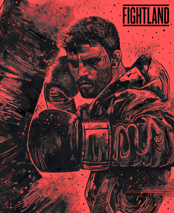
“NATURAL BORN KILLER, 2015. Acrylic, Digital 16×20”. For Fightland’s Carlos Condit feature.
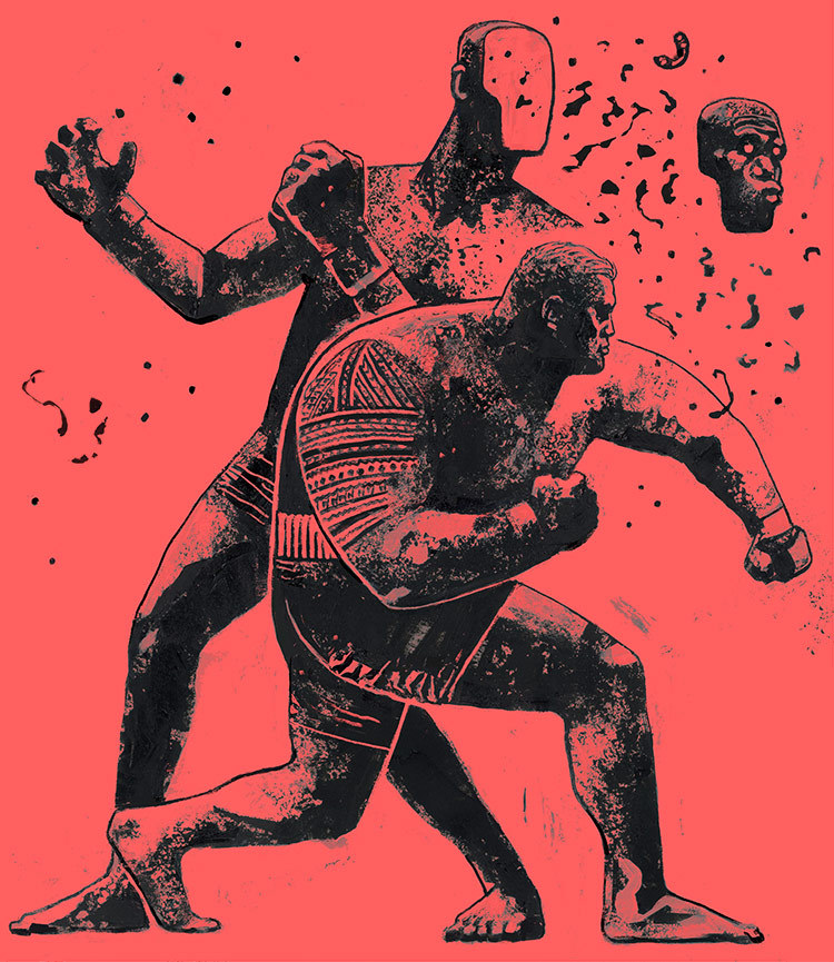
“SUPER SAMOAN,” 2016. Acrylic, Digital, 20×24″. For Vice Fightland.
“I got to a place where I could be very expressive, especially when the subject matter is action or violence, which loans itself to my gritty style. With monotone, I can really focus on movement and texture without being bogged down by subtle tones and blending. The more color and dimension I add, the more it just looks like a regular painting.”
While he’s found momentum with his current style, which is quite distinct and easily identifiable—somewhere between Frank Miller and WK Interact—Galang is working on unreleased pieces that experiment with more color but continue a close dialogue with the graphic inspirations that his current work is rooted in. And he hopes to eventually do some cover runs for comic books.
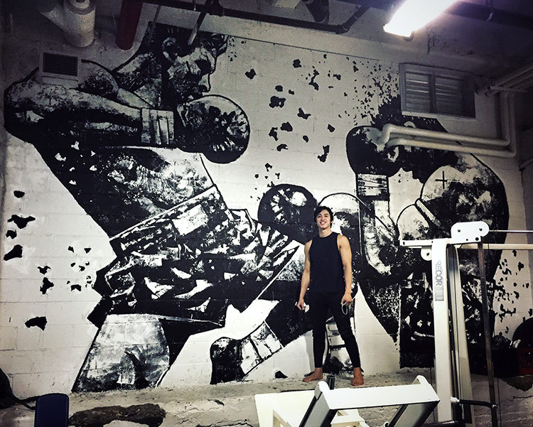
Gian Galang in front of a mural he painted for New York City’s Five Points Academy.
Galang’s process is to use black and white acrylic on paper that’s about 2 x 3 feet, painting each body separately and then combining them in photoshop, where he adds color and cleans the paintings up. “I discovered a lot of tools when I got hired to do murals,” he explains. “One of my biggest concerns was how to get the texture on that big scale. I found different, bigger rollers; experimented with ripped up cleaning sponges; putting knives, which give you uncertain textures; even crumpled aluminum foil, which I dip in paint and dab onto the piece. I use that on paper now, too.”
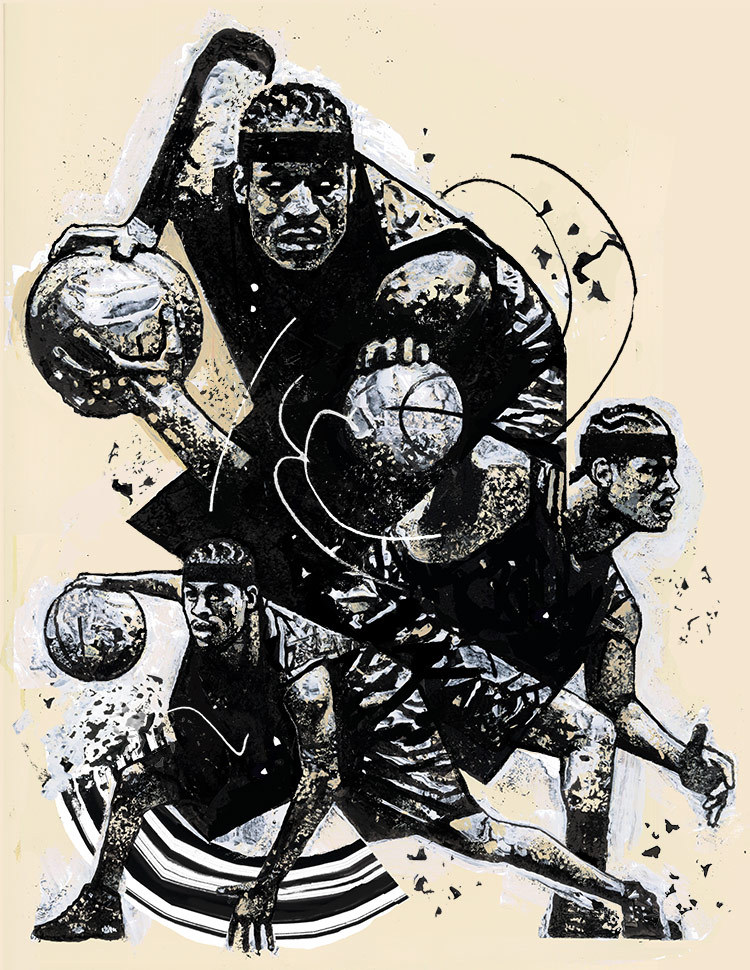
“CROSSOVER,” 2018. Artwork for the Reebok/Allen Iverson Answer IV Royal Purple release.
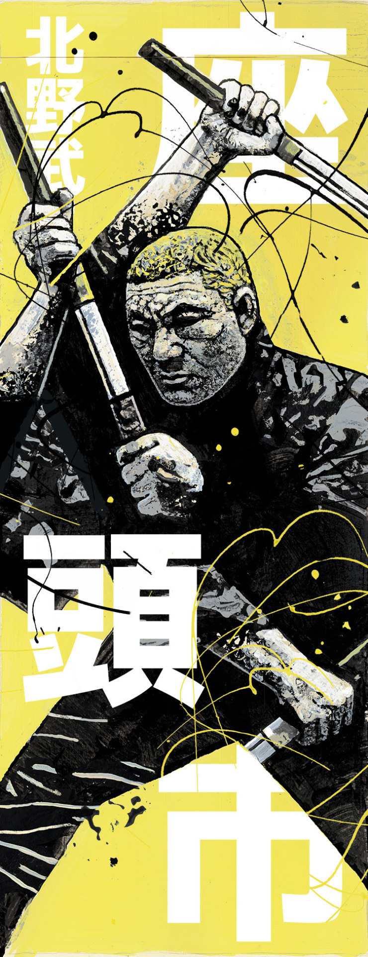
“Zatoichi Bootleg Poster,” 2017. Acrylic, Digital 12×31″. Prints here.
Galang credits a lot of his inspiration to painter George Pratt, a teacher of his from Virginia Commonwealth University where he studied illustration and graphic design. “[George is] always exploring new techniques and trying new mediums, stressing the need to be fresh.” Galang grew up in Virginia, where he moved when he was ten. Before that, he lived in Hong Kong where his mother worked after leaving the Philippines. He moved to New York about 10 years ago to work in the ad world, soon joining the prestigious Wieden + Kennedy 12 in its fifth year and working at award-winning agency Anomaly NYC.

