
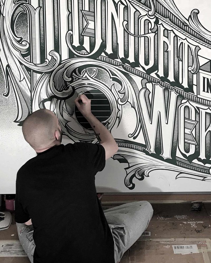
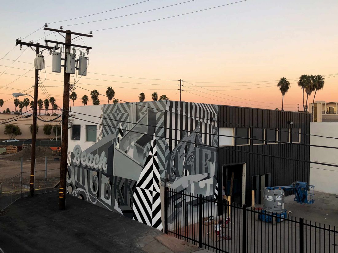
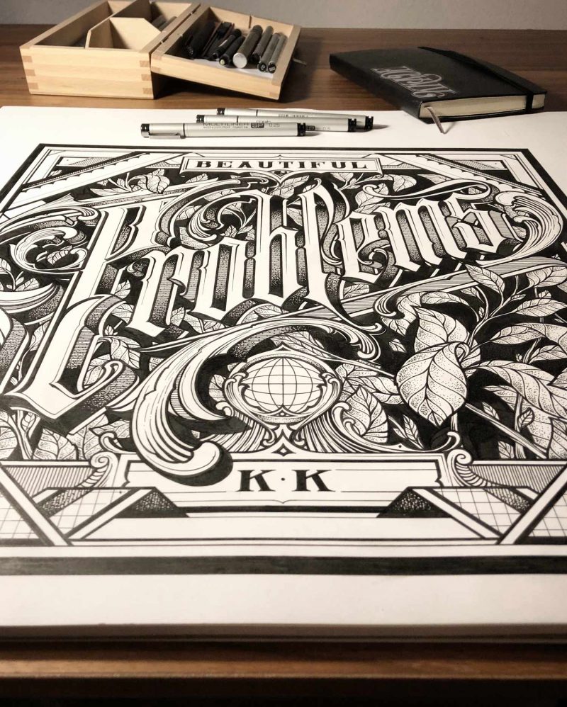
Bern, Switzerland-native KKADE utilizes exceptional talent and artistry in his approach to lettering. His distinct style of typography features delicate lines with bold strokes and he translates this beautifully into both his professional design work and murals painted on walls worldwide. In art school, he developed an appreciation for the intricate geometry and detail of art deco and baroque, in turn inspiring his own very modern aesthetic.
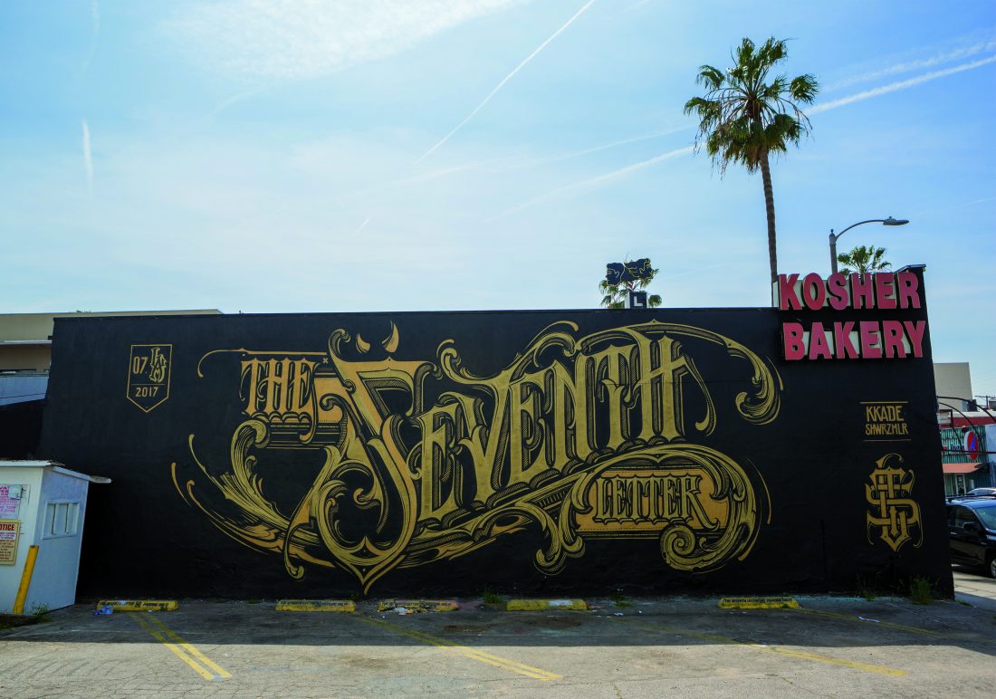
In 2015, KKADE met The Seventh Letter crew and after a few design and exhibit projects together, he made their rank and file. His solo exhibit, Broken Leaders, premiered at ComplexCon in 2018 along with a killer capsule collection of clothing and accessories he designed in collaboration with The Seventh Letter. KKADE is a natural, with a love for tradition and the ambition to break new ground in technique. Exhibiting at events like the 2018 Design Week Portland in Oregon, KKADE transcends his medium by creating designs for album covers, streetwear, niche corporate logos, and collaborating on murals with international graffiti writers.
Reimagining calligraphy through his own lens, he combines his contemporary influences and progressive ideas to create exquisite experiences with letters. While graphic design thrives around the world, KKADE brings his own brilliant take that attracts eyes with sophistication and street skills.
I spoke with him about his influences and how he’s successfully taken his lettering from the street into his creative graphic design work at large.
TRINA CALDERÓN: How did you discover graffiti? And why did you fall in love with it?
KKADE: From Backspin Magazine, a graffiti magazine from a friend in school. I fell in love that day, and after, I started drawing every day and I never stopped. I can’t describe exactly why I fell in love with it, but it’s probably the explanation for my fascination and passion.
I started in 1999 with classic graffiti. [By that] I mean, classic style lettering, bombing, and tagging. After twenty years, I’m working now more into [other styles of] lettering, classic typography and graphic artworks. The change came slowly, and this is also the reason why there’s still graffiti aspects in my lettering work.
What’s the graffiti scene like in Bern?
We have a pretty big and good scene out here. In the graffiti scene, you can find high level [talent] and huge diversity. I am sure this is also because we had, back in the days, a lot of writers who pushed the level pretty high. People like DARE, TOAST, SMASH 137 or KESY are worldwide graffiti pioneers, and they all come from the small country of Switzerland.
I think this is very good to keep a high level, in this case, younger artist have a good competition and a high standard. In the typography or graphic scene, it’s quite the same. We always had a lot of good graphic designers and everything. I probably just need to say Helvetica.
I fell in love that day, and after, I started drawing every day and I never stopped.
You’re involved in an art collective called Schwarzmaler, what’s that about?
Schwarzmaler is an artist collective and it’s in the process of becoming an official art and design agency. We developed it after [working on] years of projects together, from classic graffiti sessions to commercial festival artworks or even installations for events. We have members like MOWER, who pushes the graffiti part more than the commercial, and people like WES21 and ONUR, who are more into classic painting and mural works.
We always had that mix, which is good for the exchange and inspiration. And we are close friends, making the whole thing for me even more familiar and important.
What part of graffiti culture influences your graphic design aesthetic?
Well, graffiti is lettering. I probably did, in some way, a step back to the roots of the letters but tried to keep graffiti elements. I think the whole freedom of graffiti was the best influence for an element like classic typography. This kind of art has sometimes a bit more strict rules and because of my background I break them probably easier than a classic graphic designer.
Did you always know you wanted to have a career as a graphic designer? Was it natural or did something in particular inspire you?
When I started doing graffiti, I didn’t expect that I was going to be a graphic designer. But because I did graffiti, I explored all the other aspects in design and art, and it was clear to me to do something in this area. I joined art school and I that was my way into graphic design.
What was definitely clear to me was that I always wanted to be self-employed and do my own thing. After my apprenticeship in graphic design, I worked for 2 years for Scott Sports in Switzerland, and there I built my own business up, step by step. I even started to do flyers and poster for local parties during my apprenticeship, so that grew and I became more and more requested for artworks.
What artists are you inspired by? Which ones challenge you?
There’s a lot, of course. I have inspiration in very different sections of art. First, probably Alfons Mucha. His style and feeling for the ornament work is still outstanding and untouchable. Then also people like David Smith, Aaron Horkey, Ken Taylor, Ben Johnston or Tobias Saul. They’re outstanding and massively skilled artists.
Your line style is very old school. In a sense, it’s traditional but with a savvy aesthetic you’ve brought to it. What’s the evolution of this part of your style?
Yes it is, I have this traditional aspect. I have a huge respect for the old detailed and fully skilled work from the art deco or baroque time. The artists spent so much effort and precision. You really can see the love and passion. I try to borrow from this aspect.
For me, it is also the most attractive part. I love to create complex works with a smart solution in it. I love to go into outlines and details. My style is also [derived] from a big influence of the swiss graphic design.
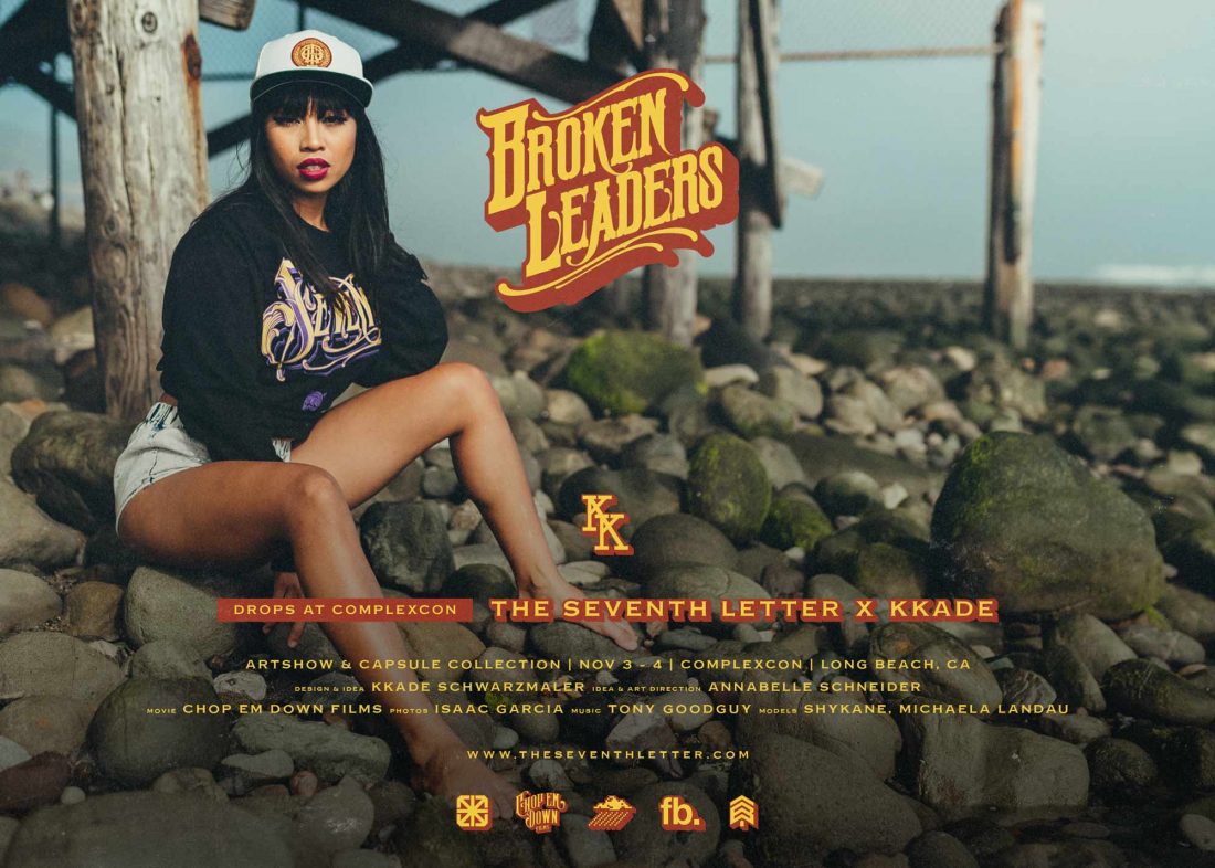
Tell me about the new work and capsule collection you premiered with The Seventh Letter at the Broken Leaders exhibit in ComplexCon last year.
Yes, the exhibition embraced paintings on canvas, smaller fine liner drawings on paper, and a capsule clothing collection with The Seventh Letter. The artworks were all created in the past two years. It is kind a salmagundi of my creative work. Some of the drawings are templates for graphic designs, some of them are just free works.
How did the capsule collection develop and what was your intention with your designs for the various pieces?
For me it is always important to give a red line throughout the whole collection. It should have a connection to each other, but they also should be different enough to create good diversity. I tried to gave it a small dramaturgy.. I started also with the 3 main designs and worked out from there. But of course, it was a huge process, I also changed or deleted a lot while in process. The content is on the first look sometimes a bit dark, but there is always a positive aspect in it. You can say there is always a kind of a solution integrated.
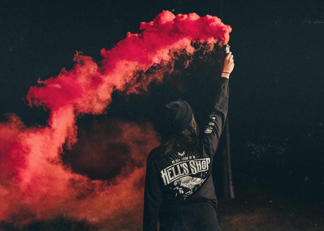
For an example, for [the slogans] “We been living up in Hell’s Shop” and “Join My Militia,” the intention, in short, was to create clothing for all the people out there who hustle, struggle, fight and believe in their work. I think when we all stay together, unite and learn from each other, we can do everything.
***