
When you hear the word “Playboy,” what do you think of? In Bobby Hundreds’ recent interview with Playboy Chief Creative Officer and heir to the throne Cooper Hefner, he wrote: “Perhaps it means tawdry centerfolds, the universally recognized bunny logo, or The Girls Next Door reality show. Maybe it means Hugh Hefner in a bathrobe, dreamlike parties in the grotto at the foot of the Playboy Mansion. To some, who read the magazine ‘for the articles,’ Playboy means world-class editorial, high-profile interviews, and literary power.”
However, the truly iconic image that most clearly comes to mind is the Playboy logo itself. It is one of the most popular company logos to date, with The New York Times declaring that “Playboy’s logo is one of the most recognizable in the world, along with those of Apple and Nike.” While other major corporations often rebrand and redesign, Playboy’s logo has been the driving symbol of the company’s corporate image for over sixty five years.
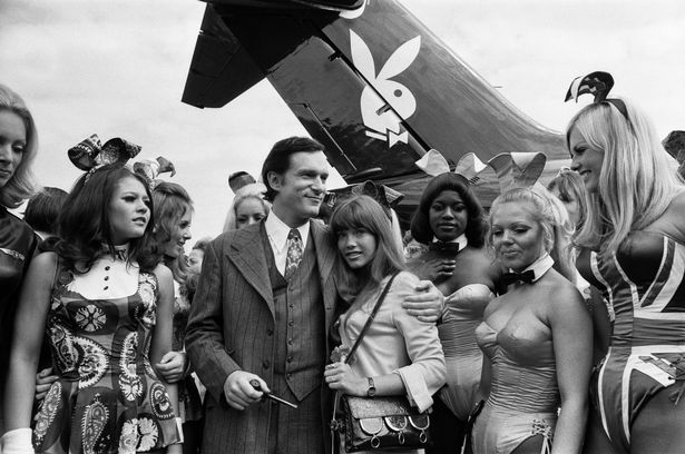
Hugh Hefner in 1970. His private jet prominently displayed the Playboy bunny logo. Photo: mirror.co.uk
The side profile of a simple black and white bunny with a necktie was created by the graphic illustrator Art Paul, who acted as Playboy’s art director for 29 years. Hugh Hefner hired Paul—one of his first ever employees—to design the first edition magazine cover and company logo. At this time, Paul had never had a permanent position with a corporation; he was only 28 years old and had been working as a freelance artist in Chicago. After being tasked to create a design for Playboy, Paul sketched his image for Hefner in under ten minutes, saying in 1994, “If I had known how famous that trademark was to become, I would have taken more time with it—and it probably wouldn’t have turned out as well as it did.” The image was meant to embody the prestige and sexiness that Playboy wanted to convey, and it surpassed all expectations as it was soon plastered everywhere spanning from each Playboy magazine cover to clothing items and merchandise to Hefner’s own private jet. The logo is everything a corporate image should be: eye-catching, recognizable, and completely unique.
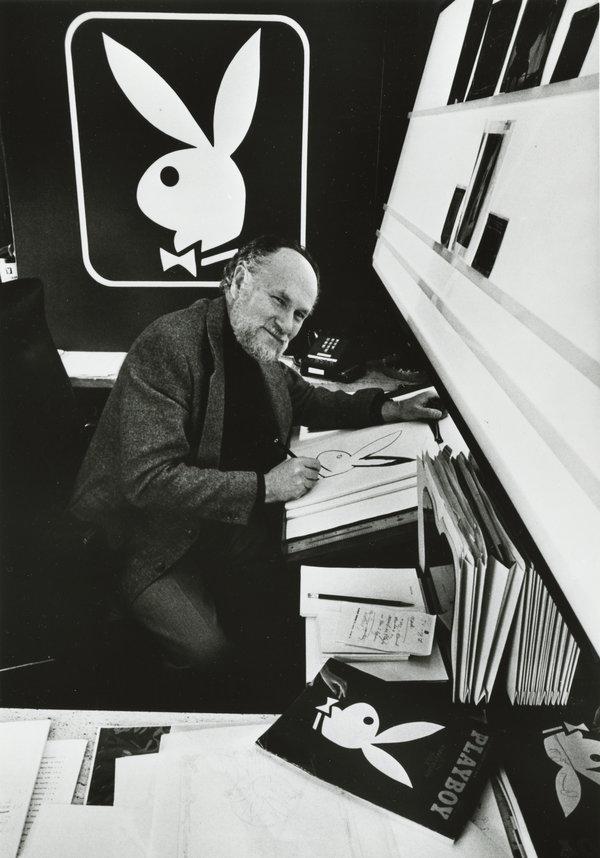
Art Paul. Photo: nytimes.com
“If I had known how famous [the Playboy logo would] become, I would have taken more time with it—and it probably wouldn’t have turned out as well as it did.” -Art Paul
So why was a rabbit chosen to become the embodiment of Playboy Magazine? In the words of Hugh Hefner himself, “The rabbit, the bunny, in America has a sexual meaning; and I chose it because it’s a fresh animal, shy, vivacious, jumping—sexy.” The tuxedo bowtie simply adds to the fact that although Playboy in its height was simply known as a “nude magazine,” there is still an air of class, professionalism, and mystique in the presentation. The company redefined what it meant to be a modern gentleman, encouraging a sophisticated life defined by free expression, fancy cocktails, and a love for jazz; the magazine’s riveting articles and interviews about social issues promoted the new age of American manhood to be intellectual and informed. Even today, each magazine cover contains some sort of image of the Playboy bunny, hidden in clever, mysterious ways for readers to find. Clearly the logo was created with the right values in mind, because Playboy has remained utterly committed to the symbol and has not changed the design at all since its conception in 1953, only reiterating the true significance of the logo and its effectiveness on Playboy as a corporation.
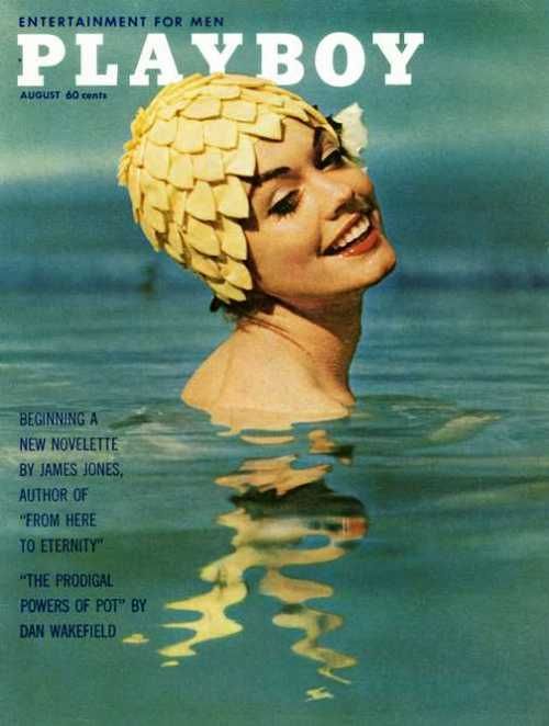
Look closely and you can spot the hidden Playboy bunny in this ’50s era cover.
***