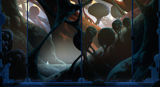
Even if you could care less about Black Sabbath or Sammy Hagar (Google them if needed), chances are you’ve come across the Heavy Metal movie if you have even a limited passion for visual art. It was a feat of animation from the dark days of 1981, although admittedly juvenile. Even for the younger bucks among us, the stylistic tropes and patterns from it have been passed on through the ages via popular references, a sequel from this very century, and, of course, by way of memes. The magazine art it was rooted in also continues to be published to this very day. Online, even.
It’s difficult not to align the artwork of Kilian Eng with the visual language of that world. His science fiction and fantasy leanings, the surreal landscapes, and the heroes/villains populating much of it all overtly reference that universe. He has, in fact, completed the circle by creating work for that very publication.
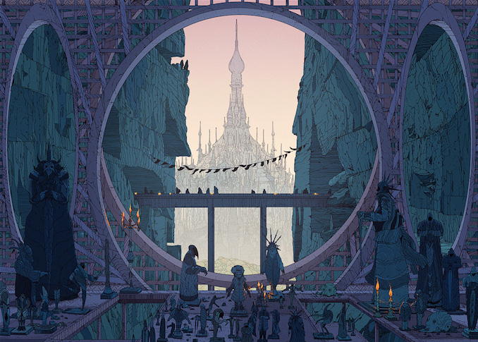
But it’s simply not fair to limit the Swedish graphic artist and illustrator to that genre or lineage. Or any, for that matter. Influences aside (perceived or real), he inhabits a space anybody would be proud to call their own. Even if it were rooted in the land of long, permed hair and endless guitar solos, there’s not many that can own that. Regardless of where it starts though, it brings us to entirely new realms.
His craftwork alone is inspiring. Each piece is packed with a level of density rarely rivaled in an age of information overload. Even as still images, there’s enough going on in each to stop you dead in your scrolling.
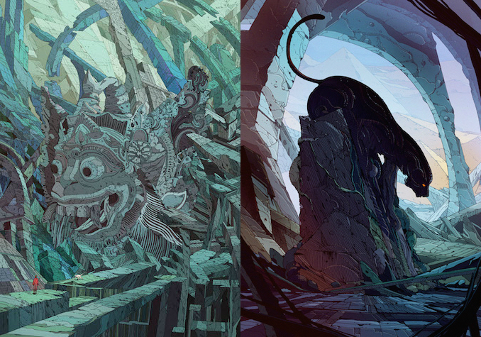
The linework is so detailed that entire objects can be defined by it, packed with varying patterns and thickness. Often, this plays directly into his penchant for depth, with foreground objects relying on untold layers of black lines to pull them away from distant scenery. As your eye drifts towards horizon, that linework fades in contrast, bleeding away into more subtle colors until disappearing entirely.
His use of color is also deceptively compact, with subtle shades crossing an entire object without drawing attention to itself. Sometimes those colors are broken up by the linework, other times fading through a gradient behind them, and many times both in concert. Those color schemes also work in tandem for creating scale, with each color grouping designating objects and ranges.
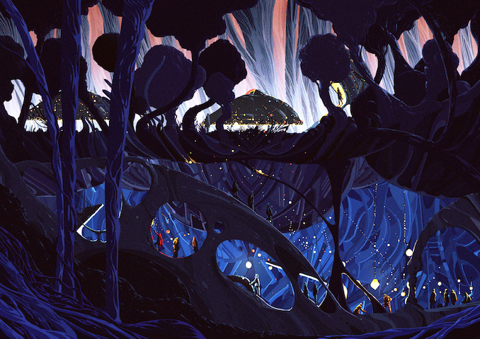
While he circles back to a number of recurring stylistic themes, he also rarely finds himself stuck in just one. Some work is such a riotous patchwork of lines and blocks of color, that it creates a monolithic pattern with little to no focal point, an aesthetic that could find itself at home on wallpaper. Other times, the close pairing of unexpected colors and contrasts are so bold that it jars a viewer into focus. Linework and color are also occasionally abandoned altogether. And while his overwhelming trait leans towards complexity, he opts for minimalism in a select few cases. It’s as if he anticipates when you might think you’re beginning to know what to expect, and then purposefully throws you off path.
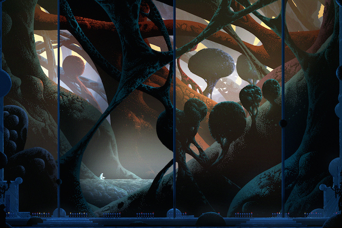
As for subject matter, the more outlandish the better. That much can be said for sure. Odd plant life stretches across gravity-defying landscapes, living creatures appear within stone, and the vacuum of space becomes inhabitable for civilization. His commercial work for movies, television, and musicians grounds him a bit, but never entirely. And it’s frequently as characteristically surprising and skillful as his personal work.
Inspiration is only as important as an artist makes it. Where they go from that starting point is what defines them. The individual effort, talent, and creativity they bring to the page (or screen) is where the real value lies. Despite similarities to a genre–coincidental or intentional–they can find new breeds of fans from all over, regardless of their interest in an artist’s most obvious reference point. And Eng is not literal in most of his influences. The work stands as his own.
***
Photos via Kilian Eng’s Tumblr. Follow his work on Instagram @KilianEng.

