FREE SHIPPING ON ORDERS $150 AND OVER (U.S. DOMESTIC ONLY)

Your cart

Your cart is empty

I'LL SLEEP WHEN I'M DEAD :: The Sob Story Interview

I'LL SLEEP WHEN I'M DEAD :: The Sob Story Interview

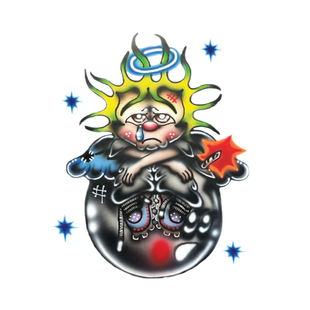
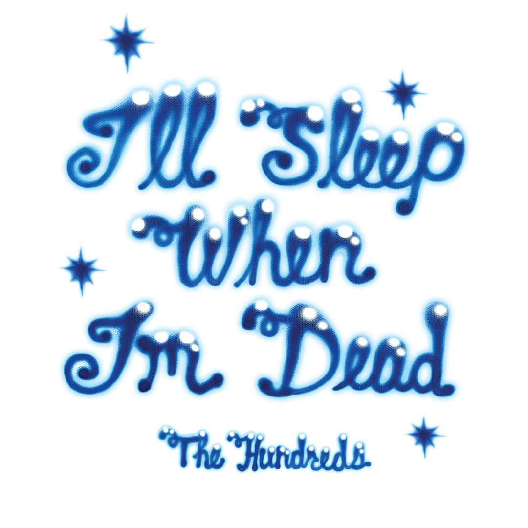
Earlier this year, I remember walking over to our graphic designer’s desk to ask a question. His cubicle had a U-shaped desk built in that took up most of the space so there wasn’t much room to make the cubicle his when he first joined the team, but he tried anyway. The right side of the desk had binders categorized by different seasonal collections, all stacked on top of each other. Boxes filled with samples took up the space underneath his desk and most of his decorations were pinned onto the corkboard that leaned against the wall on the left-hand side above the desk. He brought a portable outdoor chair with a small footrest for his visitors to sit when they came to visit in between work breaks and he stacked art design books and VHS tapes neatly in front of the pin corkboard. But when I walked over this time, there was something new that caught my eye. It was two airbrushed canvases centered on the middle desk, featuring a character slumped over a cartoon iteration of Adam Bomb with the words, “I’ll Sleep When I’m Dead.” 

As a natural insomniac, I’ve said this phrase countless times. I took a moment to stare at it, trying to figure out why this piece was bringing me peace until I figured it out: it was the airbrushed character, with the airbrush pushing familiarity to a piece I had never seen before, almost as if it belonged to my memories.

“Where did you get that?” I asked him. 

“It’s from Sob Story, he created a graphic for the Winter Collection,” he responded. (Since then, we’ve had an office move where I jumped to claim the canvases for the digital office. Sorry Glen!)

In 2024, the Winter Collection is treated much differently due to climate changes. Los Angeles boasts 70-80 degree weather throughout November, and the collections have to adapt to the times, weather, and monocultures considered. Winter collections now are released later, and as far as design and trends are concerned, we find ourselves yearning for what used to be, but we’re forced to move on with the times and adapt.

Things change but one thing remains the same: the rooted nostalgia for the idyllic moments of our youth. Sob Story’s artwork captures this feeling, acting as a bridge between the visuals that define our youth and contemporary fine art.

I caught up with the Los Angeles artist to talk about the collaborative graphic included in the Winter 2024 Collection, his signature style, and the emotions conveyed throughout his artwork. Read the interview below and shop the Dead Sleep T-Shirt by Sob Story here and and the Dead Sleep Snapback here

Sandy Mosqueda: How’s your day going today?

Sob Story: My day is going great, thanks for asking. Things tend to get busy towards the end of the year, busy is good though. Most days I’m constantly switching back and forth between administrative work and the nitty gritty hands-on stuff.

I’m glad to have the opportunity to interview you, the piece you made for the Winter 2024 Collection is in my office – I see it every day! You have a group of characters that you use throughout your art. Does the crew have a name?

The pleasure is all mine, I painted this particular piece last winter and I’ve been really excited to end the year off with this collaboration. 

In regards to the characters, I can’t really say I have a name for the crew, now that I’m thinking about it there really should be. I tend to label them as “FRIENDS” whenever I’m cataloging on my online shop/archives. 

I read somewhere that the palette you work in typically matches your characters’ behaviors. Does that mean that each of your characters has a background profile and story? If so, what’s the story behind the character you used in the Winter 2024 graphic?

My palette can be a bit bright and obnoxious. And in truth, it used to be a crutch when I was trying to translate it into clothing. I grew up in rave/punk culture so it kind of went hand-in-hand at first but I’ve been trying to expand into different motifs as of lately.

The colors are definitely a reflection of my experiences through all the characters that I’ve met in real life.

The character I used for this design was actually the first attempt to pivot into a less aggressive style and what I mean by that is simply using more skin tones and shading rather than bold lines, bright yellows, and reds. My palette started looking too “circus” and I wanted to challenge myself out of that.

Throughout the year I had the opportunity to do other collaborations with brands that ended up releasing sooner than this one however; this character for The Hundreds definitely has a special spot in my heart due to it being the first character after having that realization. The realization was that the palettes I was using weren’t always aligned with the objective.

The artwork originally came with the phrase, “I’ll sleep when I’m dead”. Why was that phrase chosen when illustrating this graphic?

Honestly, it was requested of me to include the quote by the creative team. I was really hyped on it either way because it’s something I definitely resonate with. I don’t want to say I suffer from it but I’ve dealt with insomnia most of my life. I’ve been airbrushing for 5 years and it’s the best medium I’ve ever picked up. It brings that balance I never had before when those restless moments come. Early into my freelancing career, I started taking on crazy last-minute jobs–90+ hand-painted units in 7 days for example– and I would get it done. I have to say yes to most jobs that land on my lap, it’s a rush, it’s painful, and my loved ones hate it but it’s the life I chose. “I’ll Sleep When I’m Dead” 

There’s a lot of emotion conveyed through the expressions of your characters. Do you find that they take on parts of your own experiences and/or emotions, or do they exist as separate entities? 

It’s safe to say the characters and emotions mirror moments in my life. I used to be very anxious and socially awkward, I still am at times but not how I used to be. I grew up in the Inland Empire in Southern California, and some areas I lived in were extremely conservative, to say the least. Being a person of color in very racist cities, I grew up with an angst that I didn’t understand at the time. In hindsight I understand why I felt the way I did: there wasn’t much space for “freaks” and creatives. Fast forward. 

In my adult life, I’ve been fortunate enough to end up in communities of people who see the world the way I see it. That’s basically when I started to really hone into my style, I was able to transfer all those past aggressions into something fun and relatable to viewers. Most people who grew up in similar environments carry all that weight most of their lives and I realize being able to express through paint is a blessing. It’s a choice not to live an angry life and I chose to make it fun.

Your artwork feels very nostalgic and underground. It feels like the random fire artwork you’d stumble across at a swap meet or at a sticker vending machine. Was this always your signature style and how has it evolved?

From the very start, I always wanted to make stuff like the classic “Calvin Peeing” sticker that you would see on almost every car window back in the day, the pink “Happy Bunny” stickers that always had something rude to say or even Garbage Pail Kids. I’m sure there’s still stuff like that out there, but it’s not ALL OVER the place like it used to be. Answering this question and now all I can think about is making more stickers!

Now looking back, I remember these sticker vending machines had similar-looking characters who also had melancholy facial expressions. Why do you think the sad and bummed-out characters resonate so well over time?

In my opinion, I think it all started with oldies music. Artists like Barbara Mason, Sunny & The Sunliners, etc.  If you know about Chicano culture you know we love our tear-jerkers and love songs. We had magazines like Teen Angels that highlighted prison art/love letters, we had radio icons like Art Laboe broadcasting the public voice, allowing them to send dedications live on the air. Down to the days when things were 100% analog and people were simply making mixtapes at home. This theme is so everlasting because it’s so human and inescapable. 

You do quite a bit of artwork for albums and music covers. How do you decide on the art that’s going to be featured?

I’m very intertwined with rave and warehouse culture in LA. Most gigs I’ve landed within the music world have been a product of those relationships. Shout out to Neurotek, Breach Station, and Laura Records. Meeting these groups of people opened up a lot of doors for me and although I don’t produce or DJ, I love music and it means a lot to be able to own space in a world the jobs mostly fall onto my lap and I’ve gotten to work with labels I grew up idolizing. Most of the time I’m told by clients that they discovered my work via rave flyers or my involvement with that culture in general.

What does it mean to you to have a collaborative graphic with The Hundreds?

I was hoping this question would come up. It means the world to me! I grew up poor, moving from place to place, we didn’t have much, and material things like new technology or clothes didn’t matter. I wouldn’t change my come up for anything in the world. Getting into skating and graffiti in my youth during the 2000s definitely boosted my exposure to cool shit.  It was a special moment in time for EVERYTHING, especially streetwear. I always wanted it but I couldn’t afford it, no biggie. 

It feels like this was destiny or always meant to be, but this is the product of hard work and consistency. I’ll sleep when I’m dead!

If you had to pick 3 songs that feel like this collaboration artwork, what would they be?

The Everly Brothers- “Sleepless Nights”

? and The Mysterians- “ 96 Tears”

Lou Reed – “Perfect Day”

Previous post
Next post