Normally, this is where I’d flex my eloquence and set the scene for what you’re about to read, but I honestly can’t word it any better than BRICK Magazine’s Founder and Creative Director, Hayley Louisa Brown, did in her editor’s letter for BRICK – Edition One. So, instead of embarrassing myself by trying, I’ll hand it straight over to Hayley:
As a hip-hop head myself, I was first drawn in once I started hearing whispers about BRICK Magazine in London’s underbelly. In further demand of my attention, I set eyes upon that fluorescent Pantone 802 C at the core of BRICK’s visual identity whilst scrolling through Instagram one evening. From that moment on, I knew it was about to be lit. Fast forward a few weeks – I linked up with Hayley to gain insight into how this 246-page, bi-annual, juggernaut came to be and how it’s about to reset the standard of how hip-hop is represented today.
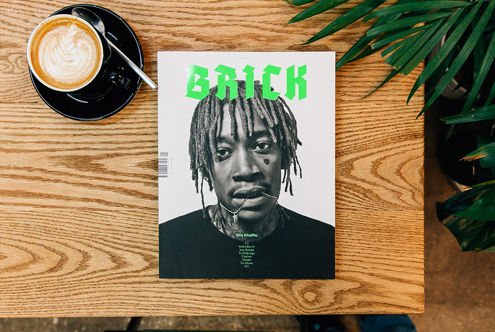
TOM WINSLADE: The thing that first gained my interest in BRICK was the clean cut design and branding behind it. Visually, it’s instantly captivating. But how would you describe the guts of the magazine, both content and concept, to someone that hasn’t seen anything BRICK-related yet?
HAYLEY LOUISA BROWN: For me, it was all about looking at hip-hop as a culture rather than just the music. I feel like a lot of the time when you’re reading an article in a music magazine, especially when it’s on a new artist, it’s almost like reading their Wikipedia page. Perhaps 300 words, spread across a couple of pages — and you don’t really learn anything, you know? So with BRICK, I wanted everything you read to be interesting, with a story or message at its core. I always wanted it to be about more than just the music. For example, there’s a whole section of the magazine dedicated to essays on hip-hop culture. I once read a book called Born To Use Mics, which is a collection of intellectual essays written around Nas’ Illmatic and all the sociological issues that broached in his songs, which really opened my eyes to hip-hop being a credible, academic subject. So in BRICK, we’ve got a guy called Nick Schonberger, who is one of the editors at Complex in New York, and also happens to be an art historian of sorts – and he’s doing an ongoing essay series for us on body modification and tattooing in hip-hop. I feel like that’s just one example of an interesting branch of the culture that we can look at. There are all these side topics that relate back to and influence hip-hop as a whole, so yeah, it’s definitely all about documenting the broader picture.
There are so many stereotypes and cliches surrounding hip-hop, which often trickle down into how it’s presented across all forms of media. Was it your intention to break away from those dated ideas and present the genre in a way that better represents the current state of hip-hop?
Absolutely. It’s always been about more than just the music, but especially now, when hip-hop is so relevant and has infiltrated all these other areas, it was about the magazine representing that properly, as I don’t think there’s another platform that currently does. I think that was also a big decision behind the design of the magazine, where we didn’t want it to become something that looked like everything else. I love the ’90s magazines like XXL and The Source — and I was inspired by the iconic imagery that you’d find in them back then. For example, you could take that Shawn Mortensen image of Tupac in the strait-jacket and put in on a cover today because it’s just that timeless. And it’s a shame, because I feel like that whole approach to how hip-hop was originally portrayed was lost in the early ’00s when the music shifted and became more commercial. I think that’s where it became less about the individual personalities and is also where a lot of the common stereotypes came from. With BRICK, I want to get back to that notion of documenting timeless moments in hip-hop history, whilst also delving into these huge personalities that embody it, rather than focusing on promoting someone’s upcoming tour or mixtape release.
It’s like what you were saying about the ’90s magazines and how they almost act as a time capsule of where hip-hop was at then, BRICK gives an honest account of where the genre is currently at and documents how the culture has evolved to date...
I hope so. I mean, we don’t have any album reviews or anything like that in there because, to me, that is irrelevant. I hate it when I get a music magazine and the back third is entirely reviews because music is so personal. Our Editor-in-Chief, Grant Brydon, just wrote a really great piece for RWD on the new Kendrick album, where he basically said that he’s not going to review it as people should just take that record for the art that it is.
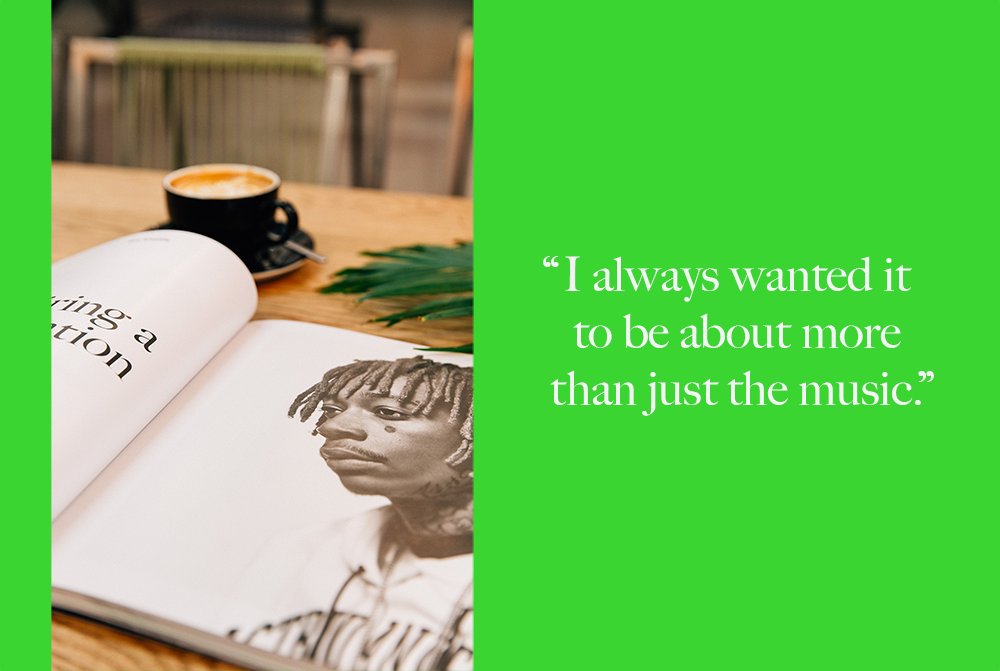
I’d say the design of the magazine certainly achieves its goal of breaking down preconceptions of what a hip-hop magazine, or more generally, what a music magazine should look like in 2015. Like you said, it’s instantly more inclusive of the culture’s diversity. Aside from what you’ve already covered, what else inspired the distinctly visual approach?
We just wanted to make it as contemporary as possible. Often, as a girl, I’ve found hip-hop magazines to be typically quite masculine. Not that it’s ever stopped me buying one, but I wanted BRICK to be something that wasn’t of that tone. Something super accessible, that literally anyone could pick up and want to read. I also love pictures, so I guess I just wanted to make something that looked nice and was full of photos, as well as having something worthwhile to say.
With your experience as a photographer who’s shot all sorts of hip-hop artists, from Kendrick to Nas, alongside tons of fashion work, was it kind of a no brainer to bring the two influences together in the form of BRICK?
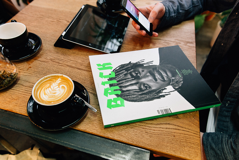
I feel like I’ve been really lucky in that, from doing fashion photography, I’ve met so many amazing people and have become familiar with some awesome photographers and their work. Music photography and fashion photography were two separate entities, but I now feel like music and fashion are so linked together, more than ever before. You’re seeing more and more musicians on the covers of fashion magazines, from all genres. So yeah, it was about bringing together the work of photographers that I think are amazing and saying, “Hey, can you do your thing, but with this hip-hop artist as the subject instead?” — and that’s pretty much how it all came together. For example, with Neil Bedford, who shot our cover with Wiz, he’s not a big hip-hop fan at all, and I think there’s something really great about that. In the nicest way, he doesn’t care that he’s shooting Wiz Khalifa or have any preconceived idea of how he should shoot him. He’s simply out to get the best photographs in his own style, capturing the personality of whoever he’s shooting. That’s what makes it interesting for me.
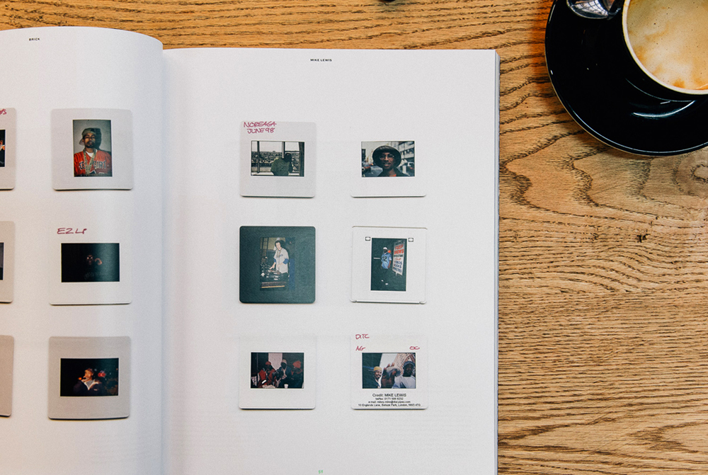
I’m personally super glad that BRICK has come to life as a magazine rather than simply another blog or website. Firstly, was it always going to be a physical publication and secondly, what’s your view on the value of print media in 2015?
I always wanted it to be printed in some capacity. When I first started out with the idea, it was just going to be a small zine, but the project kinda just grew and grew until it became this. I’m also a huge image hoarder and I’ve still got boxes of magazine pages and photos I collected when I was younger, and I guess I want BRICK to have that same effect on people. I just want people to value it and love it as an object. If you go on Tumblr, you can type in “Wiz Khalifa” and scroll through 5000 images of him, but there’s so much more value in something when it’s physical. It’s a completely different experience. I think it stems from being a photographer as well, because seeing your work in print is so much more rewarding than it being solely online.
I think it’s the notion that things are so throwaway on the Internet, or even in excess. It’s also the context in which an image is used that’s important. Like, you can go take an incredible photo and put it on Tumblr and get a million reblogs, and that’s cool, but it’s always going to have far more impact and weight behind it if it’s immortalized in print – as part of a thoughtful layout, with different design treatments setting the scene, or supporting text to embellish its meaning, you know?
Exactly. It’s more of a final product and it just makes sense, visually, when we’re looking to tell stories and create an experience in the way that BRICK intends to. It’s also an ownership thing too. Like you were saying about Tumblr, I’ve found my own photos on there before with all these notes on and I haven’t even posted it myself yet, let alone been credited for it. And I’m not so fussed about people knowing that I took a certain photo, that’s not the issue, it’s more that people simply don’t care. That’s what sucks. The image is so readily available that people simply don’t care. It devalues the whole thing and it just becomes this anonymous, disconnected entity. So yeah, it’s about getting away from all of that and going back to zoning out with a magazine in your own time, at your own pace. Something that you can pick up or put down whenever you like and come back to time and time again. That’s the experience I want people to have.
I can appreciate that. I can also appreciate it’s no easy task to pull something like BRICK together, especially weighing in at 246 pages for the first edition. What was the biggest challenge you faced whilst bringing it all to life?
Probably the very beginning stages, before we had anything in place – that idea of staring at a blank canvas. Although, as soon as we started getting other people involved and the ball started rolling, it all came together quite naturally. There were a few surreal moments, as we started to confirm people like Wiz, where it all started to become very real. We were almost in a little disbelief that people were trusting us and helping us to bring it to life like that. I think it was daunting for the design guys in the same way, as I originally went in with a whole bunch of references for how I wanted it to look. It wasn’t until we started applying those ideas to the first few stories that it really started to take shape. I’d go into the POST studios and sit down with the them as we’d go through twenty or so designs of the same page, trying to figure out exactly the direction we wanted to go in. As it’s a totally new thing, it wasn’t just the magazine layout, it was our entire identity.
Let’s talk hip-hop for a minute. Do you remember how you first developed an interest in the genre and what first pulled you in?
When I was younger, my older cousin, Becky, used to take me out in her car and she’d always have hip-hop CDs playing. I guess I just always liked it from then onwards, really. I remember The College Dropout coming out and totally blowing my mind. That’s one of my favourite albums of all time. But before that, 2001 by Dr. Dre. That’s probably the ultimate for me, and I imagine for a lot of other people. I still listen to that in full now, regularly. It still gets me just as excited.
I think that’s the marker of a classic hip-hop album, in my eyes. Something that’s relevant when it’s released, but also maintains that relevance one year, five years, or ten years later.
Yeah, for sure. I feel like there’s an element of nostalgia to it too. Taking me back to being that 13 year old kid in my cousin’s car, rapping, “It’s the motherfuckin’ D.R.E.” and thinking I was tough. That whole rebellious side of things. But yeah, for me, 2001 will always be one of the best ever.
2015 seems like as good a year as any to launch a hip-hop magazine with the sheer volume of albums being released by the biggest names in the genre, as well as the next generation coming through. Are there any records you’re particularly looking forward to, or have enjoyed this year thus far?
Well, obviously Kendrick’s new record has just come out and it’s amazing. I’ve been bumping that since its release and it’s just incredible. I love that it’s so G-Funk, and the interludes! That first one sounds like it’s straight out of a musical. There’s so much jazz influence throughout it too – I just feel like that whole record is very exciting. Oh, and the pictures — the pictures and artwork as a whole — I already knew it was going to be good as soon as I saw the visuals.
I imagine you probably have a hit list of people you’d love to feature in the magazine at some point. If so, who would be in the top 3?
For me personally, Frank Ocean, Mos Def, and probably Kanye. I’d also love to have Kendrick. I shot him a while ago when I was the hip-hop editor at Clash Magazine and it was the first time he’d come over to the UK. That was his first printed press over here and I shot and wrote the piece, which was really cool. I remember he had so much to say last time, so I’d love to have him write something for BRICK. Something special like that. Oh, and also Action Bronson. I want him to be my husband. He’s just wonderful.
With BRICK finally launching this month, after all of the hard work that yourself and the whole team has put in, it must be the best feeling to see it all come to life – but what’s the best experience you’ve had during the journey to get here?
As cliché as it sounds, probably going to the printers and seeing it in the flesh for the first time. Just seeing stacks and stacks of pages there was a moment in itself. It felt real before then, like when I looked through the final PDF for the first time, but seeing it in print was when it got really real.
And finally, what should people expect to find in Edition One? Firstly, who’s in there? But also, is there a particular story or article that you’re excited for people to read?
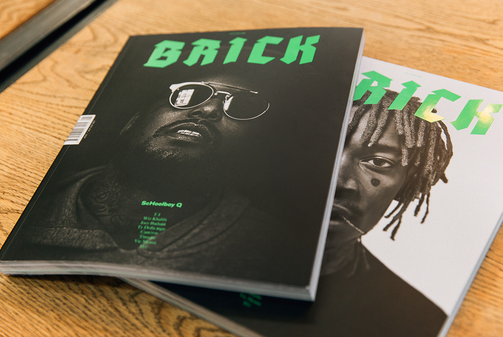
Well, we’ve got Wiz Khalifa, T.I, ScHoolboy Q, Joey Badass, Ty Dolla $ign, Cam’ron, Tinashe, Vic Mensa, YG — and we’ve covered a lot with each of them. There’s definitely plenty to read in there. For example, there’s a whole section on Atlanta that T.I features in, which also covers the younger talent coming out of that particular city, such as Father, Makonnen, etc. Then there’s the essay section I mentioned before that I’m particularly excited about. Back to when I was working at Clash, Matt Bennett, who was one of the editors, put me in touch with his friend Nina and she’s had the craziest life, ever. In a nutshell, she started a zine in Sheffield, and sent one out to LA, to which, Tupac was like, “Yeah, come interview me” — and she ended up working at Death Row Records. She was mentored by Suge Knight and pen pals with Tupac. In fact, one of the letters he wrote to her from prison is actually in our magazine. So yeah, I’m particularly excited for people to read all about that.

::
BRICK Magazine – Edition One is available to purchase online here, as well as from select retailers.

