
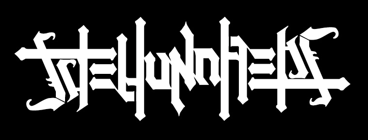
Over the years, I’ve found that some of my favorite graphics to do involve creative ways of custom lettering.. More specifically, when I get to work on some interesting symmetrical type designs and ambigrams (which can be read in reverse and/or upside down) for our line. This one’s just a straight-up symmetrical piece that we used for some t-shirts and sweatshirts years ago. Not so surprisingly, it reads “The Hundreds.”
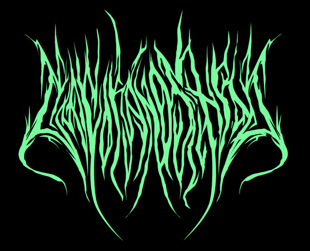
I drew up the following one for our La Coka Nostra collaboration a while back. The inspiration was drawn from death metal band lettering. I know it’s probably a little trickier to decipher, but “La Coka Nostra” is in there. Somewhere.
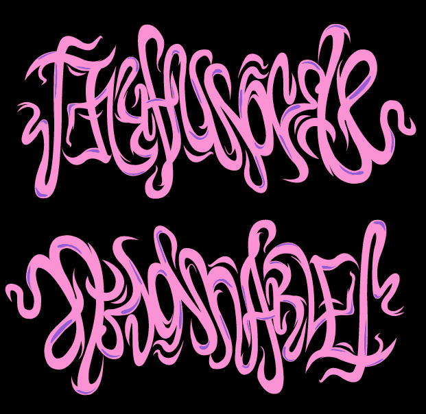
This collaboration piece actually never saw the light of day. I proposed it for a joint project we were working on with the sneaker shop Atmos Harlem. They weren’t so into it, maybe because they couldn’t tell that it reads “The Hundreds,” but when you flip it upside down, it reads “Atmos Harlem.”
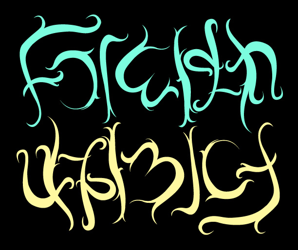
This one, however, DID make the cut. You may remember it, a recent collaboration with our friends at Foreign Family. It reads “Foreign,” but when turned upside down, “Family.”
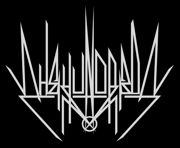
And here’s a super sneak peek at something I just wrapped up for an upcoming t-shirt later this year. The theme of this ambigram more closely follows the traditional Illuminati-type lettering. If you haven’t figured it out already, it reads “The Hundreds,” and stays exactly the same when read upside down. You don’t have to stand on your head or flip your laptop, just take my word for it.
by bobbyhundreds