Logos.
I’ve always been enamored with logos. The idea that a brand, or company, or even an individual, can encompass their entire being into one single icon. And not only that, the more basic and simplistic that logo is, the more profound the impact and memorability (yes, that’s an actual word).
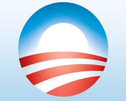
I don’t know which agency created the Obama logo, but that goes to show you.. perhaps the next leader of the free world has been summed up by probably the perfect icon to encapsulate all that he, and his candidacy, embodies. His surname whittled down to a simple “O,” the rising sun to indicate a new beginning, the usage of red/white/blue, the stripes resembling the wide American plains, the heartland. And just the fact that it’s a perfect circle, which is one of the most strategic logo shapes to work with.
I live in L.A., so every morning on my commute to work, I see Prius’s that have this concise logo emblazoned on their bumper. No mention of a name, or anything about the man’s ideals, just the image.
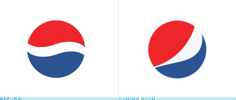
Speaking of which, Pepsi’s changing up their logo again. I’m still not over the last overhaul back when I was 11 years old. I did an entire oral report on the design shift for my 5th grade class, and I got an F because it had nothing to do with World History. Whatever, it looked like the Korean flag anyways.
So what do you think of where they’re headed?
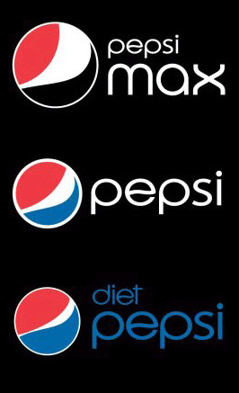
New York-baesd Arnell Group whipped this one together, in response to Pepsico’s declining sales as of late. The interesting maneuver here is that they’re gonna differentiate that wispy white swirl in the middle of the circle, depending on which Pepsi it’s marked on. “A ‘smile’ will characterize brand Pepsi, while a ‘grin’ is used for Diet Pepsi and a ‘laugh’ is used for Pepsi Max. Also, Mountain Dew will be rebranded as Mtn Dew.”

Supposedly they’re also gonna flip all the company’s logos across the board. Gatorade, Tropicana, Sierra Mist, you name it.
Check The Feed to see what the actual cans and bottles will look like.
SOURCE: BRAND NEW, Advertising Age
by bobbyhundreds


