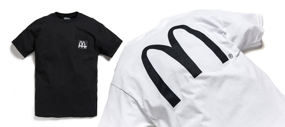
I’ve always been intrigued with corporate branding – How a monstrous entity could be pared down to a one-color icon or a universally recognized symbol that speaks volumes about its product, company ethics, employees, etc. I wanted to re-appropriate these logos, dissect them, and re-think them into new meanings. What if the McDonald’s “M” was devoid of the familiar red/yellow coloration and reduced to a black/white negative? Would it lose its power and effect?
These thoughts mutated into a new idea: imagining multi-national corporations as fake Streetwear brands, the opposite end of the spectrum as far as authenticity and organic culture. I traced the logos and tweaked hues, ripped ’em apart, did what a typical Streetwear brand would do as far as color combos and print placement on starchy boxy t-shirts. No ironic flip on the logos (which is what traditional Streetwear would do), but keeping the icon intact. Of course, this awakens threats of lawsuits and cease/desist letters, so I printed up just a few for fun, to give away to friends
Disclaimer: NEVER FOR SALE!!!!
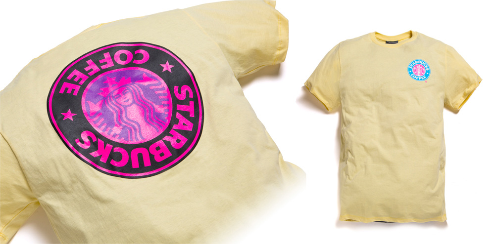
It’s nice to be able to do that whenever I want – make stuff that’s not for profit, but purely for the creative exercise, commentary, and personal sanity. This is the first one, it’s the Streetwear “Starbucks” t-shirt. Stripped of the familiar green & white, the Starbucks brand is positioned as a California-beach-style Streetwear t-shirt.
Confused? That’s the point.
It seems like Streetwear today is polarized towards going commercially big and mainstream-heavy or so expensive and exclusive, that it’s borderline ridiculous. So what about creating product that is so rare, that it basically doesn’t exist? It’s not expensive, it’s priceless? Those were more of my thoughts as I worked within the #incorpirated project. This isn’t about dollars or publicity – it’s a simple experiment and me thinking out loud. Maybe we can get apparel and fashion to spotlight pure creative action, neither motivated by commerce or business?
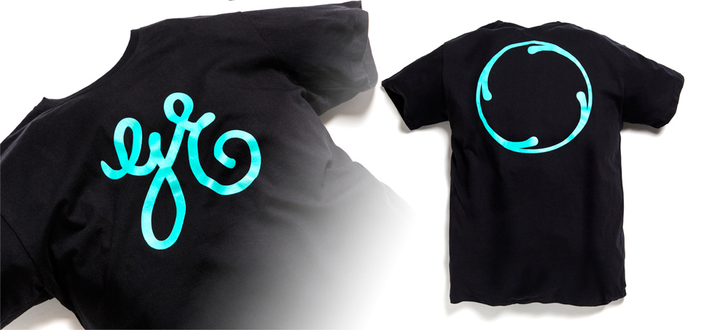
The General Electric logo is maybe my favorite of all commercial branding, to the point where I believe it exists larger than the company itself. If I can explode it in two fragments, is it still recognizable? If I channel more off-the-wall colorways, have I infused new meaning?
You gotta understand something. I’m not trying to do the traditional Streetwear parodies. So to all the other brands and designers who are commenting that they have pursued the same ironic flip, that’s great. But #incorpirated is about preserving the actual corporate identity. No rip, no subtext, no commentary. Imagine these multi-national companies as independent garage brands…
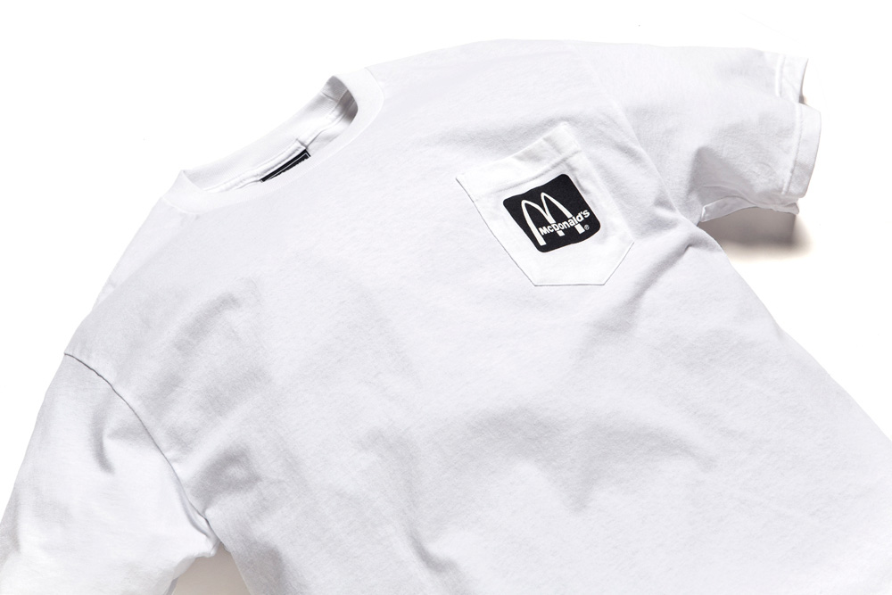
I love this one. The “McDonald’s” tee was the spark that ignited this entire thing.
Would you wear it? Why?
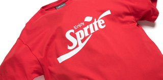
For every collaboration you see from us, there were 20 that didn’t make it. We had been in talks with Coca-Cola on bringing back Coca-Cola clothing from the ’80s (Google it!), when they suddenly pulled out because they didn’t want to be associated with our “bomb” icon. Ha. So the fourth and final piece of the #incorpirated project was to play with the most recognizable logo in the world, Coca-Cola.
Another objective was to see what I could create without legal boundaries. As our presence grows, so does the red tape, and as a designer and freethinker, it can be the most frustrating part of the process. So what if lawsuits weren’t an issue? If these t-shirts aren’t for sale or driven by profit, I can get so much further in proving a point.
Thanks for reading along and following the #incorpirated project. Hopefully it helps us all think differently about Streetwear, what we are doing here as creators, how profit-driven art is restricted, and how pervasive and powerful corporate branding is…

