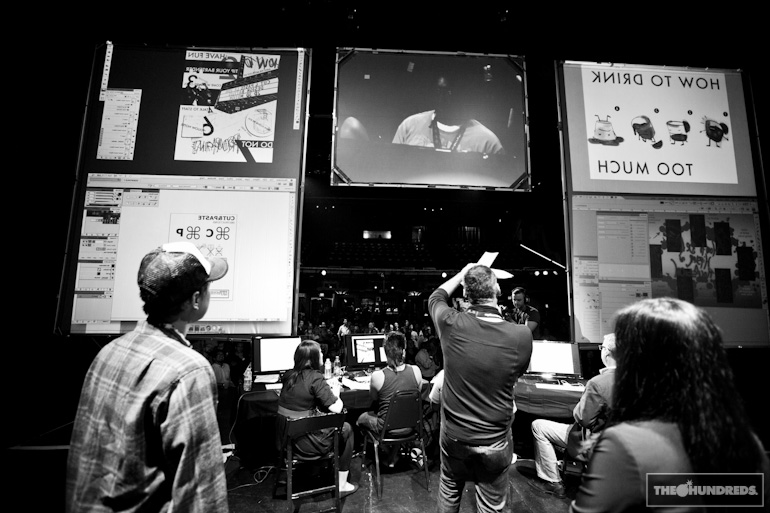
On Saturday night, the annual Cut & Paste show was held at the Henry Fonda theater in Los Angeles.
So are you guys familiar with this tournament? If not, it’s actually pretty awesome. I’ve heard about it for years, but this was my first time attending one of these. Basically it’s like a breakdancing competition, except graphic designers compete against each other in 15-minute heats, and in front of an audience. They’re given a topic to go off on, the first round they were supposed to design something around “Frienemies/Yearbook” and the final round was “Instructions.”
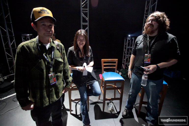
Cut & Paste actually invited me to be one of the esteemed judges in the competition, along with Eric Nakamura (Giant Robot), Jean Aw (NOTCOT), and Zack Isaacs (deviantART). These guys did a great job judging the designers’ art, while I got caught up judging the designers’ hairstyle choices.
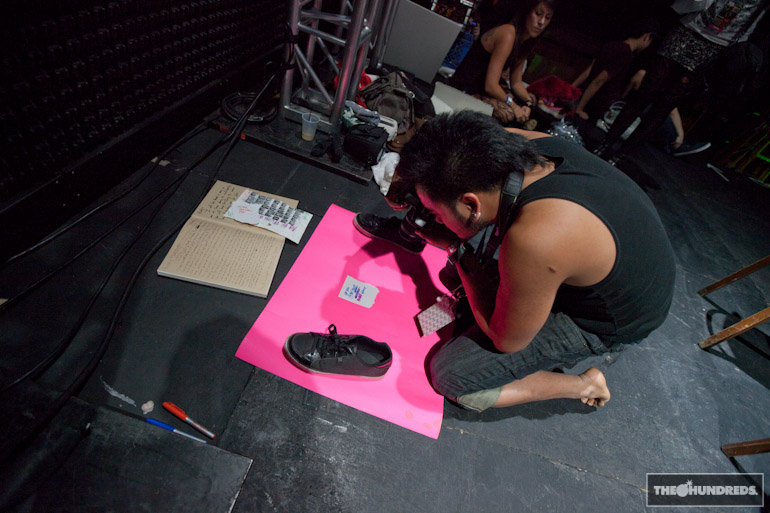
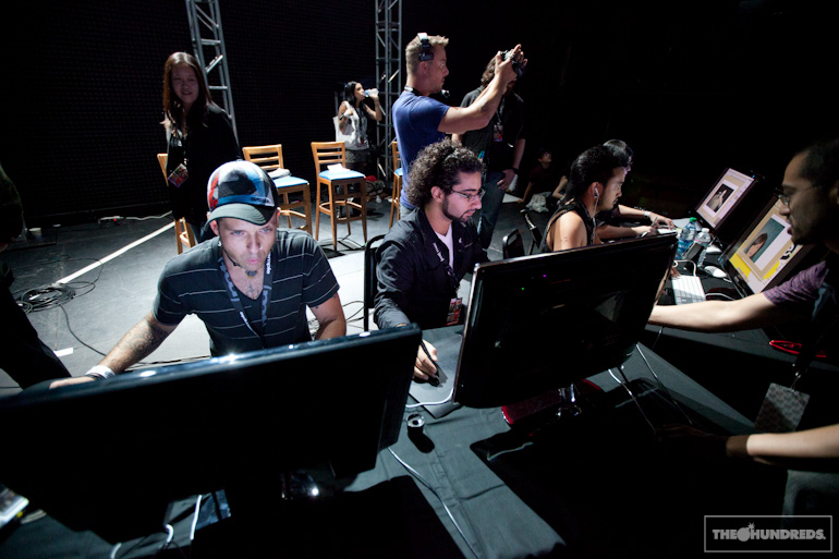
The competitors aren’t allowed to bring in any outside resources, so if they want to incorporate any photography into their final design, they need to shoot it onsite and import the images to manipulate.
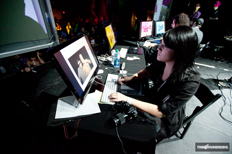
This is Allison Revilla. I actually picked her as #1 in the Finals, but she made a crucial technical mistake that I won’t get into here, ultimately costing her the competition. That’s how dire the circumstances are, this is high-stakes, kids!
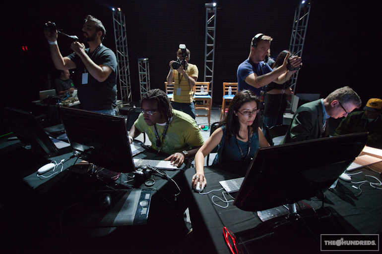
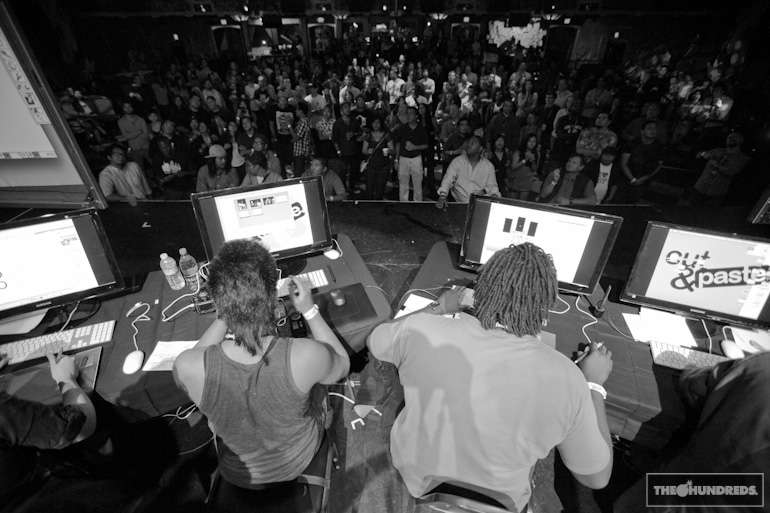
I hate when people look over my shoulder while I design. These contenders had to deal with all the judges, filmers, the emcee all poking around their situation. On top of the fact that their work is projected on the screen for the entire arena to watch, AND broadcast online. I’d probably draw a triangle with four sides if I was under all that pressure.
Natalia was also onstage with me, documenting the night. You can check out her coverage on her blog, MEOW.
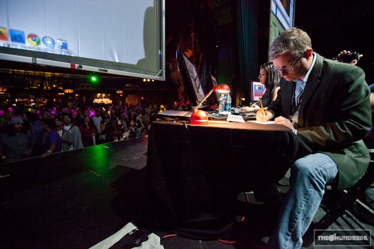
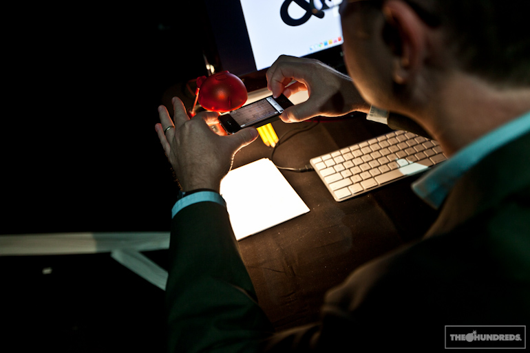
This guy is Dave Stolte. I’ll be honest, Dave came prepared to play. He even brought his own desk lamp. I didn’t even know he was in the tournament, amongst all the hipster cool kids, he could’ve been the PC guy from the Apple commercials. Boy was I wrong.
Dave’s actually an illustrator by trade, and that definitely showed throughout the night as he swept his preliminary heat and the final match. He spent most of the time drawing really cool cute characters, photographing his work by iPhone, importing, and then cleaning up his drawings in Photoshop.
That’s fine, although I did think he was a slightly better illustrator than designer. And in my opinion, the winner should have been more of a proficient designer, considering this was a design competition. But hey, what do I know, I’m just a judge, jury, and executioner. I mean, judge.
This is my vantage point, and you see the final 4 entries, but in reverse, so you have to hold this up to a mirror to get it. Dave’s winning entry is in the top right corner, and he continues onto the Finals in New York.
How rad would it be if there was a Streetwear Designers’ version of Cut & Paste? I’d like to see the following go at it in a graphic design competition: Benjie (The Hundreds) vs. Benny Gold vs. Jason (Flying Coffin) vs. Graham (Us Versus Them). Or Me vs. a 3rd grader vs. a Tax Attorney vs. a dead person. What about you?
by bobbyhundreds


