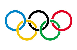
When it comes to logo work, it’s a lot trickier than most people realize. Just with our own Adam Bomb logo, when he’s broken down to a 1-color graphic, he can look inverted depending on a light or dark background. I was researching the Olympics logo tonight, I had always been told that the design is symbolic in that every flag in the world contains at least one of the rings’ colors. Apparently that was wrong, and the popular notion that the rings represent the 5 participant continents was right. And then I also found this bit on Wikipedia, which outlines the rules by which the Olympics logo is meant to be exhibited. Although it seems anal and even trivial, shows how important it is, for design and branding purposes, to stay consistent with original intent:
Despite misconceptions, the black ring may not be simply swapped out for a white ring if the symbol is placed on a dark-colored background. The rings may be produced in either an interlocking or solid version. The solid version may be produced only for single colour reproduction in the following colours: blue, yellow, black, green or red from the Olympic Rings, or white, grey, gold, silver or bronze. The interlocking version may be produced in any of the aforementioned colours, or in full colour. Reproduction on a dark background is limited to monochromatic yellow, white, grey, gold, silver or bronze. Full colour on a dark background is strictly forbidden. Reproduction on a colour background is limited to monochromatic black, white, gold, silver or bronze.

by bobbyhundreds

