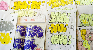
The definition of the word “toy” on Urban Dictionary reads: “A person who doesn’t have can control, no style, not even up anywhere. Does really crappy pieces.” Rewind back between 1997-1999 in Montreal, when graffiti was getting bigger. 14-year-old me was mesmerized—I spent my nights on sites like Bombing Science, and just looked at graffiti from around the world. I would attend Under Pressure and watch artists do these magnificent pieces. I found out that one of my friends was slowly starting to hit up some spots. The not-so-brilliant me said, “If he can do it, I can too!” I started practicing on paper, trying to sketch out cool pieces. I didn’t even have a name—I was in my brainstorming era… and I fucking sucked.
I then saw that movie, 187, with Samuel Jackson and his Cholo students. They were tagging K-O-S and Cartoon. I was like, “This is it! My name is going to be Car2N!” spelled that weird way. That was me straight up biting off a character in a movie. Soon after, the day came when my friend called me up and said, “Yo, chico, I’m gonna hit up this wall uptown by the railroads during the day. You in?” Deep down, I didn’t want to do it, but peer pressure got the best of me. So, we went and I did this horrible piece. It was so bad that it made me quit in a heartbeat. It made me realize I was just a toy and a fake—that I didn’t have the balls to do what artists like FAKER do. He turned his graffiti roots into his daily bread and butter as a graphic designer/creative director, with a work portfolio that extends from MTV France to KENZO.
I met Faker in 2009, during his stop in Montreal for a solo art exhibit titled “I am the band.” During that time, his graphic work was part of the now-defunct French brand Sixpack, as well as Clark Magazine. It was a time of bold graphics and big prints, and his particular style and form stood out from the rest due to colorful geometric typography, and witty French quotes.
Contrary to his name, I caught up with FAKER—the real deal—during his last stop in Montreal.
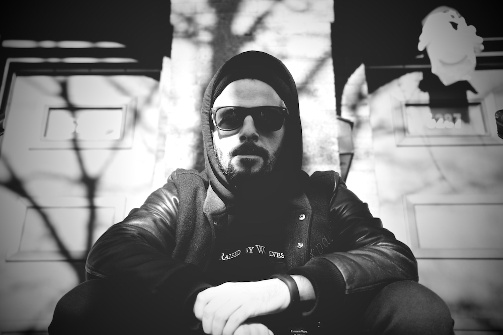
JOHNNY F. KIM: Your roots come from graffiti. How much has it translated in your day-to-day work?
FAKER: It’s true, I started to write on the walls very young. When I was a child, I went to the bathroom with a pencil to write on the door. My father was a typesetter in printing and he naturally transmitted this interest in letters and creativity to me. Although it has influenced my first steps in the visual arts, graffiti did not always help me in my studies. In live model classes, my drawings looked more like b-boys than naked women. However, I immediately liked working with the colors, typography, and, by extension, creating logos. It also helped me in the compositions; a wall or a train car is like a canvas, a frame in which you must deal.
Why the name Faker?
I chose [the] name because the letters are interesting to work with. I also liked the paradox—that subversive and offbeat side in a world where everyone claims to be “real.”
How would you describe your particular style?
It’s complicated. Back in the day, a friend and I were described as “dry design.” We did not use the 3D, but instead settled for 2D everywhere, all the time. This [has always been] the case. I remain faithful to the “dry design.” I have a rather traditional approach—I am more Garamond than Comic Sans, you know what I mean?
“I PREFER TO DO GRAFFITI SOLO, PREFERABLY IN THE MORNING OR ON MY LUNCH BREAK.”
What’s your background in typography and graphic design?
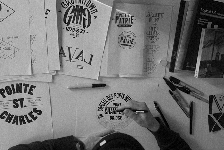
I studied graphic design and I got my degree in 2002 with honors. Then I worked directly as a freelance designer for MTV Networks France, and I looked for a job in an agency. I worked a few years in agencies, where I was doing magazines, logo design, or video animation. But I was fired each time for fiscal restraint. Last in, first out. I joined editorial [for] Clark Magazine in 2007 until the last issue in 2012. I always wanted to work a lot and I’ve had so many customers that I forget.
I have good memories of many projects. Some took part in my development, publicized my work, and allowed me to travel or to obtain new contracts. I was in Tokyo with Clark Magazine for the launch of an issue with [the cover done by] Phenomenon, I was part of a group exhibition in Los Angeles with Sixpack France, I painted in Budapest for the Hungarian F1 Grand Prix, I painted messages on the roads of the Tour de France in 2009 for the Livestrong Foundation of drug lord Lance Armstrong… [I’ve had] the chance to meet many cool people. I participated in the realization of windows for Kenzo boutiques in Paris during fashion week in January 2015. I had to work at night, bombing paint on blank media in shops. I had to compose abstract paintings, gradients, strokes, and “works” spontaneously without retouching. It was fun to paint among €10,000 dresses. In 2013, I also created the brand Petite-Patrie with a friend and we [tried] to release a capsule collection a year. It is unpretentious; a personal project that we shared with pleasure. Purely artistic, but fun.
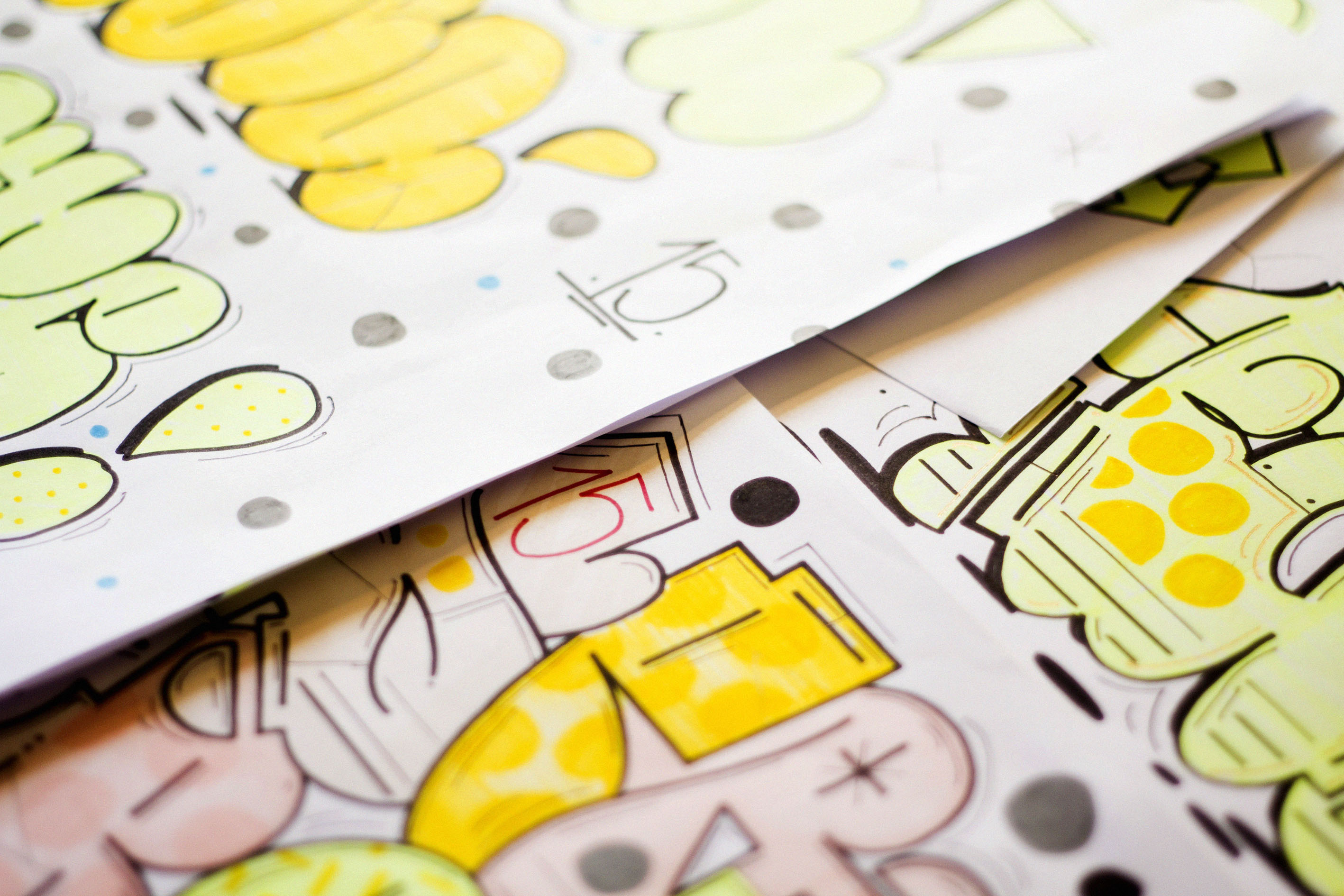
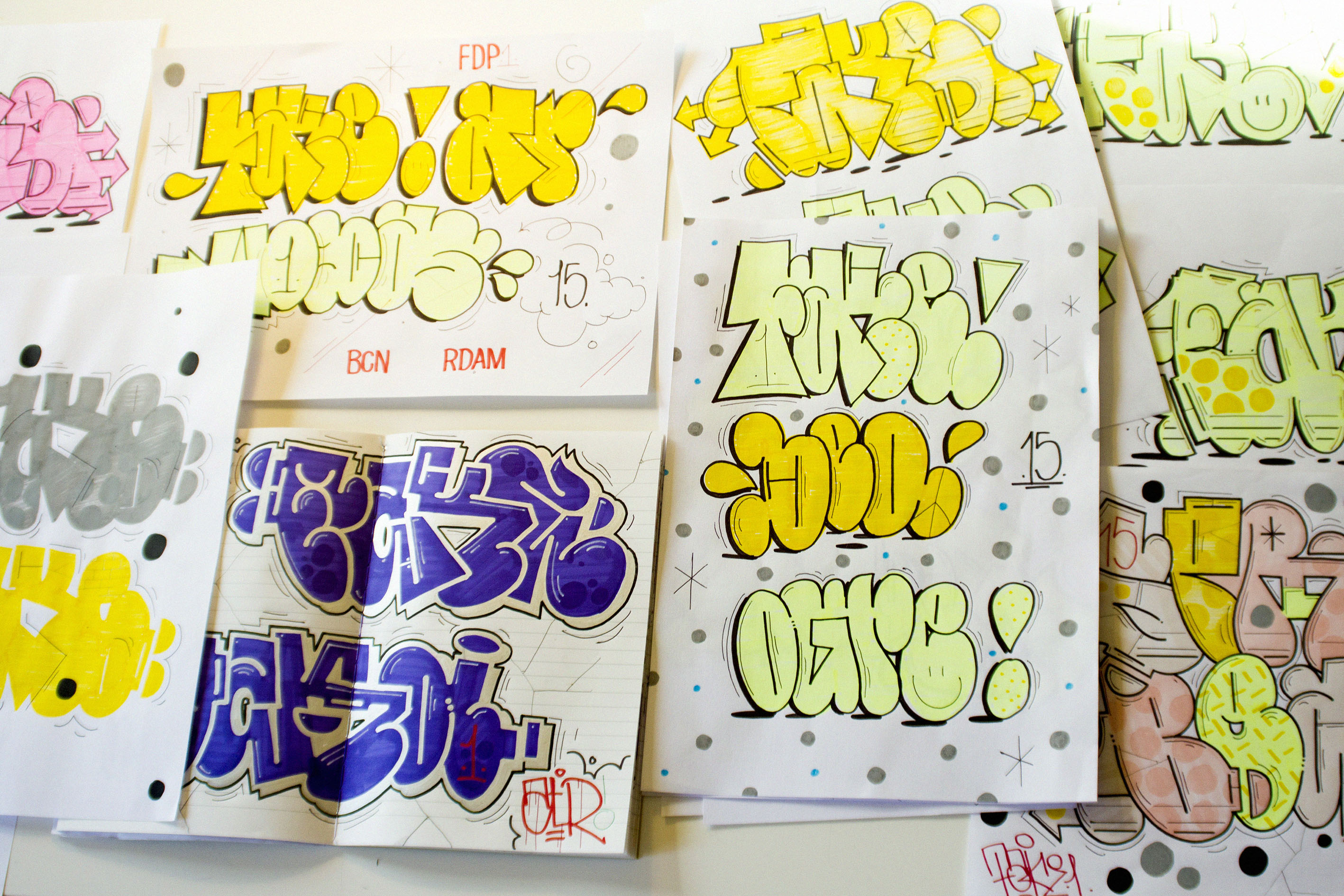
I noticed a lot of symmetry and geometry in your work compared to other artists. Is that more of a preference or a technique at this point?
Funny that you mention the symmetry because I don’t calculate it when I work. It’s instinctive. I looked at my designs and you’re right, there are many symmetries… Maybe I have to go see a psychiatrist to look into my past to see if I had a hidden Siamese brother or if I ever suffered from schizophrenia. Seriously, my motto is, “All or nothing,” and I’m a Gemini. I am both strong and fragile. For sure it’s this duality in me that makes me work so symmetrically.
“A WALL OR A TRAIN CAR IS LIKE A CANVAS, A FRAME IN WHICH YOU MUST DEAL.”
Graffiti became a very popular art form in the last few years. We can say that street art is very trendy in the fashion lifestyle industry. But are you a purist? What do think of the popular, legal side of an art form that is a vandal art at its core?
Graffiti was born in the streets. Unless it is part of the concept, it has nothing to do [with] galleries. There is nothing provocative about it. Although I think the graffiti art movement is the most powerful in the history of recent art, it must remain true. The best galleries to admire the graffiti are the railways or vacant lots. I think the only one who did that in the rules is English artist Banksy, who decided to appear in museums by installing his art among the other works at night. This approach was consistent. As for the recovery of graffiti by the marks, it is too often opportunistic and soulless.
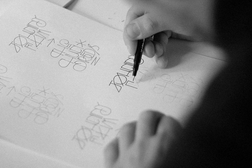
We can see that you are still very active in graffiti. But being a much older, wiser artist with more experience, do you have a code or a certain routine when you paint?
Back in the day, we moved in teams and we needed this emulation—this group energy. I do graffiti differently today. I prefer to do graffiti solo, preferably in the morning or on my lunch break. I am an impatient guy, so I paint quickly, often without any sketch—I am very prolific. I started in the mid ’90s and I was doing very complicated letters with lots of arrows and my graffiti was very clean. Now, it’s different. I don’t care about color, I don’t do 3D, and no shadows. Sometimes not even contours… #lessismore.
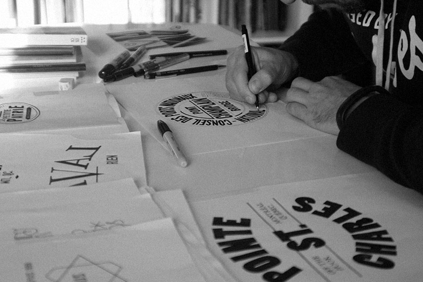
After the [recent] terrorist attacks in Paris, are you more careful and has that tragedy affected you in any way?
It happened at the bottom of my home. I heard the shots and saw the terrorists driving their black car… Le petit Cambodge and Carillon are at the corner of my street. I often eat at Le Petit Cambodge. I was surprised and shocked because I know these people, I see them often… It’s very sad—the guys who did it are cowards. I live in a neighborhood where all nationalities and all religions are mixed, and it is precisely [what makes my neighborhood] beautiful. After the killings, I did not want to fall into psychosis. If you start to watch out for people, you’re suspicious of everyone and fear others, it just generates hatred, the operating mode of the nationalist parties. Fuck ’em. I will remember what was said by Italian anti-Mafia judge Paolo Borsellino, “The man who is afraid dies everyday. The man who is not afraid dies once.” Otherwise, it doesn’t affect my work in the sense that the work is a way for me to break with the news, with the daily. You focus on your goals and you think of less crap around you.
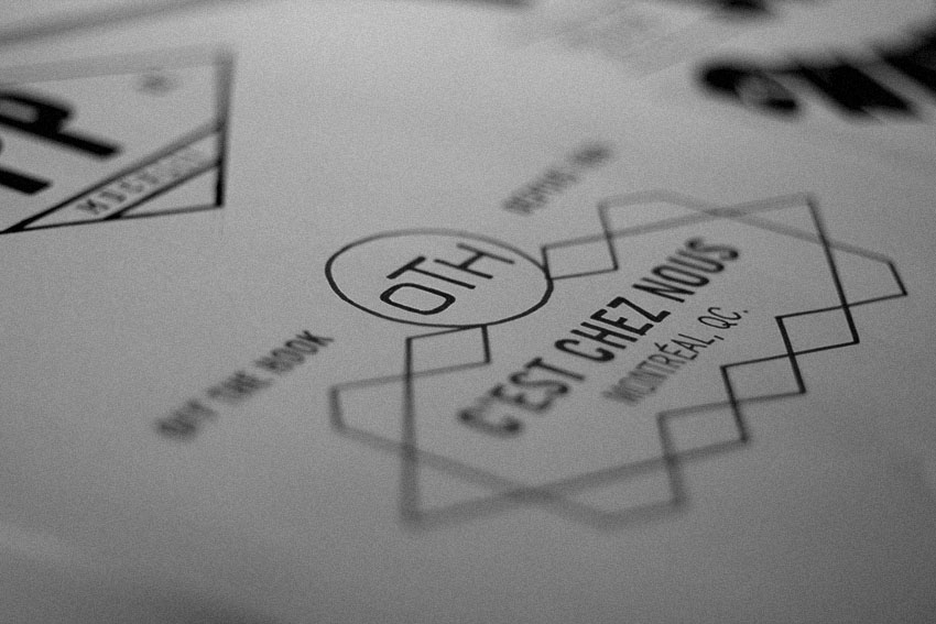
Throwup or full piece?
I love to do throwups. It’s an exercise of speed and spontaneity. If it is dirty or if it flows, it doesn’t matter and is even better. As I’ve told you, I’m quite impatient and I can do a throwup in the street in less than a minute. My throwup is always the same: it’s a logotype (I am a graphic designer).
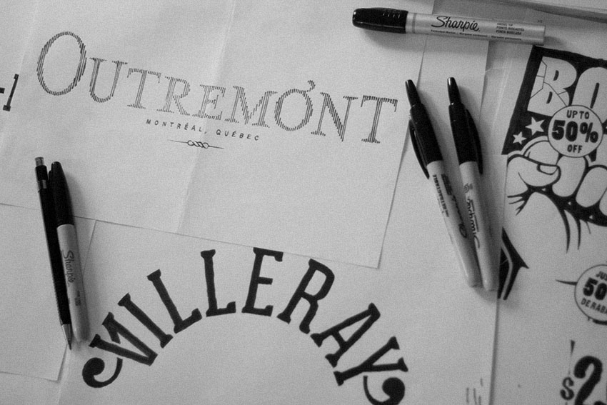
Anything in the works for you?
I have many corporate projects, but it’s not very exciting. You know how it is—I have to make money to pay my rent. What is important is that in 2016, as you know, I have to release a new Petite-Patrie capsule. I’d also want to work on a new solo exhibition project in 2016. I still have to think about it.
***
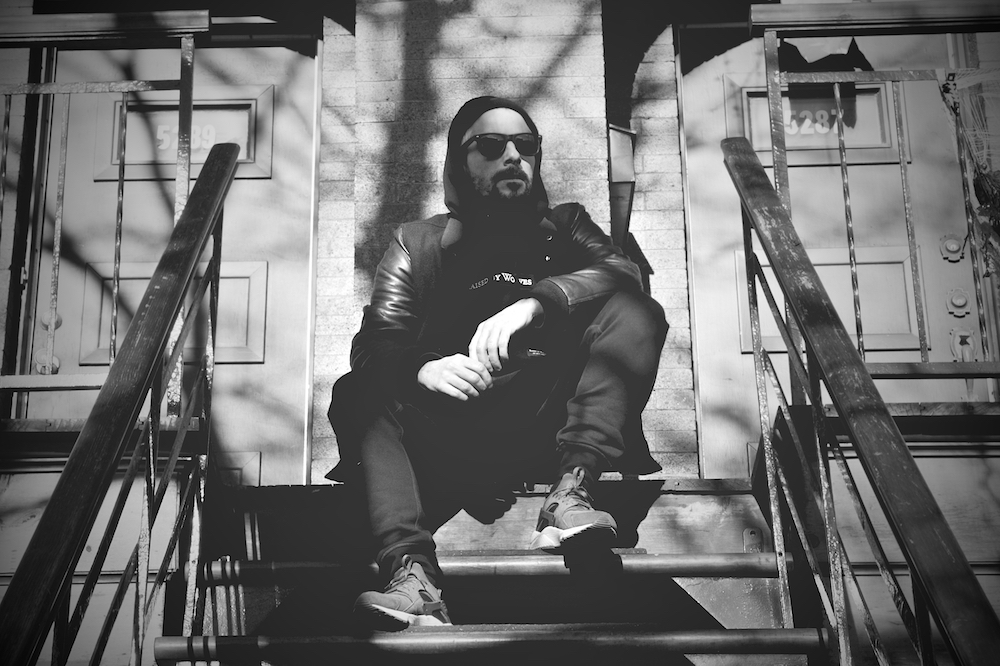
Check out more of FAKER’s work on Instagram at @laurentfaker. Photos by BUS. Portrait by Johnny F. Kim.

