Words: Maurice Pendarvis
Photos: Mark Ward
What got you into doing art?
I grew up drawing all the time. It’s what I found I got recognition for as a kid. I was copying cereal boxes, and coming up with my own characters. I was the typical arty kid œ felt tip pens everywhere, making stuff from old boxes, fascinated by Disney etc. At first school I used to get gold stars for my drawings, but had red pen all over the actual written work. I was far more interested in the visuals than writing stories. That has just stuck with me through life, and I’ve ended up pretty much doing the same thing.
Were you self-trained or did you go to college?
I went to Central St Martins in London. I specialized in advertising, as I liked the challenge of creating solid concepts. It gave me a good grounding and forced me not to rely just on the aesthetic side of things. It was pretty hardcore, with a lot of frustration at times. Alongside advertising I kept myself busy with my own work. I’d say my aesthetic is all self taught. A lot of trial and error…
Did you ever go down the corporate road? If so, how long did it last and what made you leave?
I managed to win a design award and off the back of that landed a job in an ad agency straight out of college. It was the job I thought I wanted at the time. 3 months later I was tearing my hair out!
I know what you mean. What did you do after that?
Well, I was already doing work for Stussy while at college. I was fortunate enough to get myself into a position where I was supplying a steady stream of work to them. After I left the ad agency, I went to work for Stussy full-time. I stayed there a while, until I felt the need to spread my wings a little. I was getting other commissions coming in, and there are only so many hours in the day.
You seem to have found a niche doing graphics for action sport companies, would this be a fair assessment?
I guess my work image is very much action sports. I have no problem with that œ it was through skating that I became aware of /got into the scene I now work in. I do work outside the action sports box though from time to time.
People will pigeon hole you according to your aesthetic, but I’d like to think that my work is malleable enough to work in a number of other areas too.
Sometimes art directors surprise me œ I get commissioned for work that has no connection to my own style or previous work. You’d think that artists were commissioned based on the visual vocabulary that is their identity, but that doesn’t always seem to be the case!
You obviously have a love for skateboarding graphics, what were some of your favorite graphics growing up?
I can’t lie. I love skate graphics œ the raw vibe of them, and the sense of humour in the work makes me connect with it on a personal level. I really admire Jim Phillips’ work, along with Sean Cliver, Marc Mckee, Pushead, Andy Takakjian. The thing is, I didn’t grow up with any of them. My first setup was a modern popsicle shape Foundation deck, Indy’s with some soft wheels. My older cousin gave it to me œ he used to get flow from Slam City Skates. That was around 93 œ I’d just turned 12. I was more into BMX as a young kid as I already had a bike. I remember my cousin telling me that I’d switch to skating. He was right!
When I’m into something, I really want to know about the history of it all. Be that music or graphics etc. I’m genuinely in awe of people who witnessed the 80’s heyday of skating. The graphics just seem more alive than some of the current graphics.
My favourites that I wish I had would be the classics – Vision Psycho Stick, Santa Cruz Screaming Hand, any of the Rob Roskopp board series, Powell Ripper, Cabellero, H Street Hensley etc.
When I was full on skating everyday, the hot ones were more Chocolate and Girl. I really admire Evan Hecox’s work, but for me it lacks the rawness of the early 80’s decks.
I might be mistaken, but is there a reference to the Jim Philips’ Santa Cruz arm in your Nike ‘Be True’ installation?
Yep œ no denying it. The brief was to show the relevance of the shoes to the history of both skate and basketball culture. I used the colour palette from the shoes themselves and drew connections between the two cultures. Smashed glass with arms going through seemed relevant. Before I realized I’d coloured the arm blue as a reference to the shoes. It happened by accident, but I’m happy that you noticed it. I’d like to think of it as a nod to a master.
Tell me about your workspace.
I’ve got a studio 10 minutes down the road from where I live. It’s a good space. It’s a converted warehouse that houses about 40 artists. It allows me to create work without worrying about mess etc. I’m far from the tidiest person when I’m working. It also allows me to have a cut off from work when I leave in the evening.
Have you ever thought of moving across the pond to set up shop in New York or Los Angeles?
I’ve always thought about it. It’s just working out the hassle of it all. Greencards, Visas, Studios etc.
My personal work is about my distorted view of Americana from my Bristish perspective. The one I saw on TV as a kid – The Malibu beach party with the bikini clad girls. Not sure I could cope with having the reality crush my dreams…
Your graphics have a unique aesthetic to it, its not quite graffiti but there are some elements. Can you explain your process or technique?
Thanks œ It’s all pretty much a step by step operation.
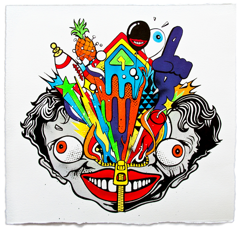
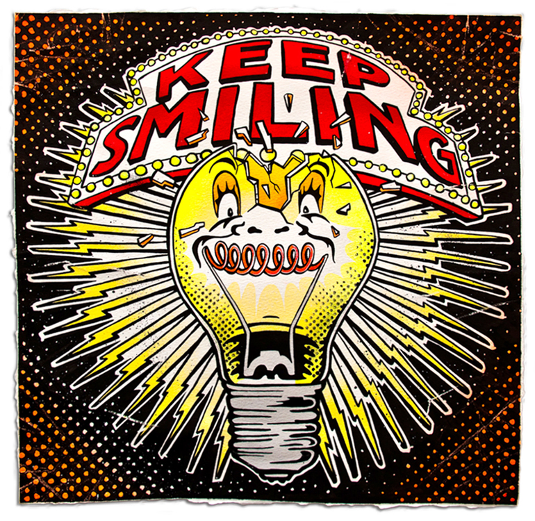
I think of a concept, something that makes sense on a level either to answer a brief or for my personal work. I then draw it all by hand with markers and brush and ink. This way the work feels and looks true to me. When that’s looking right, I go one of two ways. Either scan in the inked drawing and colour it up on the mac, or use the inked drawing as reference and work it up using paint and ink on either paper or canvas. It all depends if it needs to be sent somewhere to print, or I’m showing it in an exhibition. I prefer to create work purely by hand for a show.
I dabbled with graffiti as a kid. I was never that great – My pieces always came out a bit twisted. I can use a can, but my nerves always got the better of me. Again it’s the rawness I like and the immediate flat colour. It seems a good balance of both perfect Saturday morning cartoon cel paints and rough distressed work and I really like that combination.
With so many projects under your belt, do you have a favorite or one that you feel stands out?
It’s always hard to judge your own work. I guess one of my favourite projects was my Stussy Artist series. I created what I wanted to with no brief to stick to, yet it still made a definite connection to Stussy as a brand. I enjoyed creating that series. I get a sense of satisfaction when I look at it, which is a rare thing!
When we talked before the interview, you mentioned you were swamped with work. Can you let us in on what has gotten you so busy?
Well, I’ve got a lot of little projects on my plate right now. It seems to go in waves of crazy busy and then calm. Right now I’m painting a series of canvases for a chalet in the French Alps connected to a big snowboard brand. It’s the most interesting place I’ve ever shown my work. On top of that, I’m creating some more decks, and t-shirts. I’ve also got a show next year so I’m creating work for that between commissions.
Â
Can you tell us anything what you have coming up?
The biggest thing to ever happen to me is coming up soon. I’m getting married to my fiancé Catherine. Looking forward to that! That’s another reason why my time seems to be tight at the moment. So many things to organize…

