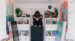
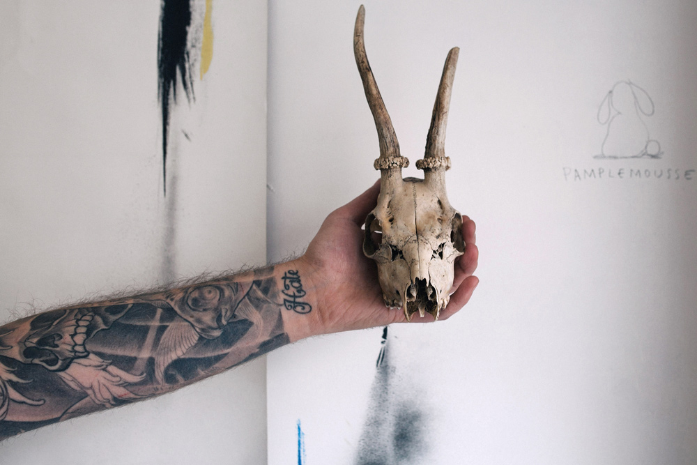
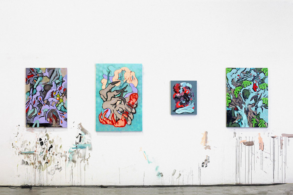
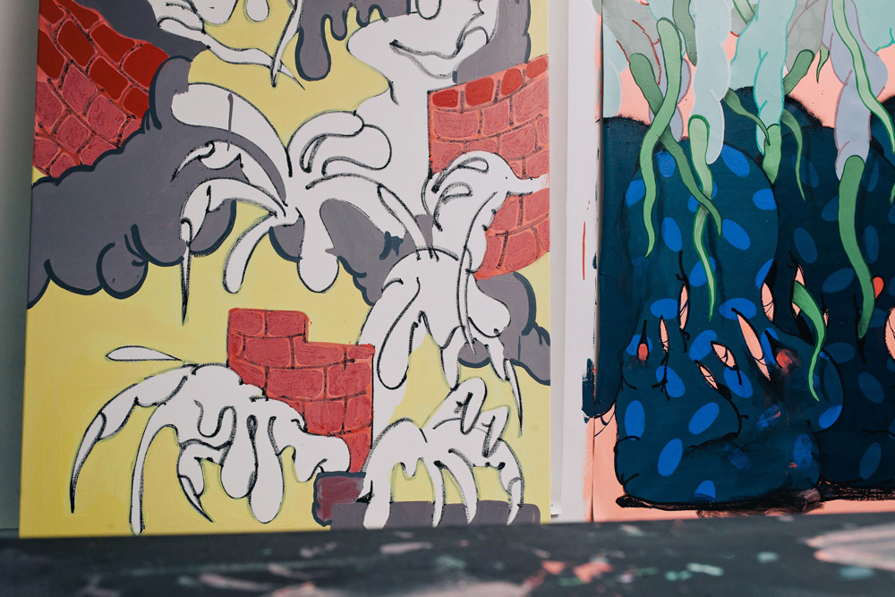
Inside his Paris studio, ILK is cloaked in black—except for the colorful drips of paint that have landed on his black Converse. His hair is long and reminiscent of the Heavy Metal music he listens to, and he is sleeved in black-and-gray tattoos. Beside him rest several taxidermy animals, as well as some new sherbet-colored paintings, which feature twisted monster hands and oozing goop that manifest the creepiness of a great John Carpenter film.
Painting on canvas, however, is new for ILK, whose background is in graffiti, graphic design, and art direction. “I started to paint canvases a few months ago,” he explains, “and in 2015 I will make fewer graphics and will devote more time to painting.” So in this exclusive interview with The Hundreds, we talk to the artist about this transition, as well as his favorite horror movies, preferred typeface, and what his cat thinks about his work.
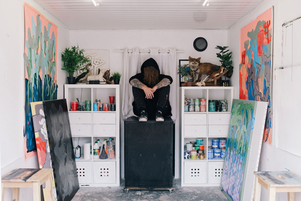
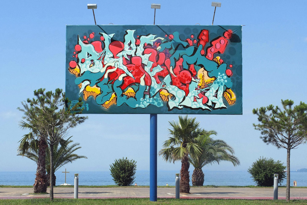
“Headlines 2013 jam graffiti wall in Venice, Italy with Remio, ILK, Greg Lamarche, Pref, Sweet Uno, RGB crew, The crew.”
ZIO: You are from the suburbs of Paris. What was it like growing up there?
ILK: I was born in [department] 93 and I still live there. I grew up wandering from city to city: Blanc-Mesnil, Drancy, Aulnay-sous-Bois, Saint-Denis, Aubervilliers, La Courneuve, Montreuil... I’ve always been torn between geek culture and street culture. I discovered Metal when I was around 10 years old, I started to develop my film cameras in the lab at 11, and I started playing Magic cards and Warhammer at 12. Parallel to that, I lived in a ghetto and I always bathed in street culture—I was playing basketball, I was listening to French rap, and I discovered graffiti at 16. Growing up in the suburbs and swimming in many different cultures is very rewarding, and develops a real eclecticism.
So you started writing graffiti at 16. What was the scene like in and around Paris when you started writing?
When I was a kid, I would draw my own versions of the cartoons and logos I saw on the covers of albums by Slayer and Megadeth. One day, while walking down the street, I came across a graffiti artist who made a chrome fatcap on a store. I was 16 and I was fascinated by the spontaneity of drawing letters as quickly. I stayed to speak to him, and the next night, I went out with a buddy to do the same. We were too greedy and tried to cover the whole city, and so we finished the night in custody. But then we persevered. At that time, I was never going to Paris, so I did not know the Parisian scene at the time. There was no internet to show us all that is! I stayed around my home to paint stores, walls, highways, trains, and everything else I could find. The style was really naive and without mastery, but the sensation of drawing on new media and walking in the street with some friends was exciting. It was the right time for a naive style without thought.
“WE WERE TOO GREEDY AND TRIED TO COVER THE WHOLE CITY.”
Ilk’s work in Batumi, Georgia.
When did you start doing graphic design? Did you go to school for it or were you self-taught?
In high school, I did not know at all how to orient myself. After doing the bac [a college entrance exam required in France], I followed a friend into Deug d’Arts Plastiques, in the category of European photography. I soon was disgusted by photography because other students were well-off children and had professional equipment, flashes, and a lot of supplies. My parents were modest and could not pay for these things for me. I was trying to survive with only a Minolta X700. But this environment of self-centered people quickly disgusted me.
One day, I met a much-older friend who was working in an advertising agency, and he offered me to come spend an afternoon at his work. I watched him make a cover for a band. At the time, I drew some flyers for small metal concerts, so when I found out it was possible to “live what you love,” that was the turning point. I immediately searched for a graphic design school and a company to make the switch.
I had a huge stroke of luck, after sending out my CV 100 times on the first day, I got an interview the next day for toy-box packaging at Disney, and one of the designers was a friend who I would skate with. He pushed my application and I was hired by bluffing because I had never used Photoshop or Xpress at the time. The first week, he told me everything, and then it was on. With my first paycheck, I bought my first computer, and I continued to learn alone at night after work.
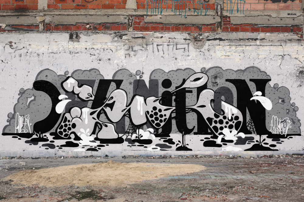
“Definition.”
You like to play around with typography. If you had to choose one to use for the rest of your career, which typeface would you choose and why?
I would be tempted to choose a type that everyone forsakes, like Comic Sans MS. I think it’s unfortunate that it’s a laughing stock for everyone, and this makes it more endearing to me. More seriously, I love Helvetica for its versatility and its pure Swiss design, and Gotham Condensed because it is really urban and has a feel like New York sign painting. To choose only one is too difficult, I think I would choose a pencil and paper and always prefer to design my own letters.
“WHEN I FOUND OUT IT WAS POSSIBLE TO ‘LIVE WHAT YOU LOVE,’ THAT WAS THE TURNING POINT.”
I read that you like old cartoons and gory horror movies. What are a few of your favorites?
I love old Disney cartoons of the 1930s, like Mickey Mouse’s Steamboat Willie, The Skeleton Dance, The Mad Doctor... My favorite is Mickey Mouse’s The Haunted House. I also like Fantasia, which is newer. And animated cartoons from my childhood like Hokuto No Ken, but my favorite is Jayce and the Wheeled Warriors.
I’m a big fan of horror movies of all kinds, such as The Thing and all the Carpenter films, Adam Chaplin, Martyrs, Oldboy (2003), Alien (1, 2 & 3 of course), Texas Chainsaw Massacre (1974), The House of 1000 Corpses and its sequel Devil’s Rejects, and all movies of the king Rob Zombie, Saw (1 & 2), The Shining, Nightmare on Elm Street, Friday the 13th, Leprechaun, Pet Cemetery, Jeepers Creepers, the first Halloween... I could speak for hours about that!
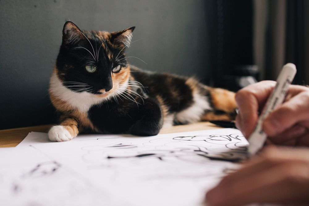
You post a lot of photos of your cats—especially the calico one. What are their names? What are their personalities like? Are they fans of your art?
I have two cats, a very elegant fat black-and-white cat, whose name Pierrecardin (a French reference to Back to the Future), and a calico cat named Lucy. She is very nice but also crazy, as she runs back and forth through the apartment for 30 minutes without stopping. She also spends her time walking on the keyboard of the computer, sleeping on my drawings, eating the pieces of paper, biting pencils and brushes, and licking my beard when I try to concentrate—so, I do think that this may be a way to tell me that she likes what I do.
What are your goals for 2015? What do you have planned?
I started to paint canvases a few months ago, and in 2015 I will make fewer graphics and will devote more time to painting. I have some proposals from galleries to make an exhibition of paintings, but nothing is decided yet. I remain open, and I will choose the proposal and place that is best for my first painting exhibition.
From the Converse Cons Paris exhibition.
What is your best piece of advice?
Even if we have to make concessions when we work for clients, it is important to keep the flame going for what we really love and continue to carry it into our personal work. It is not a secret, to live our passion, it takes hard work.
::
Follow ILK’s work at ILKFLOTTANTE.COM. Photos by Karl Hab.