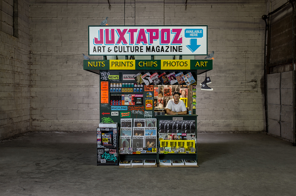
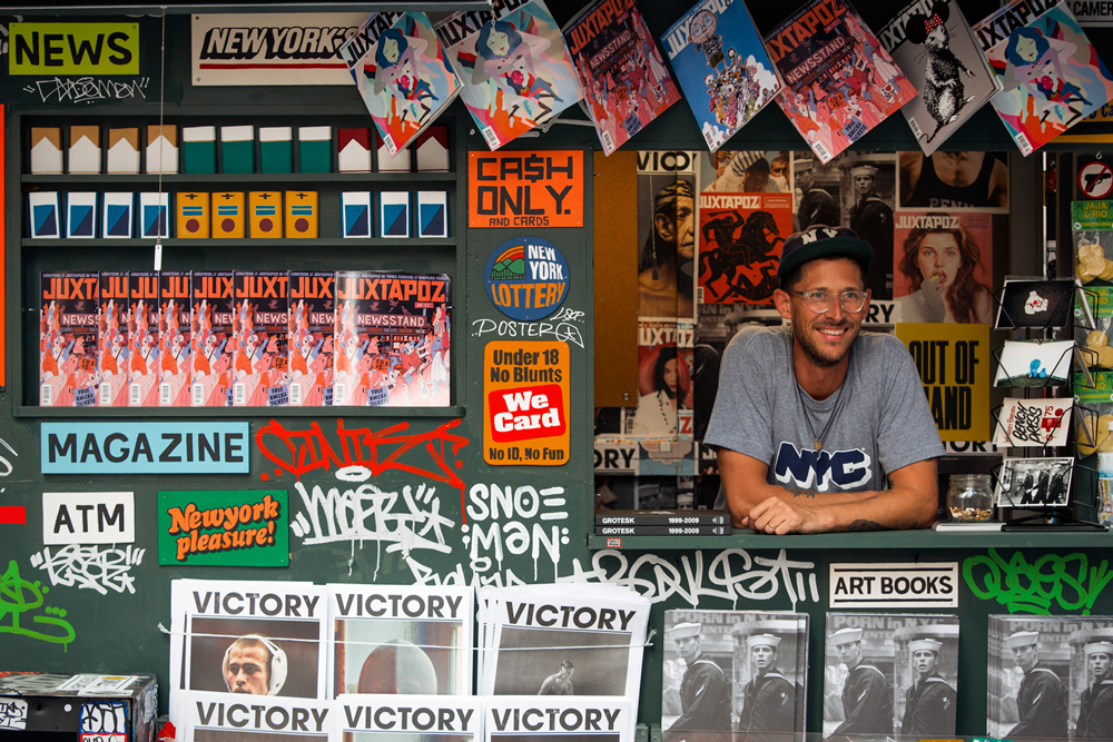
This year marks Swiss-born artist and designer Kimou Meyer AKA Grotesk’s 16th living in NYC, and his current installation T.SQ Newsstand in Times Square—a collaborative effort between his own Victory Journal, Juxtapoz Magazine, and Times Square Arts—is an ode to his lifelong love affair with the city. Grotesk’s T.SQ piece is at first glance immediately familiar—an aluminum and plywood replica of a now-vanishing cultural relic: the urban newsstand.
Plastered with colorful print material, rows of cigarettes behind the counter, advertising lottery tickets—one might remember the fading New York newsstand as essentially a small shack occupied by a single clerk, usually found peeking his head out of a small window-shaped space between all the text and color, graffiti, and packs of gum. Once a ubiquitous part of NYC from the ’50s to the ’90s, the Observer reported that as of last year, with the decline of print sales, only 309 of the once 1500+ independent newsstands remain standing.
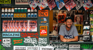
On view until this Sunday, October 18, Grotesk’s T.SQ Newsstand is “a very real analog temple in a digital mecca,” says Chris Isenberg, Editor-in-Chief of Victory. The meta-monument is decked out with fake cigarette packs and fake pigeons made of wood, issues of Victory Journal and Juxtapoz, and tagged—from top to bottom—by NYC graff legends like Chino, Rime, Lions, and members of the Irak crew and Smart Crew. And, like the classic stand, it’s manned by a clerk—except here, it’s Grotesk himself, filmmaker/photographer Cheryl Dunn, ONLY NY’s Micah Belamarich, photographer Daniel Arnold, or members of the Fool’s Gold crew.
I had the chance to talk to Grotesk about the Newsstand, his early love for NYC as a young Swiss kid, reappropriating artifacts, and what it means to be “real.”
Grotesk in the T.SQ Newsstand. Photo by Shane Lyons.
[In your work], you often reimagine artifacts, giving them a sort of second life contextually and culturally with humor. What is it about this reach for the past that you really connect to, especially with signs?
I was raised in Switzerland and I studied in Belgium and the European aesthetic of the world is very minimalist. And there’s not really that many signs with the same kind of language that used to be on those old [urban] liquor stores and bodegas and grocery stores and sports stores. There was none of that aesthetic in Switzerland growing up. When I arrived in the US, it was a very important visual shock for me because… there were still a lot of those signs and I was just absolutely amazed by the craftsmanship that was in it and the aesthetic that was drastically opposite to where I grew up. I started to document a lot of those signs.
I have my life in New York, I’ve evolved. Tomorrow it’s going to be 16 years I’ve [lived] in New York. Most of those signs have slowly gone, one after the other. So that aesthetic was a huge inspiration in my work and I started to basically look at my picture and kind of use that language to communicate some message in the same way those signs, in situations, will communicate, “This is a grocery store. This is a bakery. This is a liquor store.”
The T.SQ Newsstand fully operating. Photo by Brian Kelley.
You have a sort of whimsical nostalgia for “old New York.” When did this fascination begin?
So I grew up in a small city, Geneva, Switzerland… I would go to a lot of hip-hop concerts, we had a lot of culture from the US, I used to skateboard. My parents were architects and were always fascinated by big cities and urbanism. So they educated me and my brother at a very young age, how to look at buildings, how to appreciate beauty for structure—like the Empire State, World Trade Center, Chrysler Building—and we had a lot of books about New York at home. They used to do scale model architecture, so I was often in their studio, building little cityscapes with wood blocks. I would just create those little New York cityscapes that my parents [showed me].
For my 10th birthday, my dad got me a book about New York graffiti and a book about skateboarding, and I’m an old man so that was ’84. I was completely fascinated by the subways covered in graffiti, by the skateboard scene that was starting to be born. But because I was so far from this and there was no Internet—there was Style Wars [on VHS] and Wild Style that we would play over and over and over. Some old school VHS that friends would bring from New York or some graffiti video. So subconsciously, I created that fantasy world of what New York was in my head through that and also looking at movies like The Godfather or Mean Street—all those kinds of movies. Even New Jack City, which was later, but I would watch all those things and have that very distorted fantasy of New York. But on the other hand, I would start to look at signage books and all that.
So when I came here, it was kind of a very frustrating experience to arrive in the city that I dreamed to be in, but most of my ideation of the city was gone. There was no graffiti on the subway obviously, and it was a lot cleaner than I expected. Not to say that I was hoping it was dirty and smelly, but it was just kind of different. So I think I started to chase the things that were remaining from the past in the city when you go deep in some neighborhood on Staten Island, the Bronx, or Queens—you still find those untouched [areas]. A little strip that has an old school liquor store, bakery, and an ice cream parlor. I’d take a lot of photos and then get really inspired from those references, plus what I had in my head.
Basically, I think New York is one of those cities where either you fall in love with it or you hate. For me, the source of inspiration was never-ending. And once you become one with the city, you start to—my work wouldn’t be the same if I weren’t in New York. I would probably do something different because there is so much stuff you see every day here, from beautiful stuff to horrible stuff. Constant inspiration. You’re never low on energy, sometimes it’s bad energy, but at least it’s energy.
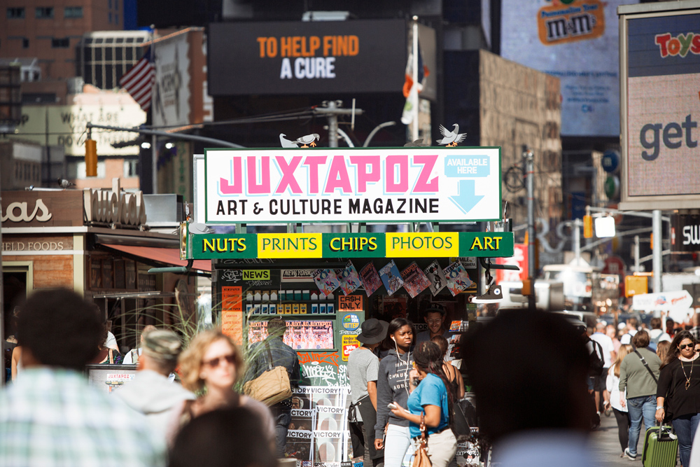
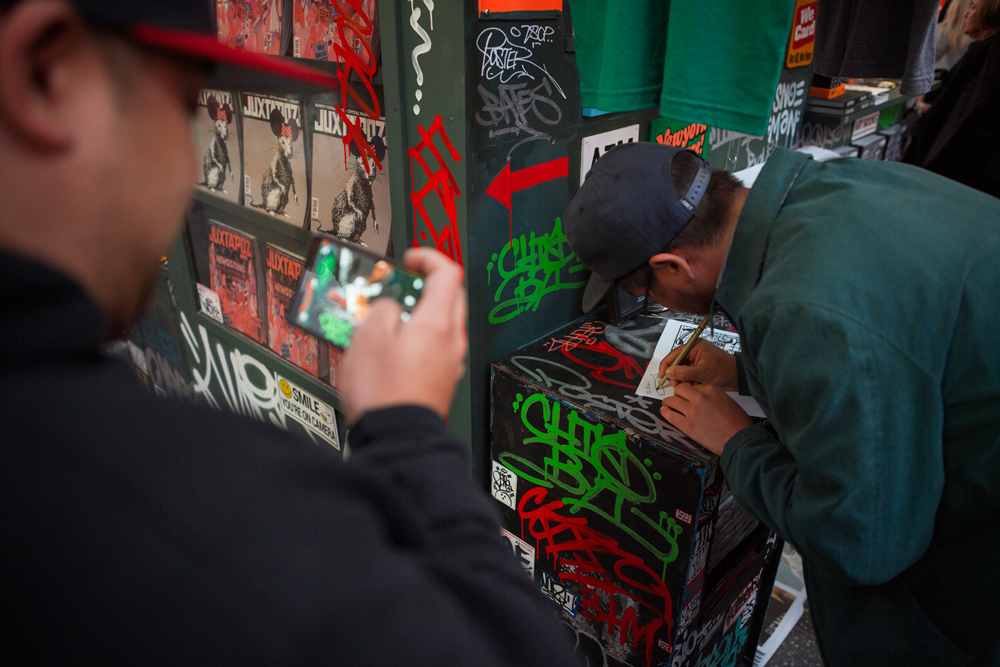
Photographer Daniel Arnold takes the reins. Photo by Brian Kelley.
Can you go into detail about some of your favorite aspects of the T.SQ Newsstand that you worked on? I was looking at your Instagram and saw that moving Joshua Prince memorial on the side.
Well, the first thing was to try to be as authentic as possible. From my memories of the newsstands I’ve seen—that are gone now—when I first arrived in New York. And also, to do a twist on it so people will understand that it’s kind of fictional as much as it’s very close to reality. You wonder, “Is it a real newsstand? Is it something new? Is it a joke? Is it art?” The key important thing of that newsstand was to be a medium for conversation, whether you hate graffiti, you [might] say, “Why is that ugly wood shack covered in graffiti in this beautiful, slick Times Square now that it is all about digital advertisements?” And some people have the other approach, “Wow, this is like a relic from the past with a twist, I miss that time.” Not to take one position, but to raise those conversations between people.
…The fact that it’s in Times Square was kind of an opportunity to showcase a lot of people that usually don’t have the chance to be in—as far as tourists and attractions—one of the most populated locations in New York. There is, I think, close to 500,000 thousand people every day in Times Square. So it was kind of a unique way to bring some culture from the Five Burroughs to a place where actual New Yorkers do not really go and hang out anymore.
So we created some details—for example, we can’t sell cigarettes, but cigarettes are kind of a part of the newsstand; one of the last places where you can buy cigarettes. So we made wooden cigarettes that look like a pictographic interpretation of them. There are real pigeons, but we didn’t know how many were coming, so we populated the newsstand with fake pigeons… There are about 12 pigeons, painted and wood, on the top of it. And those pigeons are basically also a nod to the local animals, like the rats.
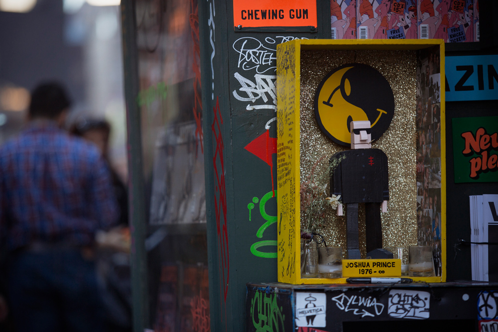
A memorial to Fool’s Gold co-founder Joshua “Dust La Rock” Prince. RIP. Photo by Brian Kelley.
As far as graffiti goes, I had the chance in my last 16 years in New York to meet a lot of the best street bombers and graffiti writers in New York through different jobs, through my blog, through a lot of my friends, and I’m more of an observationist of the scene. I’m not part of a crew, I’m not really a graffiti artist myself, but I have a passion for it. So this project was an opportunity for me to say thank you to all my friends that have been helping me on projects or that I worked with in the past. I can say, “Hey, come put your name on the newsstand, you’re going to have a lot of exposure in a way because it’s going to be in the middle of Times Square.” Pretty much everyone I invited just came right over to our warehouse where we built the newsstand to put their name on the structure.
…We made a newsstand publication that’s only available at the newsstand. And, again, the idea of the newsstand was to bring printed matter to a place that you pretty much can’t find anymore newspapers or magazines and, on top of it, art and culture magazines—they’re almost impossible to find in that area.
So we brought some culture in a place that kind of really lost culture. We brought some magazines to tell people it’s not dead, it’s very alive. And this project wouldn’t have been possible without the support of Converse.
Can you name some of the bombers that you had put their tag on the newsstand?
We incorporated the work of many artists, but there is a guy named Chino who is from Brooklyn and he’s one of the original graffiti guys from Brooklyn, he used to write for The Source. I have a guy named Bonus, we had a guy named SP One, we had a guy from a crew called MSK named Rime. We had Lions—he’s a local guy, we had a guy named Cinik. Essentially, a lot of them are more street bombers than graffiti artists doing beautiful murals. I mean, Rime does, but it’s more people that are highly respected in the street. We had two guys from the Irak crew, which is a downtown crew but with people from the Bronx and other neighborhoods. We have a guy named Bates who came from Europe, he’s one of the biggest graffiti artists in Europe. We had Haze, who is a legend, he did some of the Beastie Boys’ album covers, he did the Def Jam logo… We had the Smart Crew, a bunch of them came. We had a guy named Ojae—the list is long.
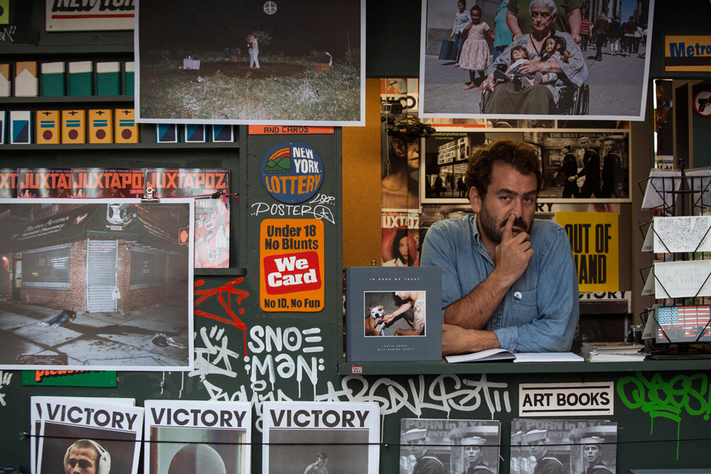
ONLY NY’s Micah Belamarich signs a zine. Photo by Brian Kelley.
Tell me about how Victory Journal came to be.
I’m the co-creative director with my business partner Aaron Amaro. The publisher is Stephen Benedek, who is also my partner and the Editor-in-Chief is Chris Isenberg. Basically, we started Victory as all of us being passionate about the image of sports, the aesthetic of sports and far as visuals go. We didn’t really care about the stats and results—it was more about how sports are beautiful when it’s beautifully shot. There are amazing stories, amazing failures, amazing victories, and we were just frustrated that there was no publication that had a celebration of the aesthetic of sports. Whether it was the body in motion, the equipment, and some of the very small stories that for usual media, would be small stories, but for us, it’s a beautiful story. Sometimes the guy that carried the equipment for the pro team might have a great story because he’s been there for 40 years. That’s the kind of story we want to tell.
Victory started as a one-off issue to say, “Hey, let’s start to do something about sports to show people how we think, breathe, and contextualize sports in a cultural world.” So we did the first one and it sold out so quick that we did a second one and here we are, about to launch issue ten. It keeps growing, we keep getting better contributors, and we have a great distribution. From a passion project, it’s become a real media venture and we’re very proud of it.
T.SQ postcards. Photo by Brian Kelley.
I liked that quote from Sherry Dobbin, the Times Square Art Director regarding the T.SQ newsstand. She asked, “Is it real? What can you buy? What is it when the artists seize back a piece of history?” What does this notion of “real” mean to you?
To keep it real—for me real, real is more related to integrity. Like for me to be real means to have integrity in what you do. In this project, it doesn’t matter if people think it’s a fake newsstand because the content, the people who built it, and the guest clerk are all very real and very respected. It’s fake because we had to build it from scratch because there were not any places in Times Square that could house our idea. So we could not do that the way we wanted, to trigger those conversations in just a metal container, we had to contextualize it and polarize the attention.
So if somebody comes and is like, “What is this thing? Is this a relic from the past? Is it fake?” Just if that person is in front of it, we engage a real conversation, and that’s what real is about. It’s about not lying and being 100% behind what you’re doing.
***
The T.SQ Newsstand is currently on view in all its glory until this Sunday, October 18. Catch it in Times Square.