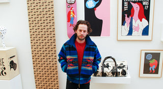
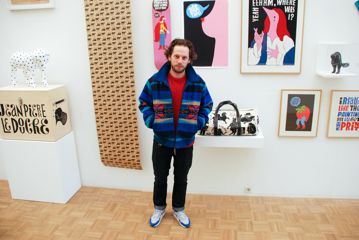
Pieter Janssen is without a doubt one of the most well known and prolific Dutch designers/artists. His real name might not ring a bell, but his nickname, which became his signature, will most definitely sound familiar: Parra. His unique style and a slew of collaborations (including two items for The Hundreds back in 2007) has made him a household name in both sneaker stores and art galleries around the world. I recently stopped by his current exhibition in the Kunsthal in Rotterdam. It’s Parra’s first solo exhibition in his own country, and he used the opportunity to show people a selection of his broad spectrum of work. From fine art to t-shirts, from record sleeves to big commercial projects, the artist has done it all. And that is most likely one of his biggest strengths. Somehow he has managed to let people from all walks of life get familiar with his work. I picked 10 items from his current show, simply titled Parra to showcase the diversity of the one they call Parra.
10. Posters and flyers
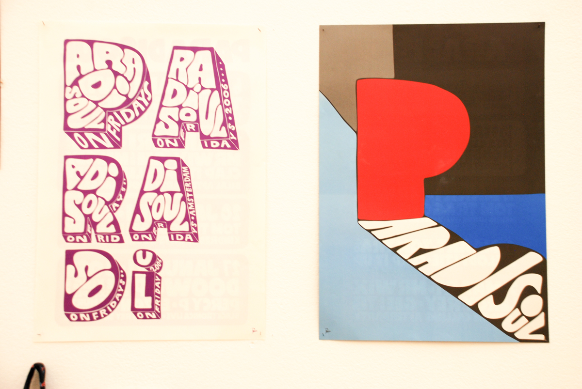
Flyers and posters for parties are one of the easiest ways for artists to get your work out there. Although your name might not be mentioned anywhere, people will be introduced to your style and hopefully start recognising your work. Parra was no stranger to this grind, designing posters and flyers for parties and venues in Amsterdam since the late ’90s. Pictured here are two posters for legendary mid-2000s club night Paradisoul, hosted at the Paradiso venue, designed by Parra. Throughout the years, his artwork and hand style has been seen on a wide variety of flyers and posters, from small venues like the Bitterzoet to posters for Mysteryland, a dance festivals that draws crowds of over 50000 people.
9. Clothing
Parra started his own clothing label, Rockwell, in 2002. The brand started as just doing T-shirts for the first two years, but since 2004 it has been putting out collections twice a year. It’s offerings slowly grew into items like sweaters, jackets, hats, bags, and eventually even bed covers and shower curtains. The style of the graphics really evolved throughout the years, many people would barely recognise most of the early graphics as Parra’s nowadays. The label started out with ‘simple’ graphics, then focused more on Parra’s hand styles and custom letters, but it really hit big when Parra introduced his now-famous beaked creatures in the 2006 collection. The Le Collection Noir collection introduced us to Rustico The Great, a mixture between a human and a bird who slid his feet in the private parts of two females of his species and used them as shoes. Ridiculously over the top, people ate it up and close to 10 years later these creatures still appear on Rockwell pieces.
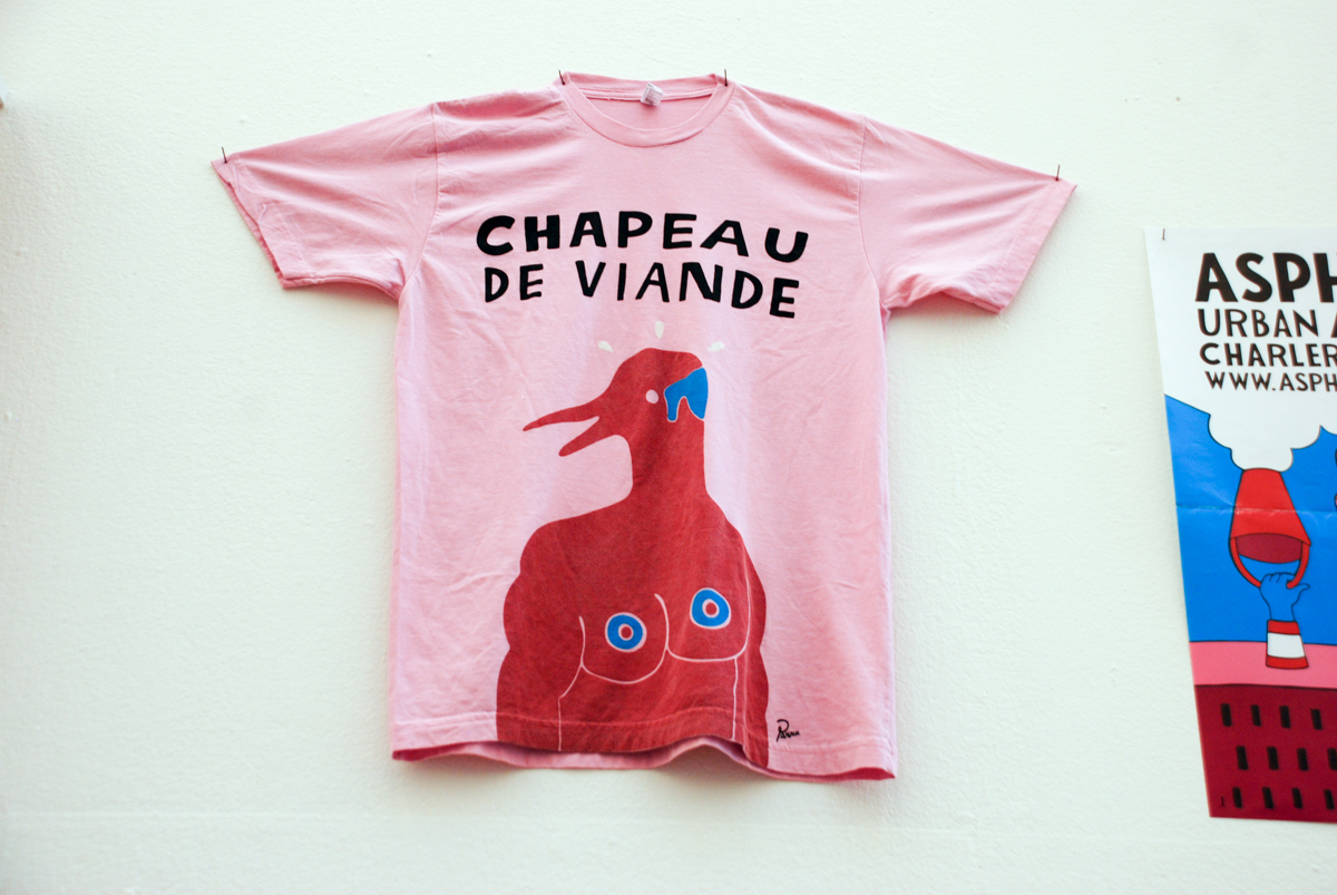
Rockwell, Chapeu de Viande t-shirt – 2009
8. Record covers
One of Parra’s earlier gigs was various artwork for the notorious Amsterdam musical duo Rednose Distrikt. His first work was on the label of the Scumbag promo 12 inch and continued onto the Rock Your Rednose Well In The Distrikt album (2003) and 2005’s Denk Ik EP, which shows an early version of Parra’s beaked creatures on the cover. Parra also founded Rockwell Records, a small imprint that released a total of three highly limited LP’s between 2003 and 2005. In 2008 Stones Throw recruited Parra to design James Pants’ album artwork, as well as various T-shirts for label greats like Madlib, J Dilla and Charizma.
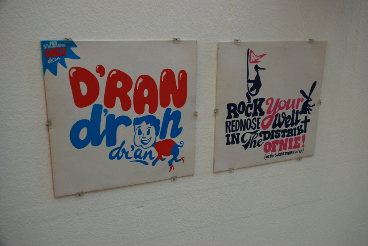
Rockwell Records covers: D’r An, D’r An, D’r An (2004) and Rock Your Rednose Well In The Distrikt (2003)
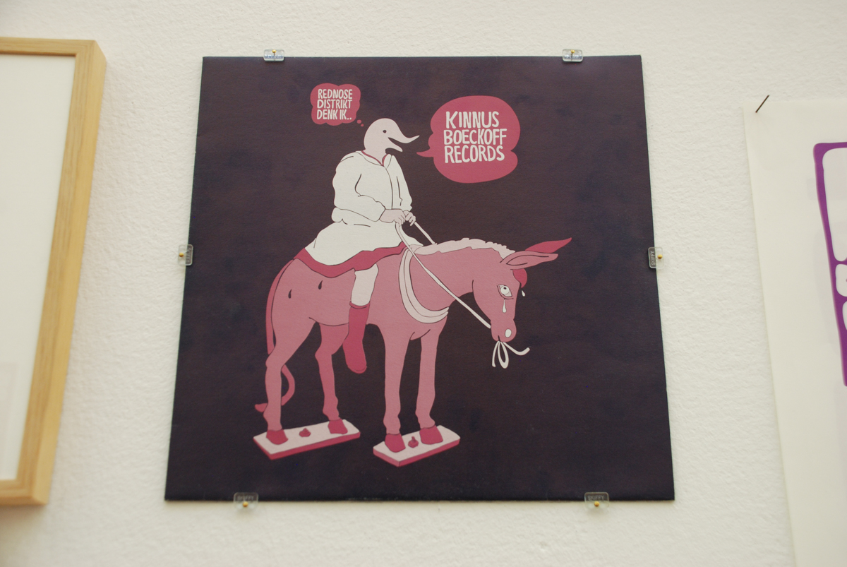
Rednose Distrikt – Denk Ik – Kinnus Boeckoff Records, 2005
7. Skateboarding
Before he was Piet Parra, he was Pieter Janssen, a talented and well-respected skater. After various sponsors he ended up on the Dutch skateboard brand Colorblind, as one of its earliest pros. Parra later transitioned into the brand’s art director. Parra designed the company’s later logo and various boards, including a series with various creatures (like a swan, weasel, crow and ghost) and the vegetable series from 2005, pictured here. Eventually this led to Parra doing board graphics for brands like enjoi, Skate Mental and Zoo York, as well as local shop Ben G, and he now owns his own skateboard brand, Tired Skateboards.
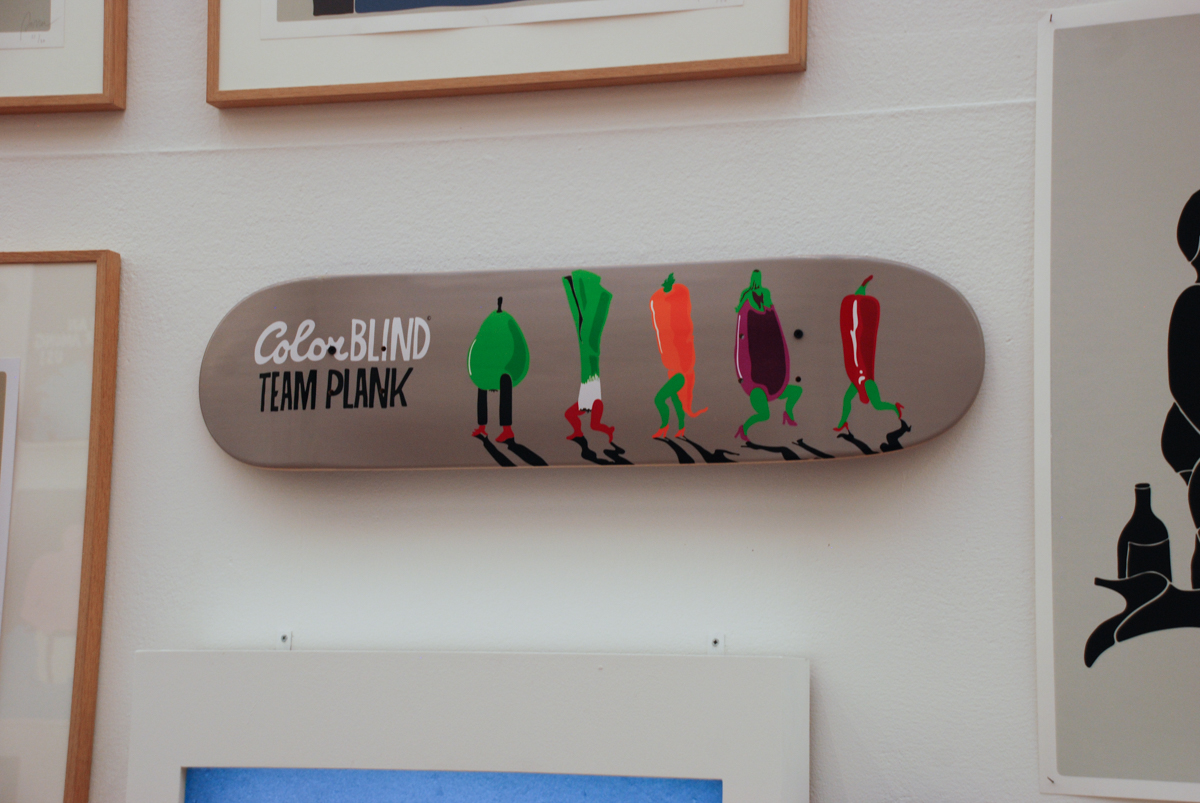
Colorblind Skateboards, Team Plank – 2005
6. Patta
Parra and Patta have always been closely connected. Besides the fact that Patta founder Gee gave Parra his nickname*, Parra had his studio in Patta’s original building at the Nieuwezijds Voorburgwal, did a huge amount of collabo’s with the shop (for brands like Nike, Alife, ASICS, Rockwell and Patta’s own in-house label, which originally was printed op Rockwell blanks) and of course designed its now world famous Script logo. Fun fact: it actually was not the first logo the shop used. Back when Patta first opened their doors back in 2004 the Amsterdam based sneaker destination identified itself by its block logo, which was also used for the store’s exclusive Converse All Star project.
*Gee was very connected in the Amsterdam night life, having worked for Sony and Fat Beats. Parra used to call him multiple times a day to make sure Gee put him on the guest list for a party. Gee eventually replied “Stop acting parra, Piet!”, with parra being short for paranoid. The name eventually stuck so well that barely anyone addresses him as Piet, most people just say Parra.
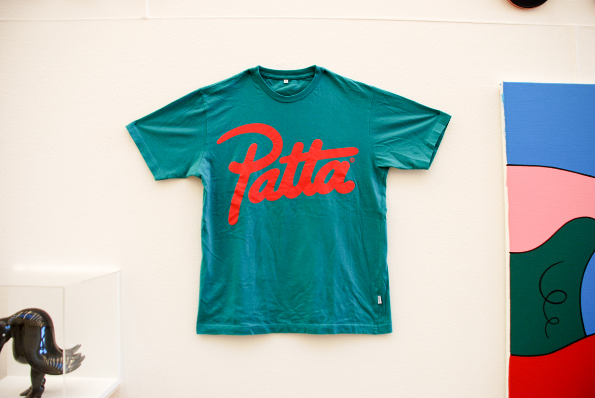
Patta T-Shirt – 2008. Made to match the adidas x Patta ZX 7000.
5. Sneakers
Parra has a good list of footwear collaborations. Multiple shoes for Nike (Air Max 95, Air Max 1, Air Maxim and in a way a pair of FC’s), as well as projects for Vans, Converse, Alife, and etnies+ made him a well known name in the sneaker community. But the most important shoe in that list is the Air Max 1 Amsterdam. The shoe was part of a 2005 European city series from Nike that included shoes for Berlin, Paris, and London. But none made the impact that Parra’s Amsterdam inspired Air Max 1 had. Originally the shoe had a completely different color scheme, based on the plastic bags of Dutch supermarket Albert Heijn. However, right before the release of the shoe, Albert Heijn changed the design of their bags. Parra felt like his concept was ruined and changed the colorway and insole around to a Red Light District-based design. What remained was the “Amsterdam is King” on the back, a spin-off of his classic Rockwell “Rock is King” graphic. Although no one camped out overnight for the release, the Amsterdam AM1 was the first shoe ever that had people lining up outside of a store in The Netherlands. To this day, it’s on the top of many people’s grail list, topped only by the original “Albert Heijn” sample/hyperstrike which is still out there for the right price…
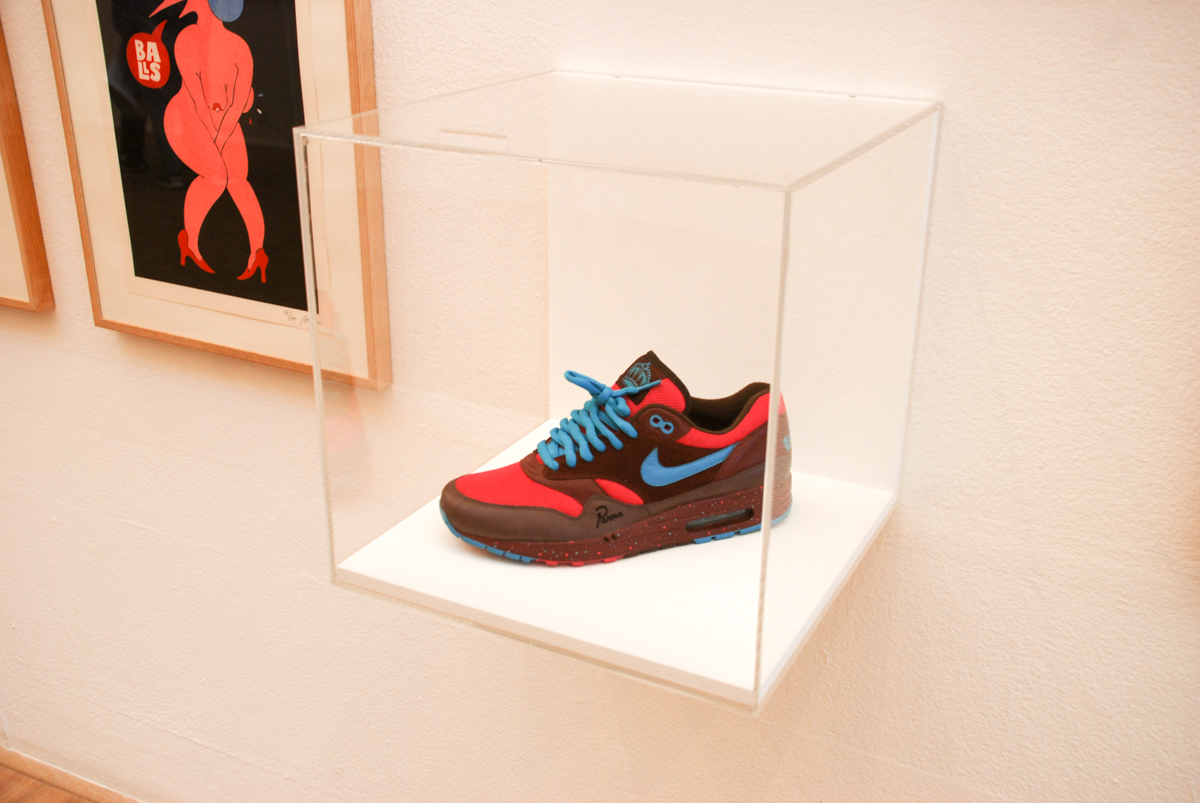
Nike x Parra Air Max 1 ‘Amsterdam’ – 2005
4. Music
Besides skateboarding and art, Parra has always been into music. Not just as a listener, but he’s been making beats for years as well. It was a side project, something for himself, although he did release a few uncredited records on Rockwell Records. But in 2006 Parra teamed up with Dutch rapper Faberyayo and DJ/producer Rimer London to start their own music group: Le Le. Faberyayo would rap or sing,over Rimer’s beats (in Dutch, English, French and German) while Parra drew live artwork on stage. Of course the cover art of the group’s albums and singles, and many of the videos, were taken care of by Parra as well. Although the group managed to only break into the singles chart once, their two albums were fairly successful. Besides his work with Le Le, Parra also mans the turntables in his Parra’s Sound System supergroup, which also consists of DJ’s Tom Trago and Mr. Wix and MC Lyrical Tie.
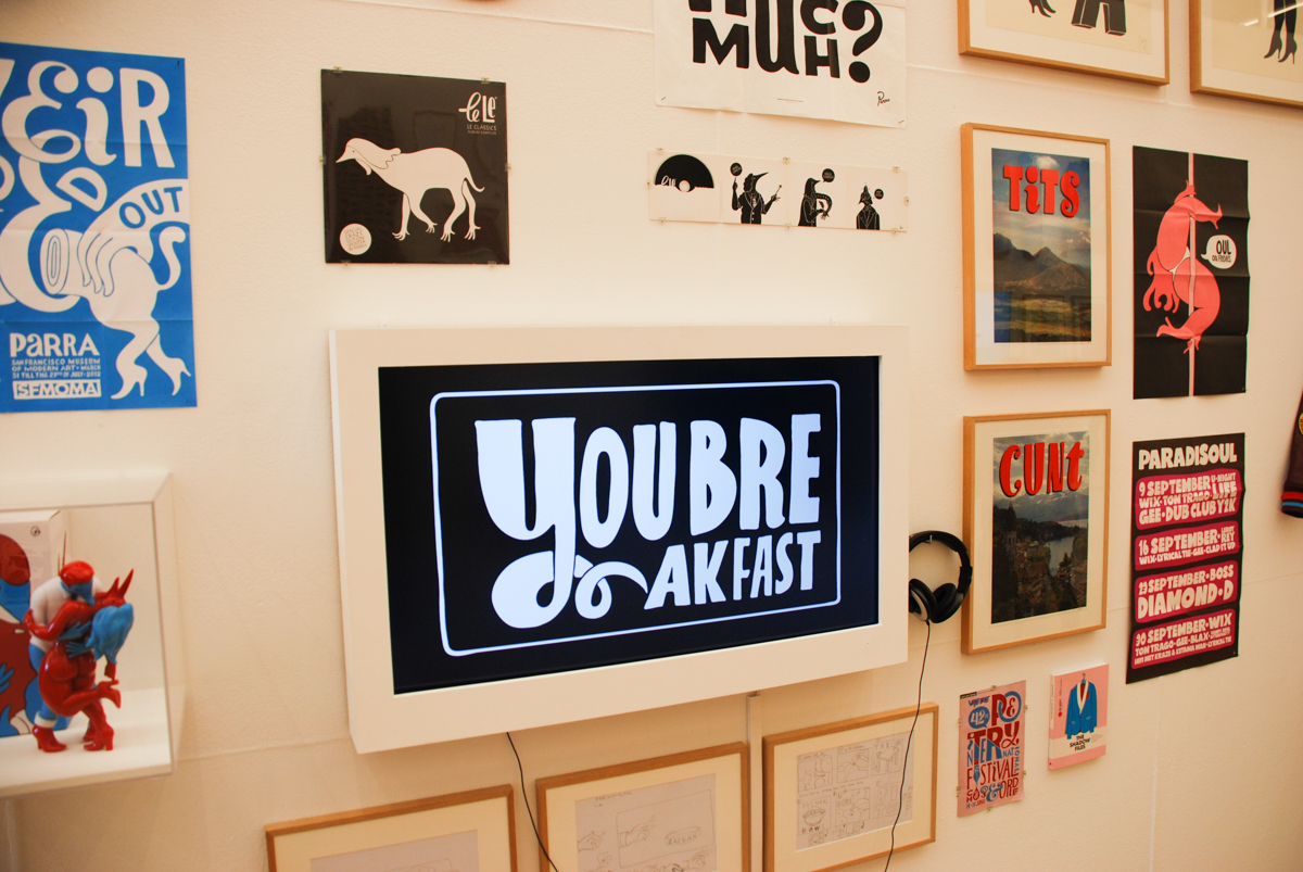
Video: Le Le, Breakfast – 2008
3. Book covers
It’s not very common for artists in Parra’s field to illustrate literary book covers. But in 2010, Parra was approached by a Dutch publisher to illustrate the cover of Brett Easton Ellis’ latest work, Imperial Bedrooms. The book launched alongside a reprint of Ellis’ debut novel, Less Than Zero, which also featured custom Parra artwork on the cover. A Parra-designed edition of American Psycho was released later. Since both artist have a thing for the absurd, it was without a doubt a great match. Overall this was a truly beneficiary collaboration. Parra was exposed to a new audience, that might not step into a store that sells Rockwell, and Parra fans were introduced to the books of Brett Easton Ellis.
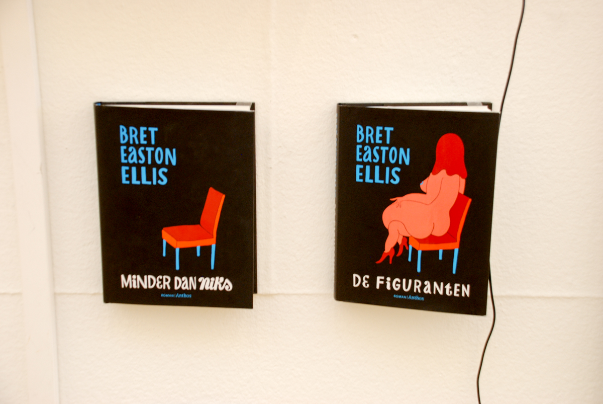
Covers for Bret Easton Ellis: Imperial Bedrooms and Less Than Zero – 2010, Roman Anthos
2. Magazine covers
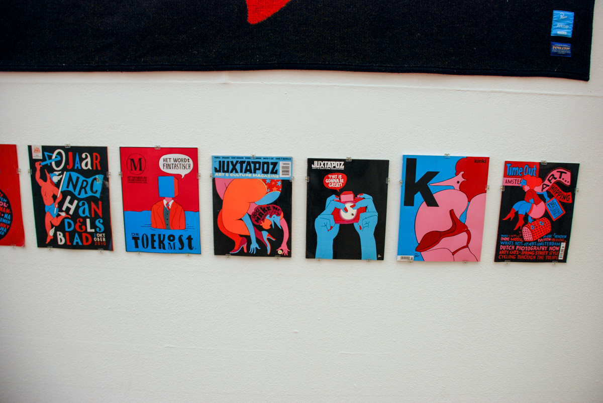
Designing magazine covers brought Parra’s work into the houses of thousands of Dutchies who may have never heard of him before. Much of his illustrations were for the weekly magazines that were part of the Saturday edition of large Dutch newspapers like NRC Handelsblad, VPRO’s TV guide and Amsterdam’s night life magazine Time Out. Besides all these covers for national publications, Parra also designed two covers for the March 2008 issue of Juxtapoz, and multiple issues of Arkitip, exposing his art to an international audience.
1. Art
While it may be a bit hard to believe, Parra has only been making “conventional” art for a relatively short time. Up to 2009. all his expositions were one off drawings or prints of his work, shown in galleries throughout the US and Europe. But during an exposition in Berlin, called I Like the Tee Shirt but I Will Get the Painting, Parra showed new work consisting of paintings and polyurethane sculptures. Ever since, there’s been a more steady output of Parra canvases and sculptures, including limited edition porcelain dogs and Christ-like busts, created for commercial retail.
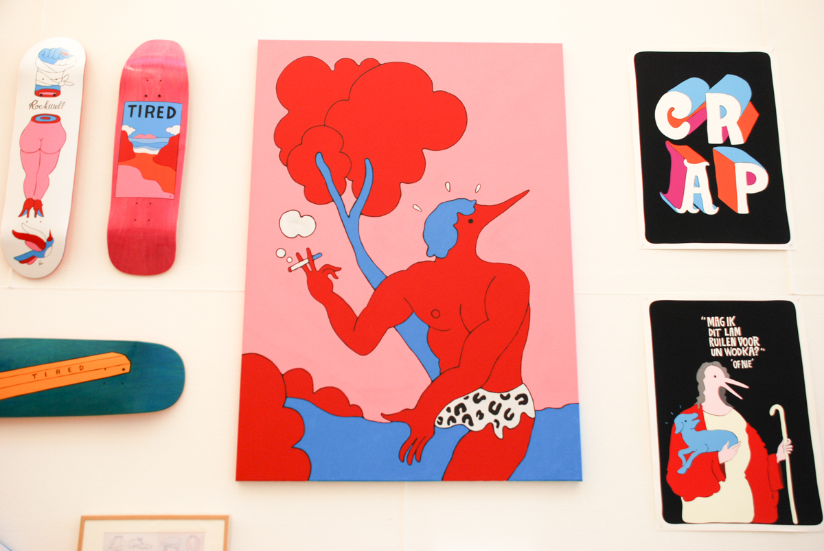
Tarzan Interrupted – 2009
::
The Parra expo is currently on show at the Kunsthal in Rotterdam until June 7th, 2015.

