Sterling Bartlett is a visual artist from Los Angeles, California, by way of San Angelo, Texas; Seattle, Washington; and Phoenix, Arizona; among other assorted stops during a peripatetic childhood spent on army bases across the US.
“Drawing, at its best, contains the seed of a refusal-to-be-sold.” The subtext of this declaration from the poet and cultural critic Wayne Koestenbaum contains the seed of a punk ethos—the refusal to sell out—that feels quaint and declassé in our current era of the hustle. But punk, like painting, has died a thousand deaths. The juggling of histories, references, and influences is standard for an artist balancing personal and commercial practices. Bartlett’s early work—juxtaposed text and images rendered in feathery graphite pencil with painstaking detail—rides the slippages of meaning that occur when a thing is placed next to another thing. The stark, monochrome illustrations function like jokes: resulting punchlines are oblique observations on contemporary culture reserved for those who “get” the picture. The apex of this format was a drawing that collapsed references to Belgian Surrealist René Magritte and Gucci Mane that hilariously reframes the basic question of ontology.
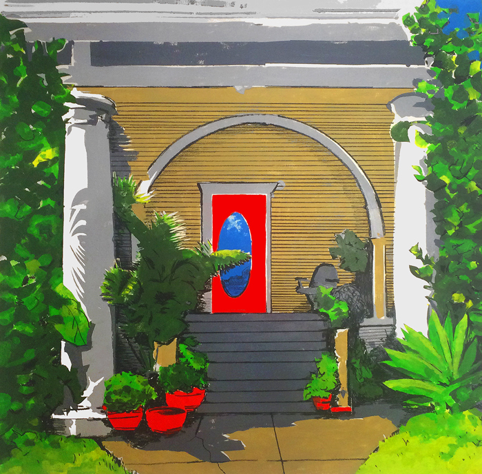
Eventually, Bartlett felt trapped by the very visual syntax he created. Each picture was bound by its own internal logic, alienating those who couldn’t parse the constituent parts. He began to experiment with pigment again, and in total about-face, Bartlett’s practice burst into color. Starting with portraits of friends (including yours truly), then globs of abstraction scathingly paired with bits of text both composed and appropriated, and most recently images of the domestic architecture around the eclectic working-class neighborhood of Victor Heights, where he lives and works. The paintings grow larger and more colorful, increasingly grounded in a personal mode of vision—the pictures of houses and friends are painted from photos he usually takes himself on his iPhone—rather than abstract cultural referents. The image has absorbed the text, but the tenor of his worldview remains seeped in the paper, darkening the candy-colored acrylics with mere shadows of meaning.
We spoke late at night via gchat, propped up in separate bedrooms across the city.
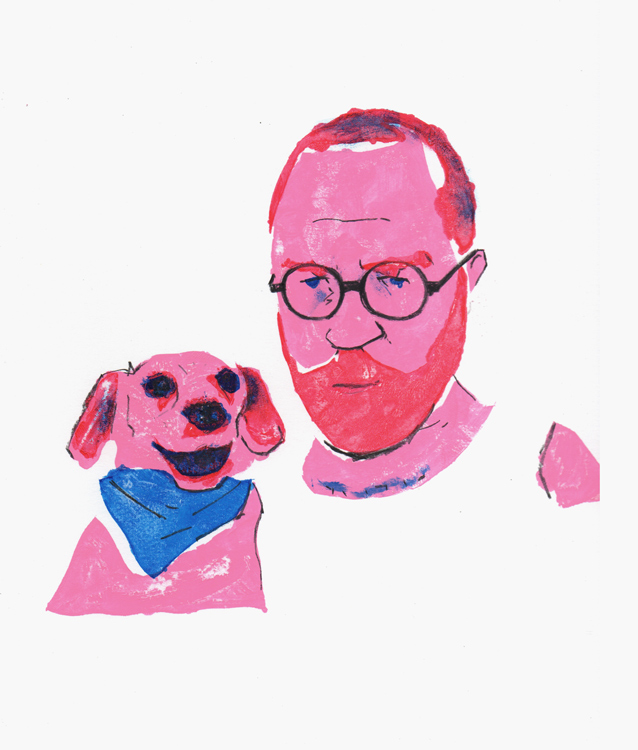
“Self W Dog,” 2015. Monoprint and charcoal on bristol 9X12″
How does drawing shape your relationship with the world?
Drawing is the foundation of my work. I’ve drawn continuously since I was three years old. Line is paramount even if disjointed or obscured by color. To draw a thing is to know that thing intimately. We so often passively register the forms of our environment, but to draw something is to syphon every detail, and recreate them.
Line versus color is an old debate... maybe this is reductive, but lines are also by-products of colors butting against one another. In your recent paintings at least, they seem to have an accord.
Yep, Poussinists vs. Rubenists. I don’t know where the line is between the right amount of charcoal drawing, and too much—and it leads to a great deal of failed works—but the ones with the right amount make it, and the ones with too much get tossed, so I guess I’m a bit of a reluctant Rubenist.
That makes sense given your roots in rendering. Can you describe the process for your most recent body of work? There’s an immediacy to the portraits and neighborhood paintings, but there’s no brushwork or shading to be seen. It incorporates techniques and subject matter that have always been present in your work.
My recent work is done using a kind of bastardized monoprint technique. Using Photoshop, I separate the source image—often a photo I took—into it’s different colors and print each color onto its own series of tiled papers, which then get cut into stencils with an Xacto. Once each color’s stencil is cut, I lay it onto the paper to be printed on, and apply pigment using a brayer, or a separate sheet of paper primed with paint. Once the stencil is removed, the print is inspected, and the process is repeated until all 6 to 11 colors are successfully laid in. Once all of the color-forms are in place, charcoal drawing is done to reinforce certain aspects of line and shadow.
“Douglas,” 2015. Monoprint and charcoal on bristol mounted to panel 12X12″
Can you describe your early relationship to painting, and how it might differ from before?
I’ve always been compelled to make images, but I didn’t start painting in earnest until my teen years. By the time I was 19, I had settled into a practice of making really big acrylic paintings full of pop-culture references. Looking back, those works were probably an attempt to own and assimilate those references, to try and get a handle on my identity. At the time I lived in a young artist residency connected to a small gallery, so a lot of the work I was producing was being shown on a regular basis. It was an invaluable education, but I cringe when I think about that early output. That body of work continued until about 2007 when I decided to take a break from painting entirely.
Since picking it up again, the relationship is less dire if anything. I am pretty comfortable in my own skin at this point, so rather than conjuring up an array of disparate images to build a grand narrative I am more directly documenting a lived experience.
“Modernist Pet,” 2015. Monoprint, charcoal and duct tape on bristol 19X24″
“Everett,” 2016. Monoprint and charcoal on Arches 22X22″
Tell me about that break between these two periods of painting. You were doing a lot of drawing and then a lot of reading. Both of those seem to inform what you’re doing now.
I stopped making paintings for a number of reasons, but the biggest factor was honestly lifestyle. I was flat broke, so I moved into a tiny studio apartment. In a space like that, the idea of making anything bigger than a sheet of typing paper is totally out of the question. As time went on my situation improved, but I still gravitated toward materials that could be purchased cheaply at a drugstore: pencil and paper. Over the next few years, the stockpile of small drawings I had created accidentally turned into an illustration career, which I am happy to say sustains me to this day. Getting paid to draw means a lot of time spent at home alone with your thoughts. Some of which weren’t making a whole lot of sense, so I dove into a roughly two-year period of intense reading—theory, post-structuralism, art history, and philosophy. I’m not sure if my mind is any clearer for it, but my work certainly reflects the shift.
Even though words have disappeared from your work (for now), the paintings still “read” in some way. In what ways do you feel an image can be a text?
Well, every image has linguistic weight. A picture of a house, for example, carries with it a set of signifier words, and ideas that spell out in your head upon seeing it: “house, home, sanctuary” etc. It began to feel like I was adding superfluous expository dialogue to an already clear picture. Once the compositions became more complex, the relationships between the images depicted would need full paragraphs, and then it becomes an essay not a picture.
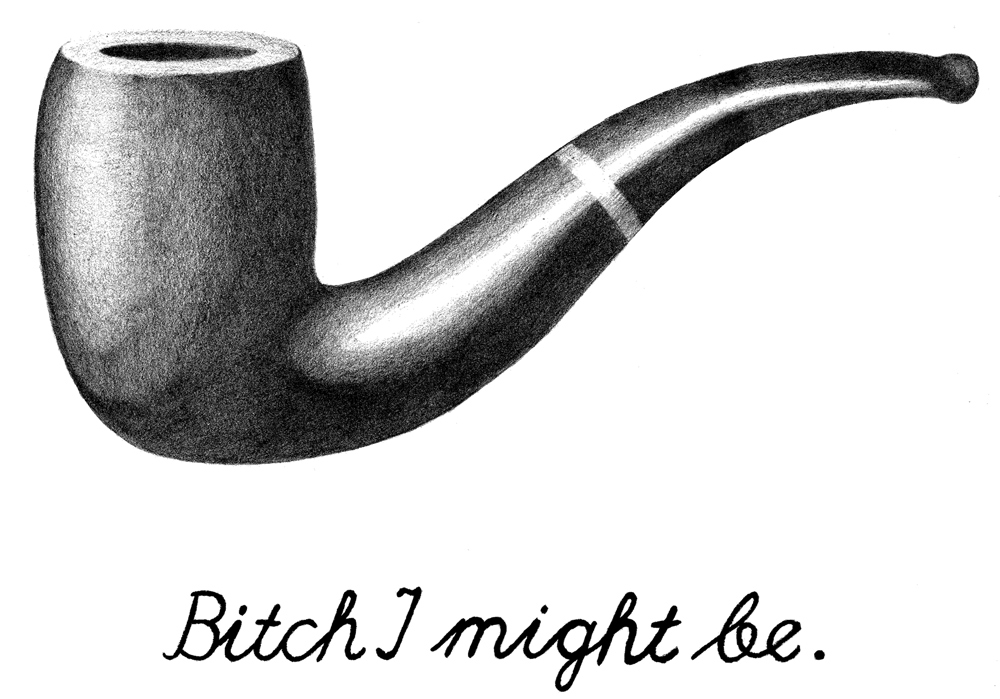
“Bitch I Might Be,” 2013. Graphite on bristol 11X14″
Where does this process come from? You seemed interested in painting again but you didn’t want to just throw paint around?
I think the print-rather-than-paint idea might be indirectly inspired by the fact that I’ve worked in graphic design and illustration for the last 8 or so years. I’ve created a wealth of digital work that my hand has never really even touched. Perhaps it stems from that.
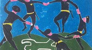
Ironically, as the imagery simplified, it became free to say more. This is really apparent in your painting Dance (2016) which you made for an exhibition called “What a Time to Be Alive.” It really feels like the culmination of your interest in appropriation and synthesizing disparate cultural references.
When I was asked to take part in a show that focused on the events that defined 2015 (racial inequality, police brutality, unchecked governmental surveillance). I had no earthly idea what to make that would add to the conversation in a meaningful way. Luckily I, (along with so many others) have an unhealthy obsession with Henri Matisse. Using his work as a template allowed me to overlay our country’s current condition onto a well-known and beloved historical document. We as a nation don’t tend to believe an idea unless someone like a long-dead celebrity tells us that it is true.
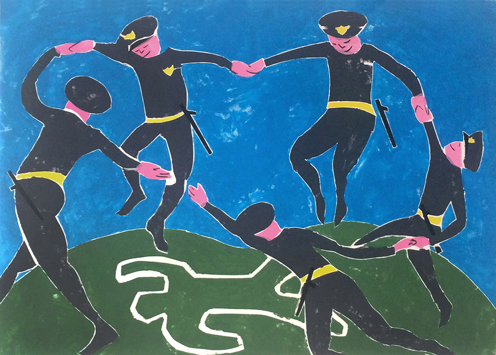
“Dance,” 2016. Monoprint and charcoal on bristol mounted to panel 18X26″
What’s on the horizon for you?
Right now I am gearing up for a group show this summer which means scaling up and making larger works. I’m also in the beginning stages of my second book project that will hopefully wrap up around the end of the year.
***