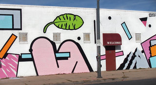
To create his bright and graphic aesthetic, Bristol-based artist Mr. Penfold abstracted his graffiti characters. “I started tearing the characters apart and focusing on the elements—eyes, nose, mouth,” he explains. “With these parts, I began to create a library of shapes that I would use to make abstract paintings. Over the years, the character elements have dropped out and now my work is pretty much just shapes and color.” His shapes and color palette, which looks like a post-modern version of the Saved by the Bell title sequence, is a definite nod to the 1980s.
Penfold cites the era’s computers, airbrushing, and skate graphics as influences, as well as artists such as Eduardo Paolozzi, Claes Oldenburg, and Patrick Caulfield. But his father, who has been a professional screenprinter for 40-plus years, has also influenced his work. “I was always surrounded by the work he was producing with artists,” he explains. “At the time, I wasn’t really into a lot of it, but as I’ve grown up, I’ve found myself drawing so much inspiration from the work I grew up with.” Perhaps even more so, there is a screenprinter’s sensibility in the way that Penfold isolates shapes and approaches color, and in the following interview, he discusses how he refined his aesthetic, plus his scientific approach to color, the artistic value of a cigarette, and more.

When and where did you first discover graffiti?
Like a lot of people my age, I first became aware of graffiti though my brother’s copy of Subway Art. I remember being about 11 years old and spending my evenings studying the pieces and trying to copy them onto paper! I think it was once I’d seen this book that I started to be aware of the graffiti around my hometown Cambridge.
When did you start participating in graffiti?
I must have been about 12—kind of hard to remember. It was around that time I started B-boying with a local crew. A few of the older guys had been painting since the 1980s, so I used to go watch them paint and they taught me the basics. I was never massively into letters and the whole ego thing that went with the scene. This was why I was drawn more toward the character side of things—as it seemed to have less of a vandalism ethos and more of an art-y thing.

How did you refine your aesthetic for galleries? How did you come up with the idea to create abstractions of your characters and letters?
I’ve always been into abstract art and it’s something that I always wanted to push in my work. It wasn’t until a couple of years ago that I actually had the guts to start pushing the abstract work! I had a slow transition from the characters to where my work is now. At first, I started tearing the characters apart and focusing on the elements—eyes, nose, mouth. With these parts, I began to create a library of shapes that I would use to make abstract paintings. Over the years, the character elements have dropped out and now my work is pretty much just shapes and color.
What era of art are you most inspired by? We definitely see a nod to the 1980s in your work.
Yeah, I love a lot of the 1980s bits—the introduction of computers and airbrushing opened up so many crazy concepts and styles! I’m really into the abstract and pop artists such as Eduardo Paolozzi, Claes Oldenburg, and Patrick Caulfield. Growing up, my house was full of books my dad had collected over the years, so I used to sift through them all the time. My dad’s been a screenprinter for 40-odd years, so I was always surrounded by the work he was producing with artists—at the time, I wasn’t really into a lot of it, I was more into comics and skate graphics, but as I’ve grown up, I’ve found myself drawing so much inspiration from the work I grew up with.

What classic skateboard graphics have been an inspiration? What are a few of your favorites?
I started skateboarding a few years before I started painting, so at the time they went hand in hand. I never had the money to buy pro boards back then, I always rode shop boards and blanks. But me and my mates used to spend hours in our local skate shop looking at all the pro decks. I was always a fan of the Alien Workshop boards by Don Pendleton and was always after the classic Santa Cruz Jim Phillips decks.

Why does your work often feature bent or folded cigarettes? Are you a smoker? Or do you just like its shape or iconography?
Yeah, I do smoke! That wasn’t the reason for the series of cig paintings though—I was really interested in the iconic symbol of a cigarette. It’s banned in advertising here in the U.K. and you never see people smoking in films anymore, but I was always fascinated by the design. It was really interesting getting feedback from that series, a lot of people hated them—some people loved them! My aim was for people to look passed the bad stuff and focus on the imagery and aesthetic value of the cigarette.

We love your color palette. Can you describe your “overly scientific approach to color”? What does that mean exactly?
About 10 years ago, I was given a book by Josef Albers called Interaction of Color. In this book, he talks about how color can play tricks on your eyes, and that you can do so much with color that most people wouldn’t even acknowledge. I used to study that book day and night, and Albers has influenced the way I use my colors to this day.
What’s next for you?
Last year was a pretty hectic one for me, so my aim for this year is to sit in my studio and paint!
***
Follow Mr. Penfold at mrpenfold.com and on Instagram @mrpenfold.